Outline ·
[ Standard ] ·
Linear+
::: Art Attack ::: V2
|
LeechFever
|
 Mar 13 2009, 07:48 PM Mar 13 2009, 07:48 PM
|

|
QUOTE(<< NoVA >> @ Mar 13 2009, 07:39 PM) Thanks!! That was helpful...but 1 question, how bout shading for PEN...other than cross hetching? Pen differs greatly from pencil and I KNOW I cant use the same technique of shading, any ideas?  That's my own way anyway and is not particularly recommendation to use pen. I just did it cause "there's a tempting scrap paper laying there and Im holding a pen" thought. And it doesnt really create a nice shading but I just wanted to see the overall rough look. It's up to individual really. i vary my technique from manga to real live people to scenery just so to experience different ways. |
|
|
|
|
|
LeechFever
|
Mar 14 2009, 04:59 PM
|
|
|
QUOTE(slumberus @ Mar 14 2009, 12:08 PM) » Click to show Spoiler - click again to hide... « Wow, nice. Switching from sci-fi to fantasy, I see. But cant critique until finish product. But so far so good  This post has been edited by LeechFever: Mar 14 2009, 05:03 PM This post has been edited by LeechFever: Mar 14 2009, 05:03 PM |
|
|
|
|
|
LeechFever
|
Mar 16 2009, 05:00 PM
|
|
|
QUOTE(Hexism @ Mar 16 2009, 02:16 PM) crap sketch » Click to show Spoiler - click again to hide... « No offense but is it the sketch or the character u r referring to?  Just kidding, the sketch if fine, but the character design depends on what the story is behind it. I notice u like to do a bit of advert illustration and gothic stuff as well as some rather ....err.... weird ones like the "Green Gay Orc". This post has been edited by LeechFever: Mar 16 2009, 08:04 PM |
|
|
|
|
|
LeechFever
|
Mar 16 2009, 08:01 PM
|
|
|
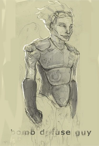
Ma Progress on the colouring part using photoshop. Mannn....it's hard work with multiple layers. WIP so far. Any comments?
<edited. update>
This post has been edited by LeechFever: Mar 16 2009, 08:22 PM
|
|
|
|
|
|
LeechFever
|
Mar 16 2009, 08:17 PM
|
|
|
QUOTE(slumberus @ Mar 16 2009, 08:08 PM) it'll be better if ur background is darker or grey. gives the glowy arm more contrast and easier to look at. Wow  thanks for the prompt reply. Like I said this is just WIP, will add in the background later cause Im still confuse on that one. Probably at the same time lower down the blue filter a bit cause I just notice this is a bit too....."blue'". This post has been edited by LeechFever: Mar 16 2009, 08:23 PM |
|
|
|
|
|
LeechFever
|
Mar 16 2009, 08:24 PM
|
|
|
Update. Added the background just for the feel of it. Will change it later. Lowered the blue filter as well. WIP still.
This post has been edited by LeechFever: Mar 16 2009, 08:39 PM
|
|
|
|
|
|
LeechFever
|
Mar 16 2009, 11:00 PM
|
|
|
QUOTE(bluesky87 @ Mar 16 2009, 10:53 PM) Eh? Going for cartoon feel rather than realistic? @redze Bro what does that line means? I think you stretch the face too much making it very distorted. The cropping on the right side of the face is pretty bad too. No offense just my 2 cent. Realistic is nice but given the time frame and the fact I'm still new in photoshop (with a mouse I might add), this is the best I can do. Besides, this is a new character design, no idea on the color scheme yet for this guy. So for now it's trial and error and experimentation. Btw, though may not be what u expected, I am aiming for a semi-cartoon feel, lol. Though would be nice if u could show me a link/tutorial as to how to make it more realistic by removing the black lining (cause all the tutorials I have seen so far is very random and I do not know the specific keyword for it). Though probably will try it later after I finish the "cartoonish" part, lol. This post has been edited by LeechFever: Mar 17 2009, 07:03 AM |
|
|
|
|
|
LeechFever
|
Mar 17 2009, 07:15 AM
|
|
|
QUOTE(redze @ Mar 16 2009, 10:31 PM) » Click to show Spoiler - click again to hide... « Looks more like a drug campaign than smoking. First is the red background.....a windmill doesnt seem to serve any purpose...looks more like a ganja farming community at the background. Second is the strecthed out head. Look a bit untidy. Actually unless u r a making a good moral out of the model, using a smoker as the face campaign...not a good idea. Kids will tend to smoke cause that face looks like snoopydog face when he's "moody", lol.  Next is the smoke, I think the white smoke is a tad bit too white and thick (looks like ganja smoke). And then the saying "Redze not merokok". If u r doing a smoking advert better use one language than mixing em up with another for better understanding. This post has been edited by LeechFever: Mar 17 2009, 07:20 AM |
|
|
|
|
|
LeechFever
|
Mar 17 2009, 01:14 PM
|
|
|
Question: Transform into what? Sparta or the 10Feet Gay Persian? lol. Just kidding nice job but have yet to critique further until I know what its suppose to transform into. But cant wait, hehe.
PS: Maybe I would draw one as well, presumably in the weekend if I have the time. Now the internet a bit laggy to see joomcool.
|
|
|
|
|
|
LeechFever
|
Mar 17 2009, 02:45 PM
|
|
|
QUOTE(Hanna_B @ Mar 17 2009, 02:34 PM) [attachmentid=852265]hi... old collection of Avril... pencil Ooooo....love it. Especially the flow of the hair. Nice one. I have a feeling u joined art class eh? This post has been edited by LeechFever: Mar 17 2009, 02:45 PM |
|
|
|
|
|
LeechFever
|
Mar 17 2009, 03:30 PM
|
|
|
QUOTE(Hanna_B @ Mar 17 2009, 03:03 PM)  .. im more to graphic design lor.. it a give.. haha From the looks of it, seem like u r very talented. Hope to see more of ur gallery soon. |
|
|
|
|
|
LeechFever
|
Mar 17 2009, 04:40 PM
|
|
|
QUOTE(Hanna_B @ Mar 17 2009, 03:52 PM) takuya ?? anyone??  honestly not as good as Avril u did just now. The nose a bit senget and there's something wrong with the lower lips (looks like it's swollen). But the hair is superb, gotta say. This post has been edited by LeechFever: Mar 17 2009, 04:41 PM |
|
|
|
|
|
LeechFever
|
Mar 17 2009, 05:02 PM
|
|
|
QUOTE(Hanna_B @ Mar 17 2009, 04:57 PM) wahh.. so terer can notice..  yeah.. still my old artwork.. been a long time didnt sketch.. 6 years.. so buzy with my little mouse... Ahhh finally fellow mouse user (as in the pc mouse not the real one). Welcome! |
|
|
|
|
|
LeechFever
|
Mar 19 2009, 08:31 AM
|
|
|
QUOTE(Hanna_B @ Mar 18 2009, 11:48 AM) hoho... ur designer to? i guess?? haha, no. But u r a designer, maybe u should consider getting urself a tablet. Seem like a good investment. |
|
|
|
|
|
LeechFever
|
Mar 19 2009, 02:18 PM
|
|
|
QUOTE(bluesky87 @ Mar 19 2009, 02:07 PM) Haha sorry LeechFever I didn't know you did it with your mouse only  Do you have any sample of what you mean by semi-cartoon feel? Making it more realistic by removing the black lining? Perhaps just lower the opacity or reduce the size of the line? Alright thanks  lol no prob. Semi-cartoon feel I mean like by adding more tones into it to make the picture more 3D with more depth but with the black lining intact (Cartoon in my book is using very few shading options that really makes it feels like 2D). Probably I can say like Prince of Persia 4 kind of feeling. By removing the black lining (or make it not clear), it can be more realistic cause...well...u dont normally see lining around ur hand right? One way of doing that is to make shade around the lining so that it blends into the shadow making it less obvious or using different contrast with the background to make the object more defined.
Added on March 19, 2009, 2:19 pmOh btw how to make the line thinner using photoshop? This post has been edited by LeechFever: Mar 19 2009, 02:19 PM |
|
|
|
|
|
LeechFever
|
Mar 22 2009, 10:33 AM
|
|
|
QUOTE(azarimy @ Mar 22 2009, 04:15 AM) i havent submitted anything here for a few months now. here's a fresh one. » Click to show Spoiler - click again to hide... « Now, who might this nice lady be? |
|
|
|
|
|
LeechFever
|
Mar 23 2009, 09:46 AM
|
|
|
QUOTE(brian-zz @ Mar 22 2009, 07:59 PM) yeah the gal is a recent stuff where i practicing anatomy and cloth folding and cloud variation is old one check out my other thread for my inking artwork My Inking 
Added on March 22, 2009, 10:53 pm» Click to show Spoiler - click again to hide... « » Click to show Spoiler - click again to hide... « got nothing to do tonite hheheh somthing for you guy To be honest, still need a bit more improvement. For one thing, try to look up human's anatomy. Dont need to be an art book, just google for pic references for that poses. Like how the shoulder should deform when u lift ur arms. This post has been edited by LeechFever: Mar 23 2009, 09:48 AM |
|
|
|
|
|
LeechFever
|
Mar 23 2009, 02:56 PM
|
|
|
QUOTE(dezz @ Mar 23 2009, 02:21 PM) » Click to show Spoiler - click again to hide... « a quick doodle...while @ work, lol *runs back and continue working* and somehow i'm seeing faces... my lecturer used to say "symmetry is evil" i'll admit i kinda agreed. but what the heck.. Alchemy software? |
|
|
|
|
|
LeechFever
|
Mar 23 2009, 06:54 PM
|
|
|
All I know is that it does a good job at making draft symmetry for new character design. Saw a couple of people used that as preliminary sketch in the dominance war.
|
|
|
|
|
|
LeechFever
|
Mar 24 2009, 07:57 AM
|
|
|
QUOTE(aizen @ Mar 24 2009, 01:11 AM) its good to see many new artworks here,, so geram coz of da bzness of uni life, cant do more proggress on my WIP artwork..  The bicycle thingy? |
|
|
|
|


 Quote
Quote


 0.0416sec
 0.35
0.35
 7 queries
 GZIP Disabled