

holy cow, just realized PS CS5.5 got brush mixer (a.k.a water Blender or whatever that called)....that does makes colour smoother a lot easier.
::: ART ATTACK V3 :::, all about handmade ART :D
::: ART ATTACK V3 :::, all about handmade ART :D
|
|
 Apr 19 2012, 02:57 PM Apr 19 2012, 02:57 PM
|

Elite
11,861 posts Joined: Oct 2008 From: Bangalasia |
holy cow, just realized PS CS5.5 got brush mixer (a.k.a water Blender or whatever that called)....that does makes colour smoother a lot easier.
|
|
|
|
|
|
Apr 19 2012, 03:54 PM
|
 
Senior Member
1,023 posts Joined: May 2010 |
QUOTE(Agito666 @ Apr 19 2012, 02:57 PM) holy cow, just realized PS CS5.5 got brush mixer (a.k.a water Blender or whatever that called)....that does makes colour smoother a lot easier. oh dat feature   just like in SAI paintool thing?  |
|
|
Apr 19 2012, 04:00 PM
|
|
Elite
11,861 posts Joined: Oct 2008 From: Bangalasia |
QUOTE(Sai91 @ Apr 19 2012, 03:54 PM) oh dat feature dont know still figure it out how to use. just like in SAI paintool thing? it doesnt looks like blender in painter |
|
|
Apr 20 2012, 12:40 AM
|

Senior Member
2,610 posts Joined: Aug 2011 |
QUOTE(Agito666 @ Apr 19 2012, 04:00 PM) dont know still figure it out how to use. They're supposed to stimulate the feel of wet paint on canvas. The mixer brushes are a little bizarre, IMO, and from my experience, it's just easier to load up Painter and use the default Painter blender/palette knife brushes instead of fussing with the settings. it doesnt looks like blender in painter They're great at keeping colour saturation and variety though, which can be problematic with the "eyedropper+low opacity brush" method of blending in PS. However, the "wet paint" simulation means that while they're great for achieving painterly effects, but not so good at refinement and finishing: the dry brush is too opaque, the wet brush is too smeary. If you're the sort that prefers crisp, bold lines and intricate details, they're only useful in the early stages when you're still keeping things rough and messy.  Added on April 21, 2012, 2:04 amJust finished the elven commission:  Agrona Tabris by *DragonReine This post has been edited by DragonReine: Apr 21 2012, 02:04 AM |
|
|
Apr 21 2012, 04:33 AM
|
|
Senior Member
1,023 posts Joined: May 2010 |
theheehehe..
  |
|
|
Apr 21 2012, 03:03 PM
|
|
Senior Member
2,610 posts Joined: Aug 2011 |
o hair there Hichigo
 Created a walkthrough thing for the elven painting I'd posted earlier. Click the image below to take a look:  |
|
|
|
|
|
Apr 21 2012, 04:11 PM
|
|
Senior Member
1,023 posts Joined: May 2010 |
QUOTE(DragonReine @ Apr 21 2012, 03:03 PM) o hair there Hichigo nice walkthrough Created a walkthrough thing for the elven painting I'd posted earlier. Click the image below to take a look:  and i can take abit tips from thre  |
|
|
Apr 22 2012, 04:39 PM
Show posts by this member only | IPv6 | Post
#1888
|

Junior Member
146 posts Joined: Apr 2007 From: Sabah, Malaysia |
Trying different style. Hmm he looked like having a hard life xD
 |
|
|
Apr 22 2012, 05:50 PM
|
|
Senior Member
1,023 posts Joined: May 2010 |
QUOTE(acefreakz @ Apr 22 2012, 04:39 PM) Trying different style. Hmm he looked like having a hard life xD dang..nice crosshatch there.. » Click to show Spoiler - click again to hide... « i never know how to do this..  |
|
|
Apr 22 2012, 08:16 PM
|

Senior Member
1,010 posts Joined: Jan 2011 From: Stranded |
Here's one of my drawing I just finished. Comments and critiques much appreciated!
 |
|
|
Apr 22 2012, 10:33 PM
|
|
Elite
11,861 posts Joined: Oct 2008 From: Bangalasia |
QUOTE(OH- @ Apr 22 2012, 08:16 PM) Here's one of my drawing I just finished. Comments and critiques much appreciated! 1. refer how to draw wing, no matter cartoon or realism one, your wing structure is a bit wrong. almost there oledi » Click to show Spoiler - click again to hide... « 2. the eyes. for me pretty much like Ancient Egyptian art's eye...oh wait, yours one kinda scary   refer how to draw the eyes no matter cartoon or manga or realism, the size of iris is affecting of the emotion / scariness of the character. or maybe soulless. you can see some bigger iris contact lens can make a fake cute effect, smaller iris can make scary effect. 3. right leg sure patah oledi 4. palm is not right. too small. awkward fingers. 5. cloth folding need strengthen up. |
|
|
Apr 22 2012, 10:34 PM
|
|
Junior Member
146 posts Joined: Apr 2007 From: Sabah, Malaysia |
QUOTE(Sai91 @ Apr 22 2012, 05:50 PM) dang..nice crosshatch there.. haha thanks my first try too xD i never know how to do this.. QUOTE(OH- @ Apr 22 2012, 08:16 PM) Here's one of my drawing I just finished. Comments and critiques much appreciated! the shape of the feathers is abit off xD would be nice to increase shading works  take ur time not to finish it too fast take ur time not to finish it too fast |
|
|
Apr 23 2012, 01:31 AM
|

Senior Member
711 posts Joined: Jul 2011 From: Soulport |
QUOTE(acefreakz @ Apr 22 2012, 04:39 PM) Trying different style. Hmm he looked like having a hard life xD wow this is the best portrait from u » Click to show Spoiler - click again to hide... « haha great job |
|
|
|
|
|
Apr 23 2012, 06:45 AM
|
|
Senior Member
2,610 posts Joined: Aug 2011 |
QUOTE(OH- @ Apr 22 2012, 08:16 PM) Here's one of my drawing I just finished. Comments and critiques much appreciated! Pretty good copy of Stormbringer. You need to observe the art a bit more closely, though:» Click to show Spoiler - click again to hide... « 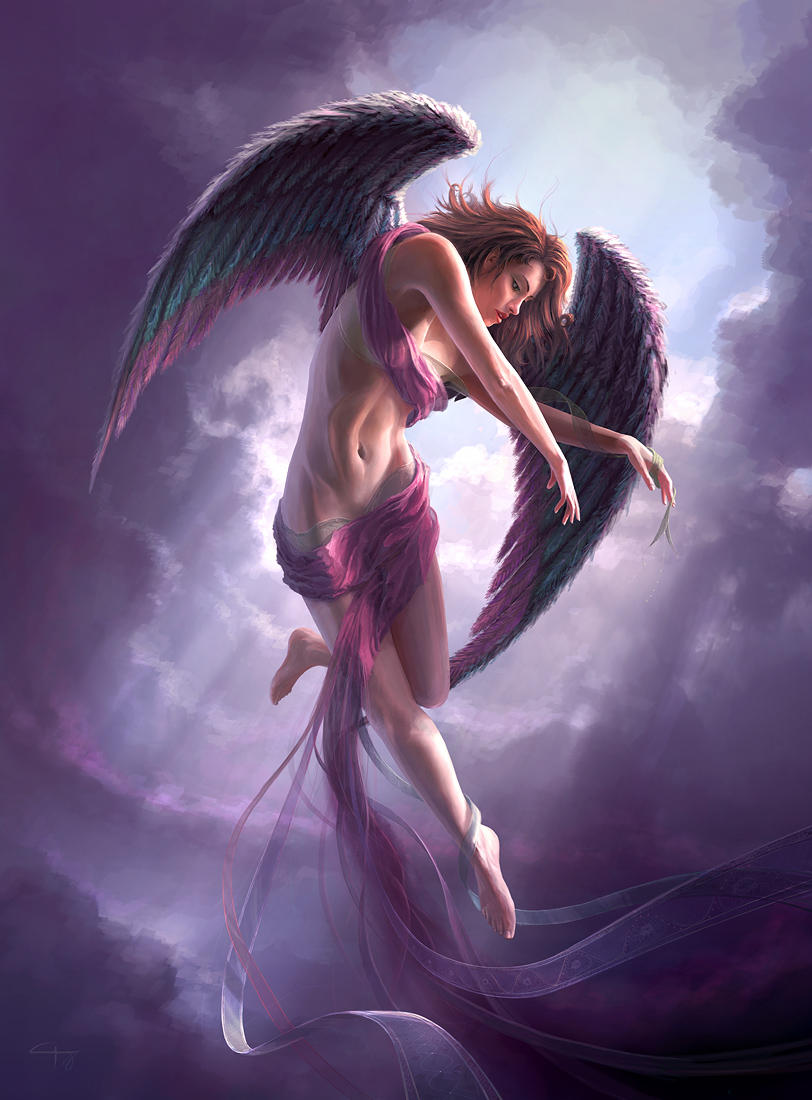 You anatomy's somewhat off. Try observing the original posing that Gary Tonge used for Storm bringer: La Danseuse by *darkmatterzone (NSFW for nudity) This post has been edited by DragonReine: Apr 23 2012, 06:46 AM |
|
|
Apr 23 2012, 06:47 AM
|
|
Senior Member
1,023 posts Joined: May 2010 |
QUOTE(DragonReine @ Apr 23 2012, 06:45 AM) Pretty good copy of Stormbringer. You need to observe the art a bit more closely, though: » Click to show Spoiler - click again to hide... « You anatomy's somewhat off. Try observing the original posing that Gary Tonge used for Storm bringer: La Danseuse by *darkmatterzone (NSFW for nudity)  nice find  |
|
|
Apr 23 2012, 08:43 AM
|
|
Elite
11,861 posts Joined: Oct 2008 From: Bangalasia |
QUOTE(DragonReine @ Apr 23 2012, 06:45 AM) Pretty good copy of Stormbringer. You need to observe the art a bit more closely, though: » Click to show Spoiler - click again to hide... « You anatomy's somewhat off. Try observing the original posing that Gary Tonge used for Storm bringer: La Danseuse by *darkmatterzone (NSFW for nudity)  wa really got this piece of art... This post has been edited by Agito666: Apr 23 2012, 08:43 AM |
|
|
Apr 23 2012, 09:36 AM
|
|
Senior Member
1,023 posts Joined: May 2010 |
QUOTE(Agito666 @ Apr 23 2012, 08:43 AM) wa really got this piece of art... |
|
|
Apr 23 2012, 10:13 AM
|
|
Elite
11,861 posts Joined: Oct 2008 From: Bangalasia |
QUOTE(Sai91 @ Apr 23 2012, 09:36 AM) u dunno? i now quite rarely surf around DA. |
|
|
Apr 23 2012, 10:43 AM
Show posts by this member only | IPv6 | Post
#1899
|
|
Junior Member
146 posts Joined: Apr 2007 From: Sabah, Malaysia |
@dragonreign lol... dono how you manage to find that XD
|
|
|
Apr 23 2012, 06:56 PM
|

Junior Member
140 posts Joined: Mar 2009 |
QUOTE(acefreakz @ Apr 23 2012, 10:43 AM) @dragonreign lol... dono how you manage to find that XD Qft. O.oThe shading seems fine to me, perhaps for a starter. It's clean and the gradient effect can be seen. But yeah, the anatomy may need some work here and there. As with the head and hair too. Use darker shades as well as stronger outlines throughout to make the image more appealing and balanced. (Looks kinda obvious that the body was drawn first and then the head comes in after.)This post has been edited by vypur85: Apr 23 2012, 06:57 PM |
|
Topic ClosedOptions
|
| Change to: |  0.0350sec 0.0350sec
 1.17 1.17
 6 queries 6 queries
 GZIP Disabled GZIP Disabled
Time is now: 15th December 2025 - 04:24 PM |
 Quote
Quote