


::: ART ATTACK V3 :::, all about handmade ART :D
::: ART ATTACK V3 :::, all about handmade ART :D
|
|
 Apr 29 2012, 08:05 PM Apr 29 2012, 08:05 PM
|
 
Senior Member
1,010 posts Joined: Jan 2011 From: Stranded |
He's turning towards his enemy!
|
|
|
|
|
|
Apr 30 2012, 08:32 AM
|

Senior Member
1,023 posts Joined: May 2010 |
QUOTE(acefreakz @ Apr 29 2012, 12:01 PM) +1 to ur exploration hahahah  Added on April 29, 2012, 7:13 pmWIP - 90%(need to repair the lower part hair -.-) and some other polishing. Comments and critiques are welcome!    pretty GOOD~ pretty GOOD~ QUOTE(kpchoo29 @ Apr 29 2012, 07:49 PM) Hi ppl, I need you guys comment on my WIP piece. My question is do you guys feel that blue dude is looking at his beam hand, or turning toward his enemy? to me yes...the blue dude watch the red beam..and his trying to turn toward that guy » Click to show Spoiler - click again to hide... « \ owsem work tho  |
|
|
Apr 30 2012, 09:32 AM
Show posts by this member only | IPv6 | Post
#1943
|

Junior Member
146 posts Joined: Apr 2007 From: Sabah, Malaysia |
thanks! @Sai91
|
|
|
Apr 30 2012, 09:39 AM
|

Senior Member
585 posts Joined: Sep 2011 |
QUOTE(kpchoo29 @ Apr 29 2012, 07:49 PM) Hi ppl, I need you guys comment on my WIP piece. My question is do you guys feel that blue dude is looking at his beam hand, or turning toward his enemy? Feel like the blue dude is sliding down the slope while prepare to engage his enemy. \ \Nice work btw |
|
|
Apr 30 2012, 10:08 AM
|
|
Senior Member
1,023 posts Joined: May 2010 |
i still dunno how you guys draw the concept drawin D;
|
|
|
Apr 30 2012, 04:12 PM
|
|
Validating
220 posts Joined: Apr 2007 |
Thx for the comments, you guys just save this dude from beheaded. Anyway here is the update, still got a lot need to be fixed tho. Harsh critiques are welcome.
 |
|
|
|
|
|
Apr 30 2012, 04:37 PM
|

Senior Member
711 posts Joined: Jul 2011 From: Soulport |
that is really good
reallly good. love the detail. cant say much because this is not the end result. I hope u can put more definition on the armor. some shine maybe. |
|
|
Apr 30 2012, 05:31 PM
|
|
Senior Member
1,010 posts Joined: Jan 2011 From: Stranded |
I like it
My opinion, you could add some detail in the environment at the back. Seems to me they are fighting in a sandy place most probably a desert. Maybe add some pyramids? Or camels....?  |
|
|
Apr 30 2012, 07:01 PM
|

Senior Member
662 posts Joined: Jan 2003 |
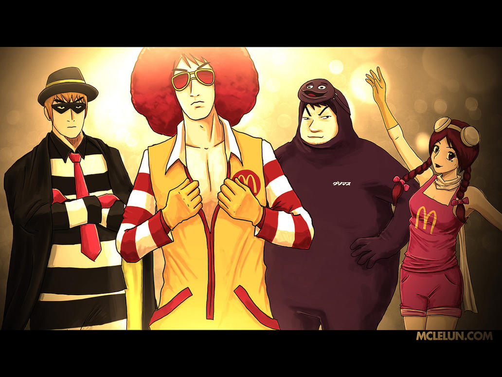
finally I have complete all the main characters from mcd
  |
|
|
Apr 30 2012, 07:26 PM
Show posts by this member only | IPv6 | Post
#1950
|
|
Junior Member
146 posts Joined: Apr 2007 From: Sabah, Malaysia |
hahahaha nice work! so cute xD
|
|
|
Apr 30 2012, 07:32 PM
|

Senior Member
2,610 posts Joined: Aug 2011 |
@ kpchoo29
Very nice! Love the dynamic feel of the illustration. If I may critique... The shadows on the foreground character is a LITTLE too harsh for a character that's fighting in an environment like a desert, where the sand particles are actually very light-reflective, especially since it looks like the metal of the foreground mecha is light-coloured/white (?). You may also want to warm the highlights, make them more yellow-toned instead of the neutral-to-cool temperature they have right now. It'll make the heat of the desert environment more convincing  |
|
|
Apr 30 2012, 07:35 PM
|
Junior Member
450 posts Joined: Aug 2008 From: Ipoh,Perak |
after a long time
i decided to draw back something i do for my fb timeline comment comment ok \  |
|
|
Apr 30 2012, 08:38 PM
|
|
Validating
220 posts Joined: Apr 2007 |
QUOTE(Adamiquesce @ Apr 30 2012, 04:37 PM) that is really good Yup I need put a lot of work on the armor, but its a real headache for me.reallly good. love the detail. cant say much because this is not the end result. I hope u can put more definition on the armor. some shine maybe. QUOTE(OH- @ Apr 30 2012, 05:31 PM) I like it It seems I faild to convey a solid message to audience, yes they are in desert. I try not to put stuff on the BG, but maybe I'll do some experiement, camel is a cute idea tho lol.My opinion, you could add some detail in the environment at the back. Seems to me they are fighting in a sandy place most probably a desert. Maybe add some pyramids? Or camels....? QUOTE(DragonReine @ Apr 30 2012, 07:32 PM) @ kpchoo29 lol actually I haven't decide what color/material to use for the mech on foreground. You mean the sand near bottom left should have lighten up?Very nice! Love the dynamic feel of the illustration. If I may critique... The shadows on the foreground character is a LITTLE too harsh for a character that's fighting in an environment like a desert, where the sand particles are actually very light-reflective, especially since it looks like the metal of the foreground mecha is light-coloured/white (?). You may also want to warm the highlights, make them more yellow-toned instead of the neutral-to-cool temperature they have right now. It'll make the heat of the desert environment more convincing |
|
|
|
|
|
Apr 30 2012, 08:38 PM
|
|
Senior Member
1,010 posts Joined: Jan 2011 From: Stranded |
QUOTE(Benny-T @ Apr 30 2012, 07:35 PM) after a long time Somehow I feel like the eyes are alittle too big compared to the mouth and nose.. i decided to draw back something i do for my fb timeline comment comment ok \ Sifu's correct me if I'm wrong.. |
|
|
Apr 30 2012, 09:24 PM
|

Senior Member
1,097 posts Joined: Oct 2009 |
QUOTE(kpchoo29 @ Apr 30 2012, 04:12 PM) Thx for the comments, you guys just save this dude from beheaded. Anyway here is the update, still got a lot need to be fixed tho. Harsh critiques are welcome. add more elements..mayb some flying dust in perspective? to create more depth of field..now it looks kinda flat..also if it has blue glow on his hand, his metallic body shouldnt look fully grey..and add more kick light to make the whole metallic surface more reflective and sharp.just my 2cents =)) QUOTE(OH- @ Apr 30 2012, 08:38 PM) Somehow I feel like the eyes are alittle too big compared to the mouth and nose.. hehe yeah u are not wrong. the eyes are a little too big compared to other features..besides, the alignment of both eyes can be refined..looks senget. Sifu's correct me if I'm wrong..nose shape can be more specific too coz thats not how nose looks like. lips as well..imbalance..=) |
|
|
Apr 30 2012, 09:36 PM
|
|
Validating
220 posts Joined: Apr 2007 |
QUOTE(inachi @ Apr 30 2012, 09:24 PM) add more elements..mayb some flying dust in perspective? to create more depth of field..now it looks kinda flat..also if it has blue glow on his hand, his metallic body shouldnt look fully grey..and add more kick light to make the whole metallic surface more reflective and sharp. You mean like put a layer of flying sand on the foreground and few more layers on the far background?just my 2cents =)) |
|
|
Apr 30 2012, 10:42 PM
|
|
Senior Member
1,097 posts Joined: Oct 2009 |
QUOTE(kpchoo29 @ Apr 30 2012, 09:36 PM) You mean like put a layer of flying sand on the foreground and few more layers on the far background? u can try that. make the overall looks more tension and impactful.what i mean background is so far i just see blue color blend with the sand. its more to like a palette u mixing color. draw everything more specific. |
|
|
Apr 30 2012, 11:17 PM
|
|
Senior Member
711 posts Joined: Jul 2011 From: Soulport |
QUOTE(Benny-T @ Apr 30 2012, 07:35 PM) after a long time bagus2i decided to draw back something i do for my fb timeline comment comment ok \ siapa kisah mata besar ka apa this is your style!  but the left eye is bigger than the right eye. not sure if u're lazy or tired when doing this,because it is so obvious. haha. This post has been edited by Adamiquesce: Apr 30 2012, 11:21 PM |
|
|
May 1 2012, 08:51 AM
|
|
Senior Member
1,023 posts Joined: May 2010 |
QUOTE(mclelun @ Apr 30 2012, 07:01 PM) finally I have complete all the main characters from mcd » Click to show Spoiler - click again to hide... « 80s - 90s feeling in thing picture This post has been edited by Sai91: May 1 2012, 08:51 AM |
|
|
May 1 2012, 12:11 PM
|
|
Senior Member
2,610 posts Joined: Aug 2011 |
@ kpchoo29
Meant that the mecha's BODY should not be so dark. Here's an example: 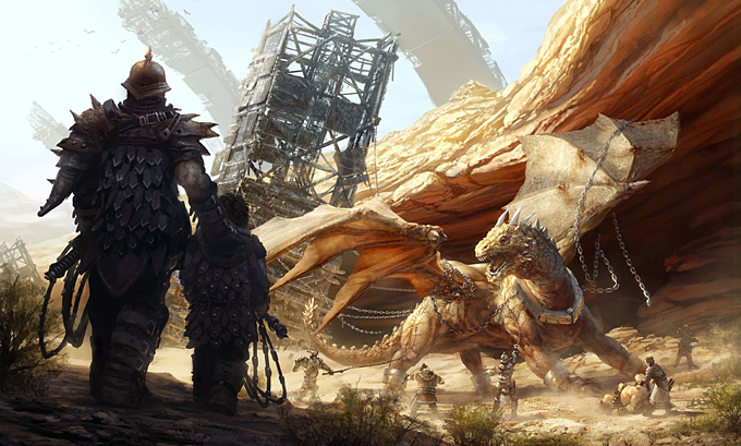 See the dragon? You can see the reflected light on the belly-side of the body. Even in the rock formation in the background, you can see that it's not entirely in shadow. |
|
Topic ClosedOptions
|
| Change to: |  0.0305sec 0.0305sec
 0.73 0.73
 6 queries 6 queries
 GZIP Disabled GZIP Disabled
Time is now: 17th December 2025 - 03:28 PM |
 Quote
Quote