Dr. Boom, Pakar Roti Boom
pen and painter 9.5, about an hour. and yes, that's supposed to be Dr. Doom
 .
.::: Art Attack ::: V2
|
|
 Feb 5 2008, 04:11 AM Feb 5 2008, 04:11 AM
Return to original view | Post
#1
|

Elite
10,672 posts Joined: Jul 2005 From: shah alam - skudai - shah alam |
Dr. Boom, Pakar Roti Boom pen and painter 9.5, about an hour. and yes, that's supposed to be Dr. Doom . |
|
|
|
|
|
Feb 7 2008, 09:33 PM
Return to original view | Post
#2
|
|
Elite
10,672 posts Joined: Jul 2005 From: shah alam - skudai - shah alam |
 yeah, more art attacks! predadoom (predator + dr. doom) pencils for 45minutes. |
|
|
Feb 11 2008, 08:13 AM
Return to original view | Post
#3
|
|
Elite
10,672 posts Joined: Jul 2005 From: shah alam - skudai - shah alam |
thanks mclelun.
 here's another painting i did today. subject: KRATOS from god of war game. well i did change bits and pieces of him. not too sure about the colours, a little too dark for my taste. and the background's too simplistic. suggestions welcomed. below is the original pencils:  This post has been edited by azarimy: Feb 11 2008, 10:05 PM |
|
|
Feb 11 2008, 06:23 PM
Return to original view | Post
#4
|
|
Elite
10,672 posts Joined: Jul 2005 From: shah alam - skudai - shah alam |
QUOTE(tsubasa89 @ Feb 11 2008, 01:06 AM) it doesnt look too dark to me....or maybe because i like darker tone painting.... raining? hmm, i guess u're right. it wasnt my intention, though haha. and the background ,due to the brush stroke, it sorta give me an illusion of raining....  did you do this on painter?  yes, i did this on painter. all the dark tone comes from the original work that i done with pencils and later scanned into painter. then painted on several layers before exporting to photoshop for some post production effects. pencils took about 2 hours, painting + post effects about 5 hours. |
|
|
Feb 11 2008, 08:35 PM
Return to original view | Post
#5
|
|
Elite
10,672 posts Joined: Jul 2005 From: shah alam - skudai - shah alam |
QUOTE(tsubasa89 @ Feb 11 2008, 11:33 AM) haha...cun la bro...XD even in photoshop i use a lot of layers when painting actually. however, photoshop layers are more for photo manipulation and effects, while painter's are give more options on controlling the outcome of the media. im still very fresh to painter as it is still too complicated for me currently lol.... btw....i wanna ask this long time ago.... is there any side effect/negatives painting on layers instead of the canvas itself like what we ussually do in photoshop? cuz last time when i did pencil sketch of black color on the layer above the canvas which i done the background, the color of the pencil somehow became like darkblue/brown for sopme reason....  the effect that u have is probably the paper surface setting in painter. bcoz of painter's ability to simulate media surfaces, what surface u attempt to sketch on will give different effects. for example, if u use pencils on a concrete wall it will definitely be different from bond paper. even papers have different types. there are watercolour papers, bond papers, tracing papers, soft papers and so on. the effect u have may actually be the setting on those rather than the layers itself. not forgetting that painter has loads of pencils to choose from  . .i've moved on from photoshop to painter successfully in 6 months. yeah, it took me that long. the best thing i love about painter apart from its realistic media is the ability to rotate canvas at will. if u dont know this, the control is spacebar+left click+alt, and while holding the 3 buttons, drag ur mouse around. u'll arbitrarily rotate ur canvas. this imitates rotating ur paper in live drawing. beats rotating the tablet LOL. u can rotate canvas in photoshop as well, but not as easily as this. |
|
|
Feb 15 2008, 09:58 PM
Return to original view | Post
#6
|
|
Elite
10,672 posts Joined: Jul 2005 From: shah alam - skudai - shah alam |
QUOTE(Fyonne @ Feb 13 2008, 02:24 PM) i painted on primary monitor n browse using 2ndary monitor, 1 project higher resolution in height, while the other in width, i used to drawn in wider one hence retrain me for looking overall, shrinking em will make harder to spot, only realise it after i see em in height monitor, when i posted em in other forum b4 posting here. since i already put it in imageshack, might as well post it here as well. to be honest, if u're drawing manga style, u can escape with a little disproportion in ur figures. mangas usually intentionally exaggerate certain parts while deliberately reducing others. this is evident in big eyes-small nose combo. what i'm saying is, ur work looks fine  |
|
|
|
|
|
Feb 26 2008, 07:06 PM
Return to original view | Post
#7
|
|
Elite
10,672 posts Joined: Jul 2005 From: shah alam - skudai - shah alam |
must.... keep... this... thread... alive....
 media: liquid ink in painter 9.5 time: 30 min. theme: amalgamation between alan moore's V for Vendetta and final fantasy's Vincent Valentine |
|
|
Feb 29 2008, 05:56 AM
Return to original view | Post
#8
|
|
Elite
10,672 posts Joined: Jul 2005 From: shah alam - skudai - shah alam |
thank you all. thank you for ur support indeed
|
|
|
Feb 29 2008, 05:40 PM
Return to original view | Post
#9
|
|
Elite
10,672 posts Joined: Jul 2005 From: shah alam - skudai - shah alam |
artist community fares stronger when it has equal support from each member of the community. that's how deviantart is so successful
. u post up an artwork, u get people to come by and see it, and then they leave comments. to any artist, it will keep ur spirits up (especially when u're down), and continuously want to produce more and more.so it's not just about saying "wah gempak" or "pergh!", it's what it means to the artist. ofcourse, artists require the occassional smack-in-the-face critiques as well . |
|
|
Mar 3 2008, 05:50 AM
Return to original view | Post
#10
|
|
Elite
10,672 posts Joined: Jul 2005 From: shah alam - skudai - shah alam |
that's a fine piece fyonne...
i suggest using the dodge brush/effects to accentuate the glow and shine |
|
|
Mar 10 2008, 08:09 AM
Return to original view | Post
#11
|
|
Elite
10,672 posts Joined: Jul 2005 From: shah alam - skudai - shah alam |
 optimus prime redesigned pencils + painter 9.5, about 5 hours. basically optimus prime meets armored core. |
|
|
Mar 19 2008, 10:35 AM
Return to original view | Post
#12
|
|
Elite
10,672 posts Joined: Jul 2005 From: shah alam - skudai - shah alam |
 a preview of page 2 (out of 6) of a comic i'm currently producing. media: pencils, digital liquid ink (painter 9.5), coreldraw 13. |
|
|
Apr 2 2008, 07:15 PM
Return to original view | Post
#13
|
|
Elite
10,672 posts Joined: Jul 2005 From: shah alam - skudai - shah alam |
haiyaa yukikaze, kasi rotate itu drawing lor
Added on April 2, 2008, 7:17 pm QUOTE(cymon @ Apr 2 2008, 04:45 AM) 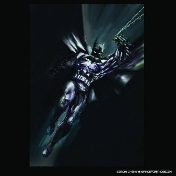 one of my old works. about 2 years ago. also working on painter and tablet. blend with dark pallete on a single layer works. about 1 hours time works. any galleries i can look at? deviantart perhaps? This post has been edited by azarimy: Apr 2 2008, 07:17 PM |
|
|
|
|
|
Apr 4 2008, 10:18 PM
Return to original view | Post
#14
|
|
Elite
10,672 posts Joined: Jul 2005 From: shah alam - skudai - shah alam |
QUOTE(azarimy @ Mar 19 2008, 02:35 AM) a preview of page 2 (out of 6) of a comic i'm currently producing. media: pencils, digital liquid ink (painter 9.5), coreldraw 13. supportlah aku |
|
|
Apr 18 2008, 08:55 AM
Return to original view | Post
#15
|
|
Elite
10,672 posts Joined: Jul 2005 From: shah alam - skudai - shah alam |
 aksi karmen a word play derived from action kamen (sinchan), redesigned and reworked as a new comic book superheroin. not a real one, duh. just part of a redesign competition |
|
|
Apr 27 2008, 05:57 PM
Return to original view | Post
#16
|
|
Elite
10,672 posts Joined: Jul 2005 From: shah alam - skudai - shah alam |
QUOTE(mclelun @ Apr 27 2008, 03:50 AM) azarimy thanks.is that a manual painting using water color? look nice it's fully digital painting, specifically using soft acrylic and water blender in Painter 9.5. |
|
|
May 8 2008, 05:04 AM
Return to original view | Post
#17
|
|
Elite
10,672 posts Joined: Jul 2005 From: shah alam - skudai - shah alam |
lets bump this thread!
 mahsuri bersiram |
|
|
May 9 2008, 07:40 PM
Return to original view | Post
#18
|
|
Elite
10,672 posts Joined: Jul 2005 From: shah alam - skudai - shah alam |
QUOTE(felicious @ May 9 2008, 10:57 AM) It would be better if the girl expression is sexier well, i dont wanna cause massive case of bleeding noses... |
|
|
May 11 2008, 03:16 AM
Return to original view | Post
#19
|
|
Elite
10,672 posts Joined: Jul 2005 From: shah alam - skudai - shah alam |
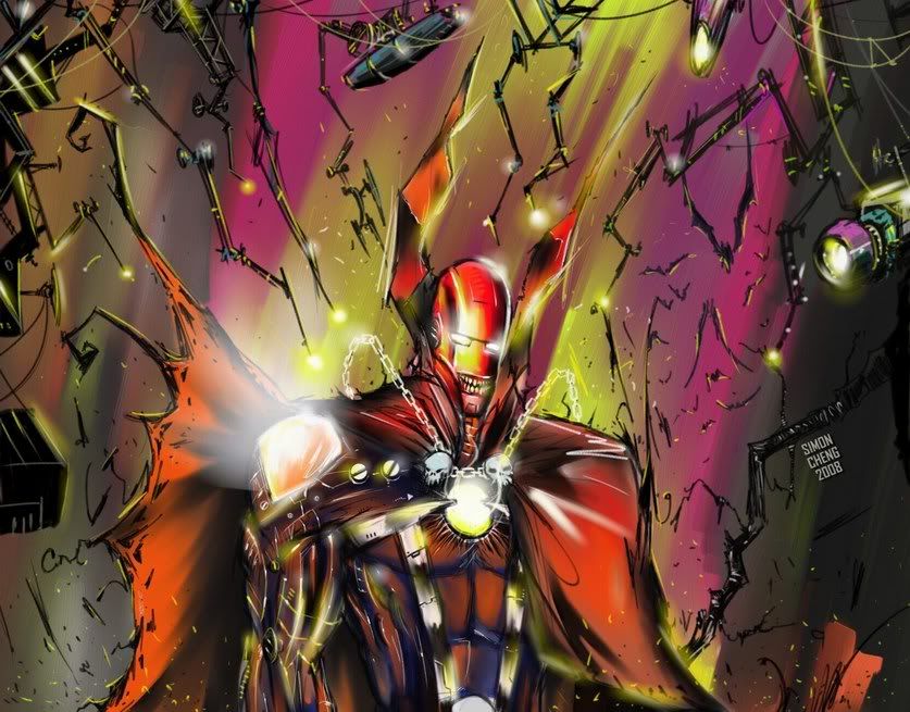
QUOTE(cymon @ May 10 2008, 01:42 PM) » Click to show Spoiler - click again to hide... « try to bump thread. fresh new digital concept work. using painter with wacom tablet. just a some rough sketch work due to some funky ideas cross over between spawn & ironman. i got this ideas since after i saw the movie second time. i want to create something hybrid sort of heroes. sort of dark versus metal !!! most of my concept art is quite big in size at the original, so at this one i already resize it for more easy at view. around 2 hours work. i just hope i could see the entire figure rather than just the bust. |
|
|
May 11 2008, 05:40 AM
Return to original view | Post
#20
|
|
Elite
10,672 posts Joined: Jul 2005 From: shah alam - skudai - shah alam |
QUOTE(cymon @ May 10 2008, 07:31 PM) woo... not yet sleep, bro? dude, i'm in the UK. so it's normal for me to be up and about at this time is 3.30am ,  wat u doing at tis time around?? wat u doing at tis time around?? no worry, i m working on next one on it wit full body punya  tat one belum dapat ideas lagi, kira warm up lah next one kasi full impact ( i wish lah )coz now busy working lain concept art. stay tune , stay tune . but if u find me between 9am to 4pm malaysian time, then u know i'm burning the midnight oil . |
| Change to: |  0.0238sec 0.0238sec
 0.55 0.55
 7 queries 7 queries
 GZIP Disabled GZIP Disabled
Time is now: 26th November 2025 - 09:12 PM |
 Quote
Quote