Outline ·
[ Standard ] ·
Linear+
Seiko Watch Thread V5, - Seikoholic kopitiam
|
kotmj
|
 Jul 9 2019, 05:03 PM Jul 9 2019, 05:03 PM
|

|
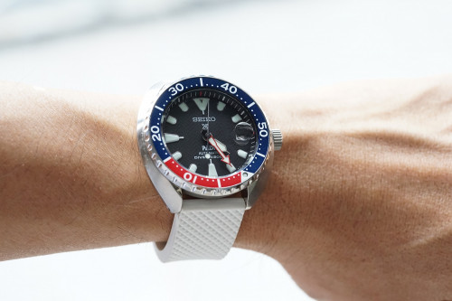 One more shot... I'm so happy I have this. It's so strong graphically. It doesn't displace the mm200---that one is such a well-proportioned, harmonious design where this mini turtle is bristling. It bristles with colour contrasts, with uncommon lume shapes, with a distinctive case shape and with textures on the dial, bezel and case. The high contrast printing on the bezel just makes the whole thing very dense graphically. The cyclops adds even more theatricality. This post has been edited by kotmj: Jul 9 2019, 05:18 PM |
|
|
|
|
|
kotmj
|
Jul 9 2019, 05:21 PM
|
|
|
The mini turtle is a laggard sales-wise. It's so underappreciated. For me, it's the small, but funky and fun Seiko diver. You want a classical, serious-looking diver you can wear for business? Plenty of other models from Seiko for that.
|
|
|
|
|
|
kotmj
|
Jul 9 2019, 09:34 PM
|
|
|
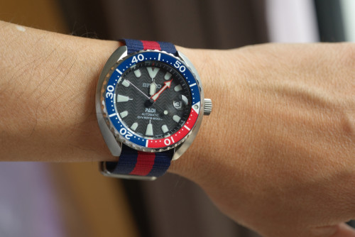
Bonetto Cinturini 300D.
The strap colour works very well with this watch because it picks up the various whites of the dial and bezel. In other words, the strap is not a disjointed element distinctly different from the watch head (as would be the case with brown leather or most natos), but seems to be a visual continuation that is congruous with the watch head.
You could also use a black strap, but black is a non-colour. By definition, black absorbs all light. Matt black as a strap is like having no strap, leaving just the watch head as the object of interest. Originally, this padi edition comes with a navy blue strap, but it is so dark as to be almost black.
A red strap would echo the red portion of the bezel and the minute hand. I tried a red perlon strap and it's also a pretty good match. I imagine a blue strap that matches the blue of the bezel would also work.
The advantage of white is its sheer brightness. It's also an uncommon strap colour. It gives the watch a huge amount of sportiness and youth.
I'd like to try an orange strap with it some day.
|
|
|
|
|
|
kotmj
|
Jul 10 2019, 12:34 PM
|
|
|
QUOTE(cyapd @ Jul 10 2019, 03:26 AM) Mind to share where you bought it? Chino Watch Japan through ebay |
|
|
|
|
|
kotmj
|
Jul 12 2019, 12:40 AM
|
|
|
I'm in love with my mini turtle. Is this normal.
|
|
|
|
|
|
kotmj
|
Jul 13 2019, 12:18 PM
|
|
|
 Bought last night a pepsi nato for the pepsi mini turtle |
|
|
|
|
|
kotmj
|
Jul 14 2019, 03:55 PM
|
|
|
|
|
|
|
|
|
kotmj
|
Jul 14 2019, 09:49 PM
|
|
|
I just tried on some Citizen Promaster divers in titanium. Somehow, they look cheap. I really wanted to like them, but they have a look like Fossil watches.
|
|
|
|
|
|
kotmj
|
Jul 14 2019, 09:57 PM
|
|
|
Somehow, even a skx007 doesn't look cheap but a RM2k (after discount) citizen diver can look and also feel cheap.
|
|
|
|
|
|
kotmj
|
Jul 15 2019, 02:00 AM
|
|
|
Well, I once put on the GS Snowflake. It didn't feel cheap at all and it's titanium.
I've actually put on my wrist a great many watches, some of the best in the world. Lange, JLC, GS, various Rolexes, etc. But I've also tried on many affordable watches. Longines, Seikos, Tudors including the BB58, Seagull 1963, etc.
Some of the Longines really do look and feel cheap. But, by and large, I liked most of the watches I've tried. They always give such a high quality impression, even the Seagull 1963.
But the Citizens I tried today were really cheap looking and feeling. They were also poorly finished. I felt so underwhelmed. Normally, I find much to like in most watches, even in Skagens. But there were many off things with the Citizens.
This post has been edited by kotmj: Jul 15 2019, 02:04 AM
|
|
|
|
|
|
kotmj
|
Jul 15 2019, 02:10 AM
|
|
|
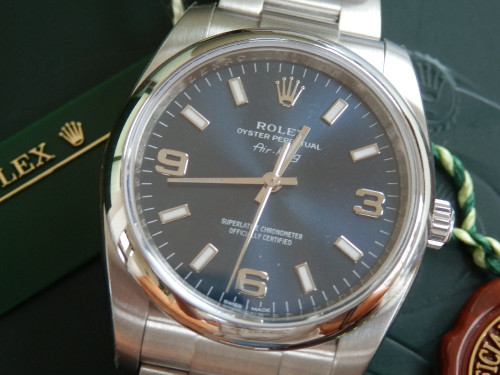
I own and regularly wear a two tone Rolex Datejust. When I put on the mini turtle, it doesn't feel or look cheap to me. It feels different, but not cheap. The designers behind it are very good at what they do, and have managed to deliver a watch which gives great satisfaction to wear and handle. Yet it uses basic materials and inexpensive processing.
|
|
|
|
|
|
kotmj
|
Jul 15 2019, 02:12 AM
|
|
|
Ah, let me put it this way. You know what the Citizens remind me of? Of Swatch.
|
|
|
|
|
|
kotmj
|
Jul 23 2019, 03:09 PM
|
|
|
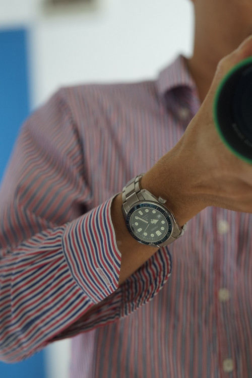 What a nice diver |
|
|
|
|
|
kotmj
|
Jul 23 2019, 11:30 PM
|
|
|
|
|
|
|
|
|
kotmj
|
Jul 23 2019, 11:40 PM
|
|
|
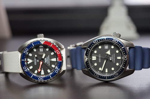
 I mean, just look at how short the minute hand on their bestseller is. Not only is it short, but there is very little surface area near the tip due to the syringe design. This makes the hand appear very stubby. |
|
|
|
|
|
kotmj
|
Jul 24 2019, 12:12 AM
|
|
|
So I asked myself, how would a genius design watch hands? Geniuses, you see, are different from the rest of us. They simply, all on their own, understand things the rest of us do not. How long did Abraham Louis Breguet make his watch hands? As it turns out, very, very long. 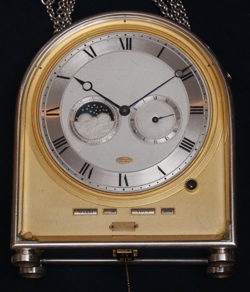 This is a clock he made for Napoleon Bonaparte's wife. The minute hand is so long that it overlaps with the outermost minute markers. Here's a closeup.  Here's another of his creations. It is not possible to make the hands any longer. He made them as long as he could. 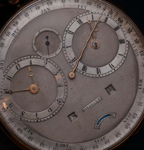 |
|
|
|
|
|
kotmj
|
Jul 24 2019, 12:14 PM
|
|
|
Somehow, on their Grand Seikos, they managed to get it right. 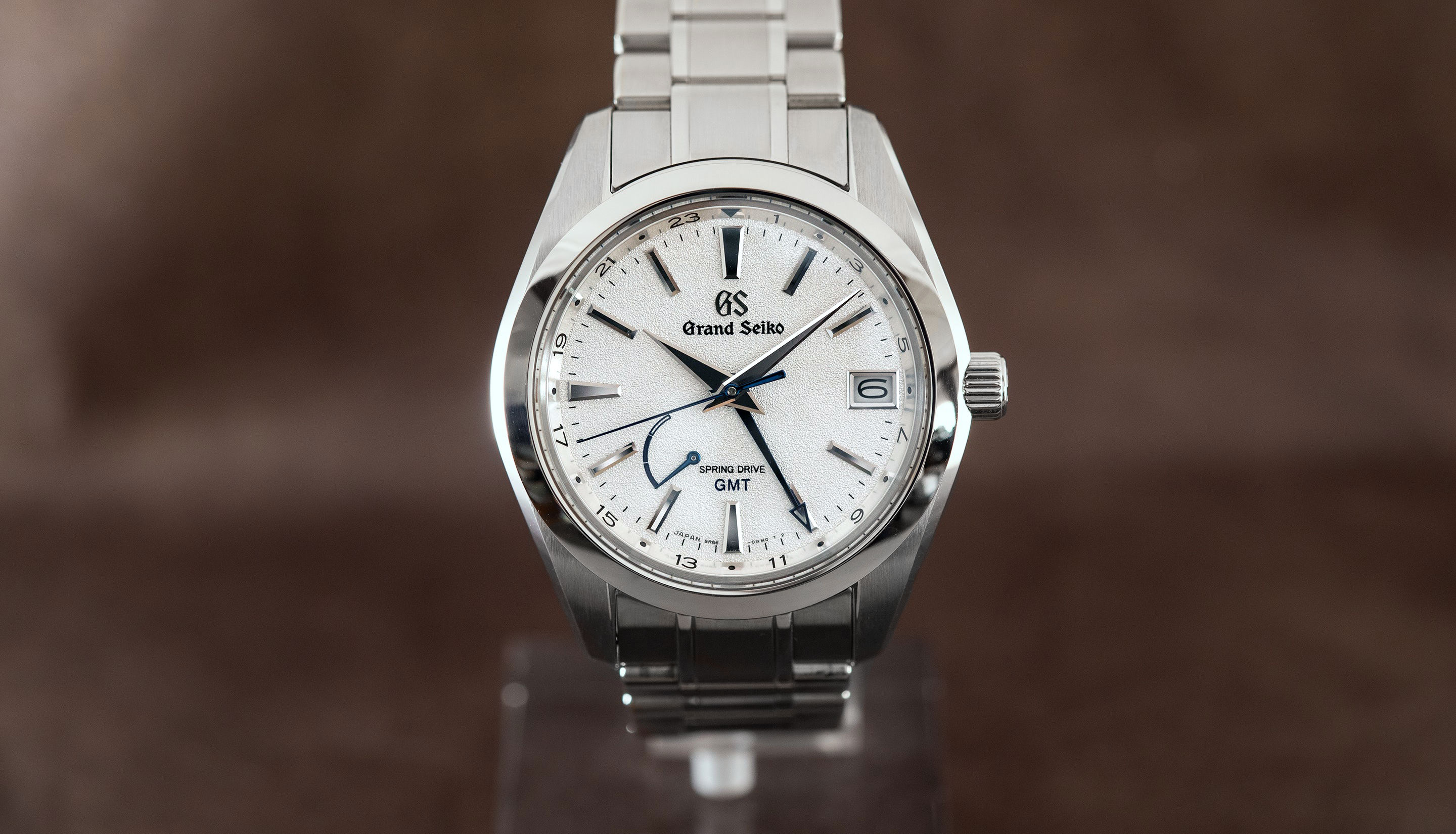 |
|
|
|
|
|
kotmj
|
Jul 24 2019, 12:16 PM
|
|
|
Notice the Grand Seiko hand lengths conform to the canonical/historic formula:
1. The hour hand just touches the base of the hour indices.
2. The minute hand reaches to the TOP of the minute markers.
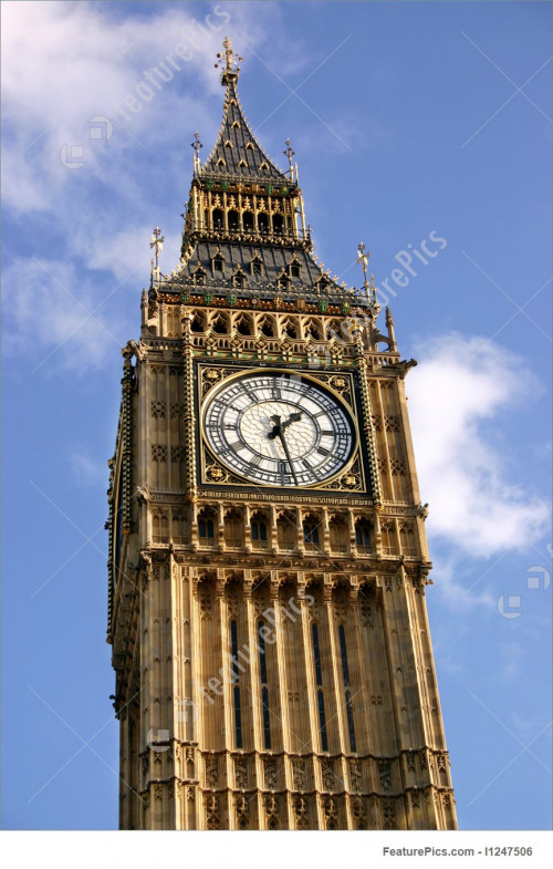
A.L. Breguet and the clockmakers of old including that of the Big Ben used this formula.
This post has been edited by kotmj: Jul 24 2019, 01:58 PM
|
|
|
|
|
|
kotmj
|
Jul 26 2019, 03:33 PM
|
|
|
QUOTE(yvliew @ Jul 26 2019, 12:06 AM) Somehow it doesn't match the shirt Focus on the bigger picture! |
|
|
|
|
|
kotmj
|
Aug 5 2019, 11:43 PM
|
|
|
|
|
|
|
|


 Quote
Quote


 0.1562sec
 0.78
0.78
 7 queries
 GZIP Disabled