

QUOTE(drpsyko @ Nov 30 2014, 02:44 AM)
Worrying Chaika


got improvement compare with your old artwork 
:::ART ATTACK V4:::
|
|
 Nov 30 2014, 11:56 AM Nov 30 2014, 11:56 AM
|
 
Senior Member
662 posts Joined: Jan 2003 |
QUOTE(drpsyko @ Nov 30 2014, 02:44 AM) Worrying Chaika got improvement compare with your old artwork |
|
|
|
|
|
Nov 30 2014, 09:59 PM
|

Junior Member
447 posts Joined: Feb 2011 From: Planet Animu |
QUOTE(mclelun @ Nov 30 2014, 11:56 AM) got improvement compare with your old artwork Thanks~~  Finally decided to stick with this art style after experimenting all sort of styles for the past artworks. Thanks to all of the comments here lol.  Btw, not doing any shorts now? Kinda missed ur rain composition. Heheh. |
|
|
Dec 2 2014, 02:16 AM
|
|
Junior Member
447 posts Joined: Feb 2011 From: Planet Animu |
A draft for Give the Gift for Art competition. Not detailed and fully colored yet, but it gives the clear idea on the message that I'm trying to send.
  |
|
|
Dec 2 2014, 08:37 AM
|
|
Senior Member
599 posts Joined: Oct 2011 |
Wow good luck!
 |
|
|
Dec 2 2014, 08:40 AM
Show posts by this member only | IPv6 | Post
#2045
|
|
Junior Member
447 posts Joined: Feb 2011 From: Planet Animu |
QUOTE(seba @ Dec 2 2014, 08:37 AM) Wow good luck! Thanks, but it would be nice if got any advice. Might as well hoping to get any help here and there. Heheheh. |
|
|
Dec 2 2014, 08:44 AM
|
|
Senior Member
599 posts Joined: Oct 2011 |
QUOTE(drpsyko @ Dec 2 2014, 08:40 AM) Thanks, but it would be nice if got any advice. Might as well hoping to get any help here and there. Heheheh. What kind of advice do u need? Idea or technique? |
|
|
|
|
|
Dec 2 2014, 08:54 AM
Show posts by this member only | IPv6 | Post
#2047
|
|
Junior Member
447 posts Joined: Feb 2011 From: Planet Animu |
QUOTE(seba @ Dec 2 2014, 08:44 AM) What kind of advice do u need? Idea or technique? Now that I have grasped the foundation of my style, but it still lack the 'punch' that it need to make it more eye catching. It would be too long if I go find it on my own. The only thing I could do now is improving the background to make it bolder and complement the orb to the subject, but I have no idea how to do it.  |
|
|
Dec 2 2014, 10:41 PM
|
|
Senior Member
599 posts Joined: Oct 2011 |
QUOTE(drpsyko @ Dec 2 2014, 08:54 AM) Now that I have grasped the foundation of my style, but it still lack the 'punch' that it need to make it more eye catching. It would be too long if I go find it on my own. The only thing I could do now is improving the background to make it bolder and complement the orb to the subject, but I have no idea how to do it. If you ask me, I'm also a bit weak and inexperienced in concept, but theoretically, something eye-catching would be usage of vibrant colors, something bold and strong but not excessive in that sense. You can also try to bring on the subject more by giving it more dimension, put it in it's place, add more dynamics and style. Of course I was just subjectively speaking, I am leaving it all to your imagination. |
|
|
Dec 3 2014, 08:17 AM
|

Senior Member
2,610 posts Joined: Aug 2011 |
drpsyko
Nice concept! Maybe add a bit of contrasting teal/blue-green to the light shining from the figure's chest? Right now it's very monochrome in color scheme, nothing wrong with that but if it's a punch you're looking for some accents of contrast color won't hurt. It'll also make the red brighter, however. |
|
|
Dec 3 2014, 09:56 AM
Show posts by this member only | IPv6 | Post
#2050
|
|
Junior Member
447 posts Joined: Feb 2011 From: Planet Animu |
QUOTE(seba @ Dec 2 2014, 10:41 PM) If you ask me, I'm also a bit weak and inexperienced in concept, but theoretically, something eye-catching would be usage of vibrant colors, something bold and strong but not excessive in that sense. You can also try to bring on the subject more by giving it more dimension, put it in it's place, add more dynamics and style. Of course I was just subjectively speaking, I am leaving it all to your imagination. QUOTE(DragonReine @ Dec 3 2014, 08:17 AM) drpsyko Thanks for the replies. Nice concept! Maybe add a bit of contrasting teal/blue-green to the light shining from the figure's chest? Right now it's very monochrome in color scheme, nothing wrong with that but if it's a punch you're looking for some accents of contrast color won't hurt. It'll also make the red brighter, however. So it has something to do with unique color variation...  Will try adding more hues and experimenting with a lot of colors. I guess two tones wouldn't be enough for this kind of artwork. |
|
|
Dec 5 2014, 10:20 AM
|
|
Senior Member
599 posts Joined: Oct 2011 |
Depends on the theme u are going for, from what I see from the illustration, the most effective thing to do is you need to add more impact into it, i.e Explosion of colors, contrasts and whatnot, monotonous palette will make it very boring to see.
 |
|
|
Dec 7 2014, 10:56 AM
|
|
Senior Member
662 posts Joined: Jan 2003 |
more drawings :3
human drawing quality not consistent. :/    affsuzuku cup     |
|
|
Dec 8 2014, 10:29 AM
Show posts by this member only | IPv6 | Post
#2053
|
|
Junior Member
447 posts Joined: Feb 2011 From: Planet Animu |
QUOTE(seba @ Dec 5 2014, 10:20 AM) Depends on the theme u are going for, from what I see from the illustration, the most effective thing to do is you need to add more impact into it, i.e Explosion of colors, contrasts and whatnot, monotonous palette will make it very boring to see. Explosion of colors, contrast is still a bit hard for ma to fathom lol. All I can do is google around and make reference from it. Anyway, still a good advice and I really appreciate it.  QUOTE(mclelun @ Dec 7 2014, 10:56 AM) more drawings :3 Love the calming, cute and happy family drawing. human drawing quality not consistent. :/ » Click to show Spoiler - click again to hide... «  |
|
|
|
|
|
Dec 8 2014, 11:28 AM
|
|
Senior Member
599 posts Joined: Oct 2011 |
QUOTE(drpsyko @ Dec 8 2014, 10:29 AM) Explosion of colors, contrast is still a bit hard for ma to fathom lol. All I can do is google around and make reference from it. Anyway, still a good advice and I really appreciate it. Haha sorry about that, I always type out things like that, generally. Love the calming, cute and happy family drawing. Oh well, let me share with you what is "godlike" in my book, and these are the epitome of the terms I used earlier. These would be DYNAMICS. QUOTE  By WLOP 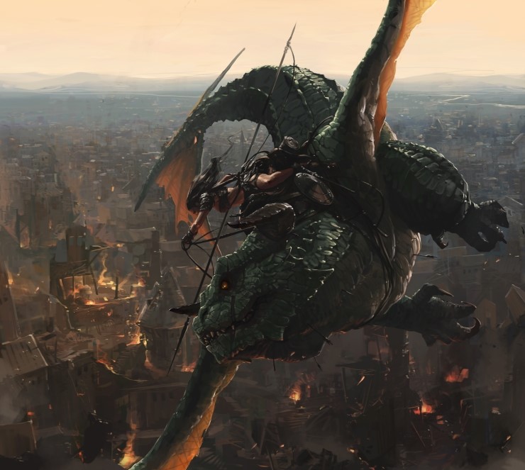 By Lee JeeYung  By Stone House This is CONTRAST. QUOTE  By Ilya Kuvshinov aka KR0NPR1NZ This is EXPLOSIONS OF COLORS. QUOTE 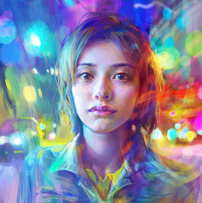 By Benjamin Get it? Stay inspired folks and have a good day. |
|
|
Dec 8 2014, 12:07 PM
Show posts by this member only | IPv6 | Post
#2055
|
|
Junior Member
447 posts Joined: Feb 2011 From: Planet Animu |
QUOTE(seba @ Dec 8 2014, 11:28 AM) Haha sorry about that, I always type out things like that, generally. Oh well, let me share with you what is "godlike" in my book, and these are the epitome of the terms I used earlier. These would be DYNAMICS. This is CONTRAST. This is EXPLOSIONS OF COLORS. Get it? Stay inspired folks and have a good day.  Ok, its godlike level... Kinda expected the explosion of colors is like what I see in abstract painting, but seeing that makes me "wth, mix n match color is sooo like rocket science"  cuz I really dont have the eyes for colors. Only good at imitating others and reapply them to my works. cuz I really dont have the eyes for colors. Only good at imitating others and reapply them to my works. Here's another try on a similar color scheme, but in portrait. The frills alone take 8 hours to paint.   This post has been edited by drpsyko: Dec 8 2014, 12:58 PM |
|
|
Dec 8 2014, 02:13 PM
|
|
Senior Member
662 posts Joined: Jan 2003 |
easy way are just understand what is complementary colors, compound complementary first. (use in movie color grading, painting etc) you always see they boost the cold color blue in shadow
the last foto share by seba are good example of color scheme. blue/purple + orange/yellow |
|
|
Dec 11 2014, 12:40 AM
Show posts by this member only | IPv6 | Post
#2057
|

Senior Member
2,367 posts Joined: Oct 2008 From: Penang / Selangor |
Not a digital painting, but my 3D modeling assignment from class

This post has been edited by V3nz: Dec 11 2014, 12:42 AM |
|
|
Dec 11 2014, 10:10 PM
|
|
Senior Member
2,610 posts Joined: Aug 2011 |
Book cover WIP
 |
|
|
Dec 14 2014, 09:22 PM
|
|
Senior Member
599 posts Joined: Oct 2011 |
 |
|
|
Dec 16 2014, 05:12 PM
|
|
Senior Member
599 posts Joined: Oct 2011 |
Apparently this is only what I can show. >.>
 Learned alot. |
| Change to: |  0.0349sec 0.0349sec
 0.33 0.33
 6 queries 6 queries
 GZIP Disabled GZIP Disabled
Time is now: 24th December 2025 - 08:34 AM |
 Quote
Quote