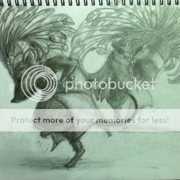
QUOTE(Loto @ Aug 28 2012, 07:06 PM)
Slightly improved! Well, sorta. But it has shadows now!
» Click to show Spoiler - click again to hide... «
I'm still not satisfied with the outcome of this but I don't know why. Help?
There are a few technical issues...
QUOTE(LIGHT AND SHADOW)
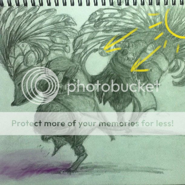
Probably the most obvious one. The cast shadows are not consistent with the overall lighting scheme of the subject. If the light comes from the upper right, the shadows should be in the lower left of the subject.
There is also very little contrast between the highlights (brightest parts) and accents (darkest parts) of the painting, and you didn't take into account the different reflective properties of the different materials (fur, leather, cloth, metal etc)
QUOTE(Tangents)
A visual tangent is created when shapes or edges within the art touch in a way that is visually irritating. It disrupts the "flow" of the image and creates ambiguous shapes that make it difficult for the eye to isolate different elements in the artwork.
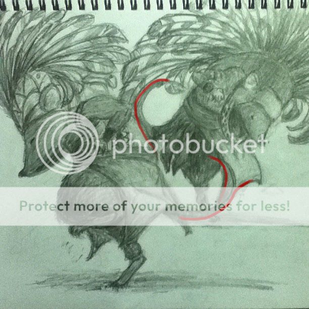
The red lines indicate where there are hidden/stolen edges. Because of the way the edges are aligned, it makes the two characters appear weirdly joined together, since the curves of the edges visually blend into each other.
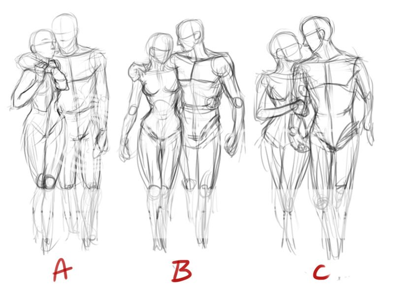
QUOTE(Contrast)
The two characters share the same amount of contrast and detail. This gives the impression that the characters are viewed from the same distance. Generally, when you want to create the illusion of depth and three-dimensions, you make the focal point of the painting have the sharpest contrast and the most details. Anything that is "off-focus" should be blurred and less contrasting. This helps the viewer to visually separate the different elements in the drawing.
The following image gives an example of how the overall image should look like, assuming the left/foreground figure is meant to be the focal point.
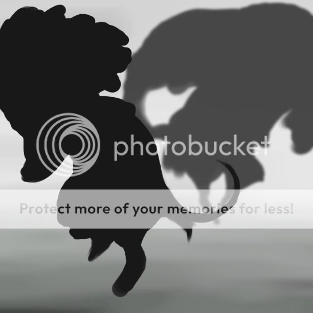
You can see that the foreground figure stands out the most, while the figure farther back seems to blend in slightly to the background.
QUOTE(Composition)
This could simply be an effect of the way the camera is aligned when the image is taken, or how you cropped the image, but the composition of the drawing is not ideal.
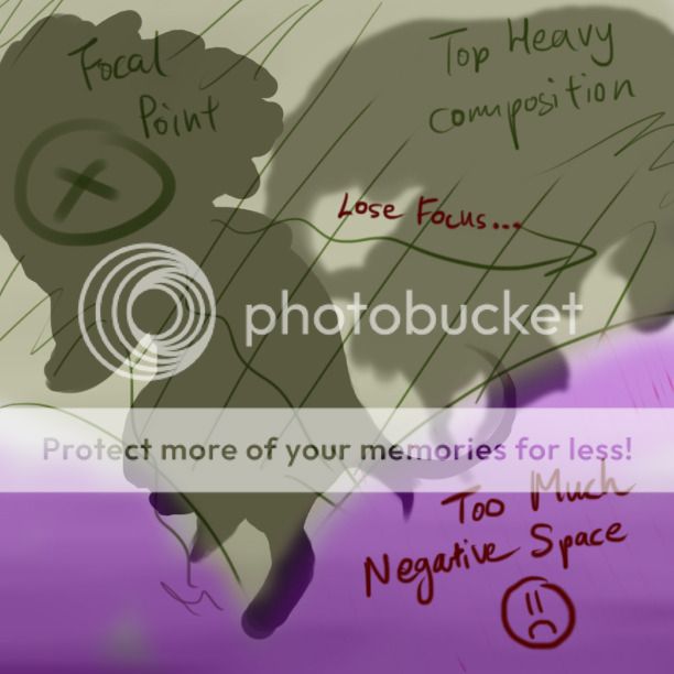
I made a few adjustments to the drawing, to help illustrate the difference it makes if you change a few things. Mostly I corrected the lighting and the contrast, and I also took the liberty of changing the tones between the clothing and the figure, to further emphasize the contrast:


 Aug 11 2012, 08:20 AM


 Quote
Quote


 I want to say something but not sure if I should


 0.0405sec
 1.00
1.00
 7 queries
 GZIP Disabled