

dats pretty good @_@
:::ART ATTACK V4:::
:::ART ATTACK V4:::
|
|
 Aug 28 2012, 04:49 AM Aug 28 2012, 04:49 AM
|
 
Senior Member
1,023 posts Joined: May 2010 |
dats pretty good @_@
|
|
|
|
|
|
Aug 28 2012, 01:53 PM
|

Senior Member
855 posts Joined: Jun 2008 |
QUOTE(mclelun @ Aug 27 2012, 02:39 PM) i guess i know what are u trying to say, the arc as in the bounciness when moving? nice, ya like agito said. that cat really weird» Click to show Spoiler - click again to hide... «  |
|
|
Aug 28 2012, 07:06 PM
|

Junior Member
114 posts Joined: Jan 2012 |
Slightly improved! Well, sorta. But it has shadows now!
 I'm still not satisfied with the outcome of this but I don't know why. Help? This post has been edited by Loto: Aug 28 2012, 07:06 PM |
|
|
Aug 28 2012, 07:28 PM
|

Elite
11,861 posts Joined: Oct 2008 From: Bangalasia |
QUOTE(Loto @ Aug 28 2012, 07:06 PM) Slightly improved! Well, sorta. But it has shadows now! tone is not clear i guess. when i look from far, i see seketul hitam there...» Click to show Spoiler - click again to hide... « I'm still not satisfied with the outcome of this but I don't know why. Help? Added on August 28, 2012, 7:34 pm   This post has been edited by Agito666: Aug 28 2012, 07:34 PM |
|
|
Aug 28 2012, 08:34 PM
|
|
Junior Member
114 posts Joined: Jan 2012 |
I see. Yeah, I probably screwed up the tone, it came out like you said and lost some amount of detail right there. I need to study more about toning, in that case.
And oh, love that detail on her This post has been edited by Loto: Aug 28 2012, 08:35 PM |
|
|
Aug 29 2012, 12:03 AM
|

Senior Member
662 posts Joined: Jan 2003 |
 draw something b4 sleep |
|
|
|
|
|
Aug 29 2012, 06:39 PM
|
|
Junior Member
114 posts Joined: Jan 2012 |
 Mole! And I have nothing better to do! |
|
|
Aug 29 2012, 08:50 PM
|

Junior Member
140 posts Joined: Mar 2009 |
QUOTE(mclelun @ Aug 29 2012, 12:03 AM) » Click to show Spoiler - click again to hide... « draw something b4 sleep  Looking cool Loto. But really blur le the camera work.  |
|
|
Aug 29 2012, 09:28 PM
|

Senior Member
2,610 posts Joined: Aug 2011 |
QUOTE(Loto @ Aug 28 2012, 07:06 PM) Slightly improved! Well, sorta. But it has shadows now! There are a few technical issues...» Click to show Spoiler - click again to hide... « I'm still not satisfied with the outcome of this but I don't know why. Help? QUOTE(LIGHT AND SHADOW) 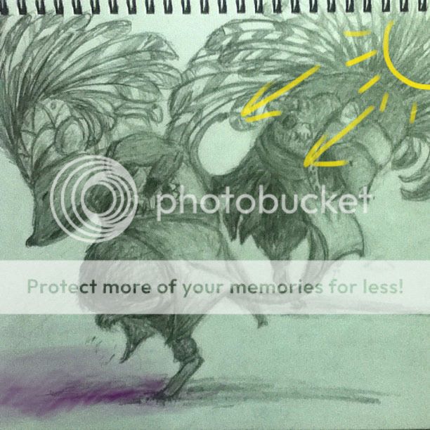 Probably the most obvious one. The cast shadows are not consistent with the overall lighting scheme of the subject. If the light comes from the upper right, the shadows should be in the lower left of the subject. There is also very little contrast between the highlights (brightest parts) and accents (darkest parts) of the painting, and you didn't take into account the different reflective properties of the different materials (fur, leather, cloth, metal etc) QUOTE(Tangents) A visual tangent is created when shapes or edges within the art touch in a way that is visually irritating. It disrupts the "flow" of the image and creates ambiguous shapes that make it difficult for the eye to isolate different elements in the artwork. 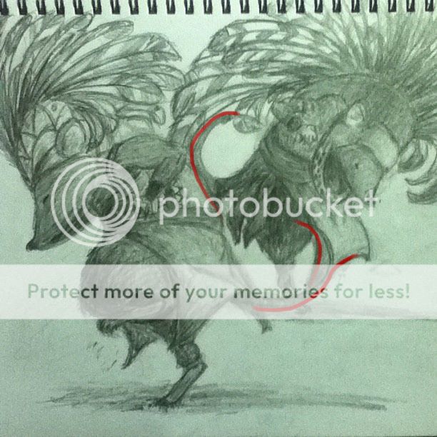 The red lines indicate where there are hidden/stolen edges. Because of the way the edges are aligned, it makes the two characters appear weirdly joined together, since the curves of the edges visually blend into each other. QUOTE(Contrast) The two characters share the same amount of contrast and detail. This gives the impression that the characters are viewed from the same distance. Generally, when you want to create the illusion of depth and three-dimensions, you make the focal point of the painting have the sharpest contrast and the most details. Anything that is "off-focus" should be blurred and less contrasting. This helps the viewer to visually separate the different elements in the drawing. The following image gives an example of how the overall image should look like, assuming the left/foreground figure is meant to be the focal point.  You can see that the foreground figure stands out the most, while the figure farther back seems to blend in slightly to the background. QUOTE(Composition) This could simply be an effect of the way the camera is aligned when the image is taken, or how you cropped the image, but the composition of the drawing is not ideal. I made a few adjustments to the drawing, to help illustrate the difference it makes if you change a few things. Mostly I corrected the lighting and the contrast, and I also took the liberty of changing the tones between the clothing and the figure, to further emphasize the contrast: 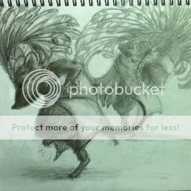 |
|
|
Aug 29 2012, 10:05 PM
|
|
Elite
11,861 posts Joined: Oct 2008 From: Bangalasia |
QUOTE(DragonReine @ Aug 29 2012, 09:28 PM) » Click to show Spoiler - click again to hide... «    |
|
|
Aug 29 2012, 10:23 PM
|

Senior Member
711 posts Joined: Jul 2011 From: Soulport |
QUOTE(DragonReine @ Aug 29 2012, 09:28 PM) » Click to show Spoiler - click again to hide... « |
|
|
Aug 29 2012, 10:30 PM
|
|
Senior Member
2,610 posts Joined: Aug 2011 |
Why? No good?
|
|
|
Aug 29 2012, 10:33 PM
|
|
Junior Member
140 posts Joined: Mar 2009 |
I guess it's too good (the effort, that is). Hehe. Too bad there's no like button.
|
|
|
|
|
|
Aug 29 2012, 10:44 PM
|
|
Junior Member
114 posts Joined: Jan 2012 |
QUOTE(DragonReine @ Aug 29 2012, 09:28 PM) There are a few technical issues... Wow. Dayum, I gotta take some lessons. A lot. A f@<king lot. Well, I'll blame my lack of attention with the focus of the pic. That and probably- no, definately contrast. I think I went crazy on the toning as well with some of my recent stuff but I eh, I'll learn from it. I made a few adjustments to the drawing, to help illustrate the difference it makes if you change a few things. Mostly I corrected the lighting and the contrast, and I also took the liberty of changing the tones between the clothing and the figure, to further emphasize the contrast: Cheers for the insights, bro! Added on August 29, 2012, 10:47 pm QUOTE(vypur85 @ Aug 29 2012, 08:50 PM) Somehow got some Akira feeling in your art. I know la! Like I said, iPod cameras suck @$$, so bleh... It's all I have left, though; with my PC down.Looking cool Loto. But really blur le the camera work. This post has been edited by Loto: Aug 29 2012, 10:47 PM |
|
|
Aug 30 2012, 11:01 AM
|

Senior Member
3,385 posts Joined: Aug 2006 From: Sao Paolo, Brazil |
hai guise...
very looooonngg time nvr sketch....will post something later |
|
|
Aug 30 2012, 04:31 PM
|
|
Elite
11,861 posts Joined: Oct 2008 From: Bangalasia |
 LRT drawing  |
|
|
Aug 30 2012, 11:58 PM
|

Junior Member
24 posts Joined: May 2012 |
can you teach me how to use grid to draw human face?
|
|
|
Aug 31 2012, 12:24 AM
|
|
Junior Member
114 posts Joined: Jan 2012 |
Merdeka Night! Now for firewoks!
|
|
|
Aug 31 2012, 01:02 AM
|

Junior Member
80 posts Joined: Aug 2012 |
i see some great critiques !
|
|
|
Aug 31 2012, 04:50 AM
|

Senior Member
817 posts Joined: Jul 2011 |
cool artwork guys . long time already din't touch pencil nowadays
 |
| Change to: |  0.0243sec 0.0243sec
 0.18 0.18
 6 queries 6 queries
 GZIP Disabled GZIP Disabled
Time is now: 25th November 2025 - 05:56 PM |
 Quote
Quote