

:::ART ATTACK V4:::
:::ART ATTACK V4:::
|
|
 Dec 9 2012, 02:30 PM Dec 9 2012, 02:30 PM
|
 
Senior Member
662 posts Joined: Jan 2003 |
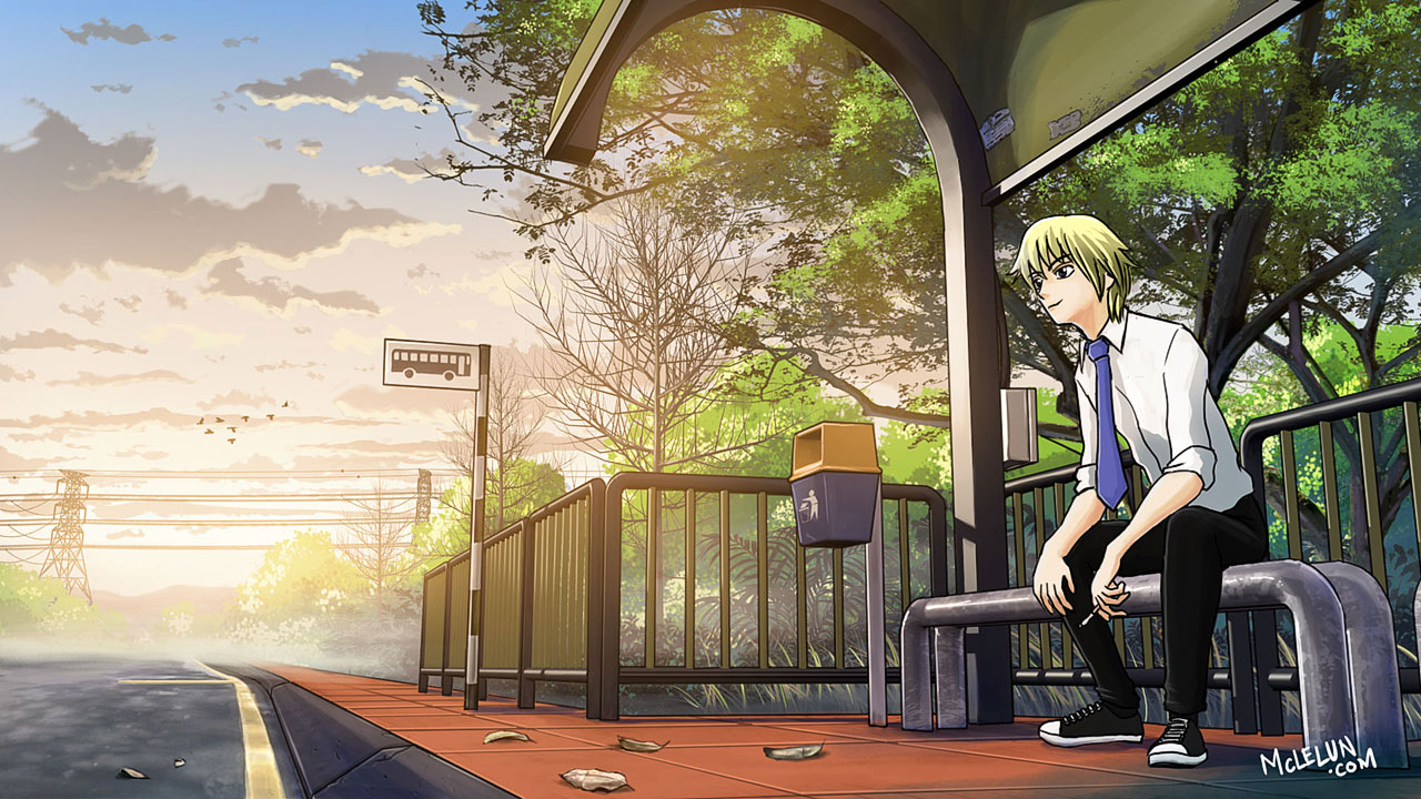
start yesterday night. wake up in the afternoon just now and finish this.
|
|
|
|
|
|
Dec 9 2012, 03:05 PM
|

Elite
11,861 posts Joined: Oct 2008 From: Bangalasia |
 done already, lazy fix ... i know the brick line perspective is wrong  |
|
|
Dec 9 2012, 03:37 PM
|

Junior Member
114 posts Joined: Jan 2012 |
» Click to show Spoiler - click again to hide... « Scan'd! Do you rike it? |
|
|
Dec 9 2012, 07:44 PM
|

Junior Member
80 posts Joined: Aug 2012 |
QUOTE(mclelun @ Dec 9 2012, 02:30 PM) start yesterday night. wake up in the afternoon just now and finish this. » Click to show Spoiler - click again to hide... « Gotta love your background paintings ! |
|
|
Dec 10 2012, 01:36 AM
|

Senior Member
1,023 posts Joined: May 2010 |
QUOTE(mclelun @ Dec 9 2012, 02:30 PM) start yesterday night. wake up in the afternoon just now and finish this. how u color so fast.. = =» Click to show Spoiler - click again to hide... «  me is like take foreverrr.. QUOTE(Loto @ Dec 9 2012, 03:37 PM) » Click to show Spoiler - click again to hide... « Scan'd! Do you rike it?  it would be awesome  |
|
|
Dec 10 2012, 08:39 AM
|
|
Elite
11,861 posts Joined: Oct 2008 From: Bangalasia |
QUOTE(Loto @ Dec 9 2012, 03:37 PM) » Click to show Spoiler - click again to hide... « Scan'd! Do you rike it?  |
|
|
|
|
|
Dec 10 2012, 11:38 AM
|
|
Junior Member
114 posts Joined: Jan 2012 |
Well, I admit that the sketch have faded a bit over time. So, I may have to darken it again.
I'm trying to find some good concept art for Dishonored that I want to refer. Any links? |
|
|
Dec 10 2012, 11:51 AM
|
|
Elite
11,861 posts Joined: Oct 2008 From: Bangalasia |
QUOTE(Loto @ Dec 10 2012, 11:38 AM) Well, I admit that the sketch have faded a bit over time. So, I may have to darken it again. try make it all at least 3 tones differences for all subject... I'm trying to find some good concept art for Dishonored that I want to refer. Any links? |
|
|
Dec 10 2012, 12:04 PM
|
|
Junior Member
114 posts Joined: Jan 2012 |
So, darker in foreground or back? Sorry if it's a stupid question. I'm no art student
|
|
|
Dec 10 2012, 03:18 PM
|

Senior Member
1,097 posts Joined: Oct 2009 |
ask where your light source comes from..
|
|
|
Dec 10 2012, 03:42 PM
|
|
Elite
11,861 posts Joined: Oct 2008 From: Bangalasia |
QUOTE(Loto @ Dec 10 2012, 12:04 PM) So, darker in foreground or back? Sorry if it's a stupid question. I'm no art student i mean more tone to make it stand out» Click to show Spoiler - click again to hide... « *anyway i sketching now, later i show you what i mean, hopefully can convey the message lol Added on December 10, 2012, 4:06 pm QUOTE(mclelun @ Dec 9 2012, 02:30 PM) start yesterday night. wake up in the afternoon just now and finish this. IMHO la, i personally feel really bad to say this... you think character do more detail a bit or maybe make the outline less bold a bit will be better?» Click to show Spoiler - click again to hide... « because my brain keep telling me this is 2 different things maybe tone also, background is really really nice but character macam little simplified This post has been edited by Agito666: Dec 10 2012, 04:06 PM |
|
|
Dec 10 2012, 05:45 PM
|
|
Senior Member
1,097 posts Joined: Oct 2009 |
agree with agito..i also feel character and environment is slightly seperated. doesnt blend well together.
|
|
|
Dec 10 2012, 05:49 PM
|
|
Elite
11,861 posts Joined: Oct 2008 From: Bangalasia |
something like this la, warning big image.
» Click to show Spoiler - click again to hide... « sorry i also sucks in BG. and the further the subject, include the background, the more "white" or fader it is... refer back the Mclelun's Background...the one near the sun... |
|
|
|
|
|
Dec 10 2012, 07:13 PM
|
|
Junior Member
114 posts Joined: Jan 2012 |
K, i felt that the rocks and the backgroimd look a little flat anyway. I'll keep that in mind
|
|
|
Dec 10 2012, 07:28 PM
|
|
Elite
11,861 posts Joined: Oct 2008 From: Bangalasia |
QUOTE(Loto @ Dec 10 2012, 07:13 PM) K, i felt that the rocks and the backgroimd look a little flat anyway. I'll keep that in mind compo is already okay, the rock side add highlight / shade so we can see not-flat from far XD |
|
|
Dec 11 2012, 12:02 AM
|
|
Senior Member
662 posts Joined: Jan 2003 |
QUOTE(ThousandMango @ Dec 9 2012, 07:44 PM) Gotta love your background paintings ! Thanks dudeQUOTE(Sai91 @ Dec 10 2012, 01:36 AM) how u color so fast.. = = I use 3d gor the bus stop perpective, and render some of the shadow in 3d. So , it actually save me quite alot of timeme is like take foreverrr.. QUOTE(Agito666 @ Dec 10 2012, 03:42 PM) IMHO la, i personally feel really bad to say this... you think character do more detail a bit or maybe make the outline less bold a bit will be better? Dont worry dude. U are not the only person that tell me about this. I have some ideas in my mind on how to blend them betterbecause my brain keep telling me this is 2 different things maybe tone also, background is really really nice but character macam little simplified Maybe thinner stroke with different color, and have to look into the ambient light/color correction area QUOTE(inachi @ Dec 10 2012, 05:45 PM) agree with agito..i also feel character and environment is slightly seperated. doesnt blend well together. Thanks for the input. |
|
|
Dec 11 2012, 12:19 AM
|
|
Elite
11,861 posts Joined: Oct 2008 From: Bangalasia |
QUOTE(mclelun @ Dec 11 2012, 12:02 AM) Thanks dude lack of cloth detail like need more shades from the fold part and texture(?) also can blend well i guess as so far the background really detail like real world with outline while character looks nothing like resemble from it. I use 3d gor the bus stop perpective, and render some of the shadow in 3d. So , it actually save me quite alot of time Dont worry dude. U are not the only person that tell me about this. I have some ideas in my mind on how to blend them better Maybe thinner stroke with different color, and have to look into the ambient light/color correction area Thanks for the input. maybe reduce detail from the background might work. |
|
|
Dec 11 2012, 07:54 PM
|
|
Junior Member
114 posts Joined: Jan 2012 |
 |
|
|
Dec 12 2012, 03:27 AM
|

Senior Member
858 posts Joined: Nov 2011 |
QUOTE(Loto @ Dec 11 2012, 07:54 PM) » Click to show Spoiler - click again to hide... «  what cartoon /anime is this? what cartoon /anime is this? |
|
|
Dec 12 2012, 03:54 AM
|
|
Senior Member
1,023 posts Joined: May 2010 |
QUOTE(mclelun @ Dec 11 2012, 12:02 AM) Thanks dude 3D gor? I use 3d gor the bus stop perpective, and render some of the shadow in 3d. So , it actually save me quite alot of time |
| Change to: |  0.0344sec 0.0344sec
 0.21 0.21
 6 queries 6 queries
 GZIP Disabled GZIP Disabled
Time is now: 25th November 2025 - 08:18 PM |
 Quote
Quote
 (i m not sifu either, here and there got more sifu than me