Outline ·
[ Standard ] ·
Linear+
Font change on Mobile version?
|
Human Nature
|
 Mar 2 2021, 02:38 PM Mar 2 2021, 02:38 PM
|

|
QUOTE(se7en @ Mar 2 2021, 02:15 PM) we're switching to device based font's for the mobile layout. so essentially the best font that is available for display on your device will be used. this allows your device to render the fonts at its optimal resolution (retina/amoled etc displays) Is there any way for us to disable this feature from our end? It is not so optimal for people with poor eyesights, it appears too narrow in my device. This post has been edited by Human Nature: Mar 2 2021, 02:42 PM |
|
|
|
|
|
Human Nature
|
Mar 2 2021, 02:57 PM
|
|
|
QUOTE(se7en @ Mar 2 2021, 02:42 PM) How exactly are you viewing all your other apps (eg Facebook, Youtube, Twitter etc) as these apps are also defaulting to a similar font set on mobile. What device are you using? We are still tweaking some aspects of the font layout/spacing etc. Send us a screenshot and we'll see what can be done. A screenshot comparison between Facebook and Lowyat. On iphone 7 plus here. Font appears to be smaller on the right side. 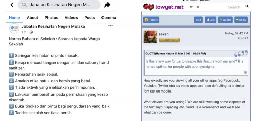 |
|
|
|
|
|
Human Nature
|
Mar 2 2021, 09:50 PM
|
|
|
I noticed that the font size has increased slightly (comparing the same post on my screenshot above)
|
|
|
|
|


 Quote
Quote
 0.0145sec
 0.58
0.58
 7 queries
 GZIP Disabled