QUOTE(ikram_zidane @ May 19 2006, 06:38 PM)
looks kinda old school... try using simple,clean design... and for the text.. i pefer dark grey rather than black...
but grey text, wud depends on wat kinda background i'm applying it on, ryt?
QUOTE(Stupid Khor @ May 19 2006, 06:55 PM)
hehe... streamyx down for 3 days, didn't see your post...

yup, the fashion nowadays are more to simplicity...
ermmm...... I should tell you that the timeline of web design
fashion something is like this:
02/03 > future machinery look (like yours)
03/04 > xp style
04/05 > aqua/gel style
05/06 > simple/tidy/clean design
well, of course you can remain this design,
some websites are still using this style,
however you should polish it a bit...
if you want to polish it, here's my suggestions:
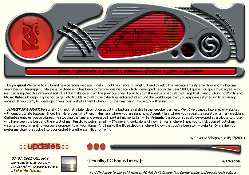
1. background colour
for this kind of design, the background is usually dark in colour...
plain milky yellow background is seriously outdated,
and doesn't fit to your design at all...
2. details
the shadows make everything seems like floating,
especially the 3 cords connecting those 2 panels...
and then the absense of details like dusts, textures etc
make the panels look 'fake'...
3. width of texts
as jayhan said, the width of the texts is too long...
this makes texts unreadable...
that's all for this time,
don't give up, keep on your good works...

Actually, I dun realy mind to change or not, the only difference will be, when will the website be completed.. ahahhaa.
dark background, say, pure black? dat won't make the shadow to be seen ryt?

dust n textures eh.. I'll look into the tutorials then..

btw, I'm still trying to decide if I shld be designing a website dat follows the trend or not.. itz even harder to establish our own design, ryt?

thx 4 sharing u guys' tots tho..


 May 17 2006, 03:07 PM, updated 20y ago

 Quote
Quote


 0.0139sec
 0.41
0.41
 5 queries
 GZIP Disabled