nice pic ,great job
Elb's Images, 27/9 - Pagani Zonda
Elb's Images, 27/9 - Pagani Zonda
|
|
 Jun 16 2006, 03:12 PM Jun 16 2006, 03:12 PM
|
 
Junior Member
114 posts Joined: Jun 2006 From: JoHo63 |
nice pic ,great job
|
|
|
|
|
|
 Jul 27 2006, 07:34 AM Jul 27 2006, 07:34 AM
|
   
Senior Member
514 posts Joined: Nov 2005 From: Somewhere |
Whoops sorry peeps. Been too busy plus my desktop is currently spoilt. Could have lost half a year's worth of pictures, but still waiting for new parts to come in.
In the meantime, here's a picture of the spanking new BMW M6 Convertible, just having its world unveiling at the British International Motorshow. 23.  p.s. comments about my shots would be great and would keep me motivated to update This post has been edited by elb: Aug 30 2006, 07:28 AM |
|
|
 Jul 27 2006, 07:45 AM Jul 27 2006, 07:45 AM
|
   
Senior Member
621 posts Joined: Jan 2003 From: HongKong |
hey thats my car
|
|
|
 Jul 27 2006, 05:34 PM Jul 27 2006, 05:34 PM
|
    
Senior Member
739 posts Joined: Mar 2006 From: Moon Palace |
|
|
|
 Jul 28 2006, 12:28 PM Jul 28 2006, 12:28 PM
|
   
Senior Member
586 posts Joined: Jun 2005 From: under MPSJ |
Bro Elb.
The first 3 shots are wonderfully done. No flaws watsoever. Can submit for competition |
|
|
 Jul 28 2006, 04:31 PM Jul 28 2006, 04:31 PM
|
|
Elite
4,956 posts Joined: Jan 2003 From: KL |
I have to say this.
The watermark is UGLY. Ugly font. Garish color. Bad placement. I know it's Photoshop, but you might as well use Microsoft Paint to put that same watermark there. Either give the text a shadow, emboss it, or go for a logo-like watermark that doesn't let too much of the background to show, e.g. the modern Ford logo. The WB in shots 9 and 10 are quite off, especially the shadows. First 3 are great, but ARGH those watermarks are traumatizing. |
|
|
|
|
|
 Jul 28 2006, 08:49 PM Jul 28 2006, 08:49 PM
|
   
Senior Member
514 posts Joined: Nov 2005 From: Somewhere |
xetajones: thanks for the compliment, but I've no time to really bother participating
albnok: I just use the default font or whatever PS gives me and tack it on. Perhaps there is an automated script or something, but I have no idea how to set it. Maybe I might pick a colour which is more harmonious next time. Anyway the transparency is such that its not too obvious; otherwise you'd find yourself too traumatized. In fact to tell the truth, I actually find it too time consuming to alter the layer's transparency etc that everytime I feel like just not even bothering to navigate the menus to alter the values. This post has been edited by elb: Jul 29 2006, 06:14 AM |
|
|
 Jul 30 2006, 11:58 PM Jul 30 2006, 11:58 PM
|
|
Elite
4,956 posts Joined: Jan 2003 From: KL |
Actually, the transparency is what's bothering. The colored tint. If it was white with transparency it would not be SO bothering.
Change the font, change the color, add a Blending Mode. Or at least add a background shape to it. Step back and look at "adding the watermark" as art as well. Just as you took the effort to compose the picture and set the exposure, take the effort to see that the watermark isn't glaring and blaring. It's meant to get in the way if you try to copy it... not get in the way when you're just glancing at it. Go surf some camwhore blogs, they tack watermarks on such that they are obvious, but not in the way. You would not expect girls to use Photoshop Actions, but they do it manually, and they do it with taste. |
|
|
 Aug 2 2006, 06:32 PM Aug 2 2006, 06:32 PM
|
    
Senior Member
753 posts Joined: May 2006 From: cj , sa. |
agreed...ur watermarks looks kinda misplaced...doesnt blend well with ur pics... well...copyrights issues aye?
=) |
|
|
 Aug 3 2006, 03:06 PM Aug 3 2006, 03:06 PM
|
      
Senior Member
2,548 posts Joined: May 2005 |
QUOTE(elb @ May 16 2006, 10:15 PM) 3. I like this one. Perhaps I am biased. Love the effect of the shadow from the pattern of the lamp shade. Had a similar junk i picked up in Turkey and converted into a lamp shade.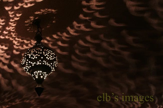 QUOTE(elb @ May 29 2006, 06:37 AM) Since everyone is hot on wheels right now (of the four 17" - 19" kind), I thought I might chuck in a picture of something circular as well. Does anyone want to hazard a guess as to what it is? Nice take of the London Eye (?)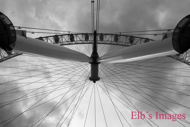 You've some real good pix in DeviantArt . |
|
|
 Aug 5 2006, 11:06 AM Aug 5 2006, 11:06 AM
|
   
Senior Member
514 posts Joined: Nov 2005 From: Somewhere |
QUOTE(albnok @ Jul 30 2006, 04:58 PM) Actually, the transparency is what's bothering. The colored tint. If it was white with transparency it would not be SO bothering. I tack it on to intrude partially to the main subject on purpose because of my issues with copyright, as much as I'd like to share my pictures with everyone. If its too blended in, it can be easily photoshopped to remove it. That's all I have to say, but thank you for your feedback.Change the font, change the color, add a Blending Mode. Or at least add a background shape to it. Step back and look at "adding the watermark" as art as well. Just as you took the effort to compose the picture and set the exposure, take the effort to see that the watermark isn't glaring and blaring. It's meant to get in the way if you try to copy it... not get in the way when you're just glancing at it. Go surf some camwhore blogs, they tack watermarks on such that they are obvious, but not in the way. You would not expect girls to use Photoshop Actions, but they do it manually, and they do it with taste. supatza: I'm a bit paranoid I guess. ??!!: Yup, that is indeed the London Eye. Thanks for the compliments This post has been edited by elb: Aug 5 2006, 11:07 AM |
|
|
 Aug 5 2006, 02:26 PM Aug 5 2006, 02:26 PM
|
|
Elite
4,956 posts Joined: Jan 2003 From: KL |
I have no problems with it intruding partially. I have a problem with it being unsightly.
|
|
|
 Aug 30 2006, 07:38 AM Aug 30 2006, 07:38 AM
|
   
Senior Member
514 posts Joined: Nov 2005 From: Somewhere |
albnok: Shrugs, I suppose I don't view it as 100% art.
Nevertheless, here's the next picture for your viewing pleasure. 24. Berry Melange (Conceptual)  Imagine a barren ground full of jagged, naked rocks. Imagine plants entirely composed of berries growing amongst the unwelcoming landscape. You get the picture. --------------------------------------------- Aaahh... summer fruits This post has been edited by elb: Aug 30 2006, 07:52 AM |
|
|
|
|
|
 Aug 30 2006, 03:41 PM Aug 30 2006, 03:41 PM
|
      
Senior Member
2,548 posts Joined: May 2005 |
QUOTE(elb @ Aug 30 2006, 07:38 AM) 24. Berry Melange (Conceptual) Imagine a barren ground full of jagged, naked rocks. Imagine plants entirely composed of berries growing amongst the unwelcoming landscape. You get the picture. Reminds me of a dessert whipped up by Jamie Oliver. Back to the pix..Good colour contrast of the berries against the browns of the rocks. Perhaps you like some order in your composition. I would have preferred a more random tossing of the berries. The berries are too organised ..black alternated with red; overlaid with blue and top off with bright red . |
|
|
 Sep 1 2006, 04:49 AM Sep 1 2006, 04:49 AM
|
   
Senior Member
514 posts Joined: Nov 2005 From: Somewhere |
QUOTE(??!! @ Aug 30 2006, 08:41 AM) Very tempting and so inviting! Are those rocks? They look so edible� Yes, those are edible sugar rocks Reminds me of a dessert whipped up by Jamie Oliver. Back to the pix..Good colour contrast of the berries against the browns of the rocks. Perhaps you like some order in your composition. I would have preferred a more random tossing of the berries. The berries are too organised ..black alternated with red; overlaid with blue and top off with bright red . Well, with a scientist/ engineer background, I can't help but look for some sort of order or symmetry. For this picture, I was working on something more conceptual really. Although I do feel that the picture on its own, or with the berries placed randomly (as you suggest), would have made for a decent product shot! Too bad that the berries are all gone now... This post has been edited by elb: Sep 1 2006, 04:50 AM |
|
|
 Sep 1 2006, 09:16 AM Sep 1 2006, 09:16 AM
|
      
Senior Member
3,758 posts Joined: Apr 2006 From: Selayang |
You ate them? Poor berries ...
This post has been edited by ac98: Sep 1 2006, 09:16 AM |
|
|
 Sep 27 2006, 03:29 PM Sep 27 2006, 03:29 PM
|
   
Senior Member
514 posts Joined: Nov 2005 From: Somewhere |
25. A close up shot that I took of a Pagani Zonda. No guesses as to which part features in the shot
 |
| Change to: |  0.0203sec 0.0203sec
 0.31 0.31
 5 queries 5 queries
 GZIP Disabled GZIP Disabled
Time is now: 21st December 2025 - 04:01 AM |