

 May 15 2006, 11:38 PM, updated 20y ago

I post one of mine too...

It's a discussion board for my school's official site,
but teacher objected my proposal,
hence I had to give up this design,
remake a simple, clean & formal one...
This was my first attempt to graffiti art,
not so cool though......
done after half a month I finished my SPM exam,
and then abandoned...
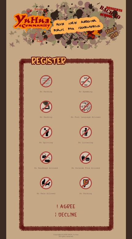
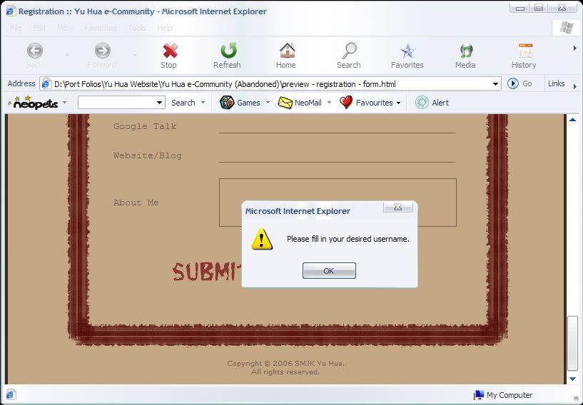
Firstly, one of the registration pages...
this comes out before the formal agreement,
just a little joke for the users......
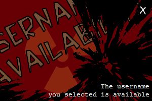
In the registration form, there's a username availability checker,
and this is a sample that comes out after they click the button...
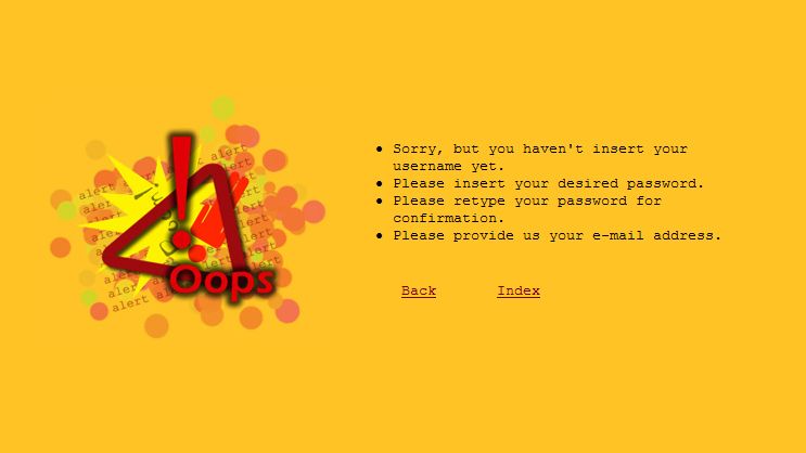
The error page, appears when there's any error/mistake occurs...
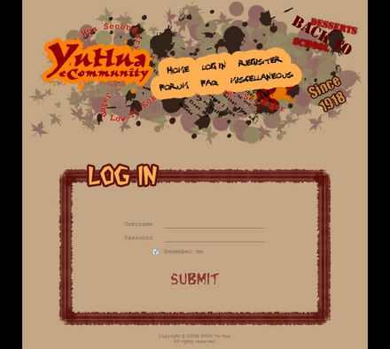
and lastly the login page...
sorry that the web design has been abandoned before I create the content pages,
so that's all for this template......
if you're thinking to buy the design,
hehe, request it from me, I might give you for free... XD
ps~
yea I know, the colour is burning sharp...
but it's the atmosphere I wished to make, implies HOT... ^^
ps~
shoot me hard, don't bother my feeling...
I need some picky comments...
This post has been edited by Stupid Khor: May 16 2006, 12:11 AM
 Quote
Quote


 0.0408sec
 0.68
0.68
 6 queries
 GZIP Disabled