

Rate my work
no frame up here..pls..
This post has been edited by kokanchai: Mar 19 2006, 08:14 PM
Attached thumbnail(s)


Rate My Logo Design, give some feedback!
|
|
 Mar 19 2006, 07:51 PM, updated 20y ago Mar 19 2006, 07:51 PM, updated 20y ago
Show posts by this member only | Post
#1
|
Senior Member
645 posts Joined: Dec 2005 From: -----Somewhere Down to Earth------- |
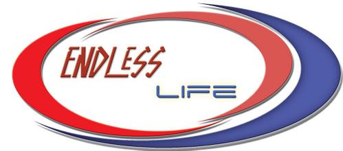
atlast..come out..with my an hour..logo design..
Rate my work no frame up here..pls.. This post has been edited by kokanchai: Mar 19 2006, 08:14 PM Attached thumbnail(s)
|
|
|
|
|
|
Mar 19 2006, 08:01 PM
Show posts by this member only | Post
#2
|
|
Senior Member
645 posts Joined: Dec 2005 From: -----Somewhere Down to Earth------- |
 This post has been edited by kokanchai: Mar 19 2006, 08:15 PM |
|
|
Mar 19 2006, 08:02 PM
Show posts by this member only | Post
#3
|

Senior Member
844 posts Joined: Jan 2003 From: S'ban.N.S |
could you resize it......... its too large to be viewable....... a standard logo size would be ok
|
|
|
Mar 19 2006, 08:08 PM
Show posts by this member only | Post
#4
|

All Stars
17,845 posts Joined: Jan 2005 |
I can't view your logo!
 |
|
|
Mar 19 2006, 08:08 PM
Show posts by this member only | Post
#5
|

Senior Member
1,933 posts Joined: Mar 2006 From: ~Universe~ |
not bad~ keep up the good work! !! can design 1 for me? jk~
|
|
|
Mar 19 2006, 08:19 PM
Show posts by this member only | Post
#6
|

Junior Member
489 posts Joined: Dec 2004 From: malaysia |
i like logo without embossed effect.. and the red color for the left one is too bright.. not so sooth the curve (probably cuz the effect)...
anyway.. nice logo design.. what is it for ?? |
|
|
|
|
|
Mar 19 2006, 08:19 PM
Show posts by this member only | Post
#7
|
Senior Member
1,385 posts Joined: Nov 2005 From: Kuala Lumpur (KL) |
QUOTE(kokanchai @ Mar 19 2006, 08:01 PM)   |
|
|
Mar 20 2006, 10:30 AM
Show posts by this member only | Post
#8
|

Elite
4,210 posts Joined: Jan 2003 From: Malaysia |
urm.. u need a concept.. badly..
|
|
|
Mar 20 2006, 10:41 AM
Show posts by this member only | Post
#9
|

Senior Member
5,355 posts Joined: Jan 2003 From: Cera |
the two fonts are not complementing each other, as i feel that they are not coherent, aka don't mix well... It's a simple design which is easy on the eye, but like etsuko mentioned, it doesn't have a theme or concept to it...
|
|
|
Mar 21 2006, 03:25 AM
|

Senior Member
719 posts Joined: Jan 2003 From: cyberjaya, ampang, malaysia |
is the logo do represent 'endless' or 'life' ? i dont think the logo itself represent both of the words.
|
|
|
Mar 21 2006, 08:08 AM
|

Elite
648 posts Joined: Dec 2004 From: THE CLONING ZONE |
Any words or themes that represents a logo should be bigger than any object or icons in the design itself and wrong choice of colors
|
|
|
Mar 21 2006, 11:51 AM
|

Senior Member
545 posts Joined: Jul 2005 From: 444 Industrial Drive. Shreveport, LA |
I dont like that "ENDLESS" Font and yellow shadow at "Life"...
|
|
|
Mar 21 2006, 12:51 PM
|

Senior Member
807 posts Joined: Aug 2005 |
im just beginer... just ignore it if u think im wrong.. k
 first of all.. for me logo mean identity.. then u should put what meaning of ur logo.. i think ur font "ENDLESS" and "Life" not mm..mm.. match.. ur colour.. 3 deffrent tone of red.. why? try not to used embossed.. IMHO thanks.. |
|
|
|
|
|
Mar 21 2006, 01:29 PM
|

Senior Member
1,104 posts Joined: Sep 2004 From: NUS,Singapore |
 You lack of creativity... You lack of creativity... |
|
|
Mar 21 2006, 01:43 PM
|

Senior Member
984 posts Joined: May 2005 |
I have to say this, your brains are wayyy too simple.
And for those fonts, they do not match at all. And the 'endless' font is horrible. |
|
|
Mar 21 2006, 02:49 PM
|

Senior Member
2,687 posts Joined: Jan 2003 From: Sue Bunk Jai Yaa! |
go get urself a decent refference book
|
|
|
Mar 21 2006, 02:56 PM
|

Senior Member
3,657 posts Joined: Jan 2003 From: My Room |
QUOTE(junkieG @ Mar 21 2006, 02:49 PM) go get urself a decent refference book Love what u say. Well, if there's any company that uses this logo, that company's branding effort will go down the drain straight away. Last minute work won't help and it's wasting our effort to rate it. next time at least show us work that u've spend at least 40 hours in thinking and executing it. |
|
|
Mar 21 2006, 03:10 PM
|

Senior Member
1,249 posts Joined: Feb 2006 |
4 me , to simple...
n dun c any motive of diz logo |
|
|
Mar 21 2006, 03:19 PM
|

VIP
3,421 posts Joined: Jan 2003 From: 2 30 N, 112 30 E |
umm... IMHO, I think that's it's pretty bad.
Typography is totally out. The way the 'curve' is positioned also seems a bit off. The logo itself and the word 'endless life' doesn't seem to tie up. 0.25 out of 5 from me... |
|
|
Mar 21 2006, 04:35 PM
|
|
Senior Member
645 posts Joined: Dec 2005 From: -----Somewhere Down to Earth------- |
i post my Art here..
not to let u guys fire me up.. i just wan some feedback.. not to toward on me.. Songhan99:i admit that i am lack of creativity..neither u are in the first time too?heh TearDrop:the way of mine are to simple?not until u can judge me..u think that u are the best of Among??hell..to over self confident..didnt u? exkay:if u think that..it wasting ur precious time to rate it..why dont u just brush of tis Topic..it really none of ur concern to rate it.. Shiitake: ya..it simple..that wat i request for it..( abt those word..i just simply put in) azxel:i know my Typography is sux..but if u think u can come up..a nice design better then me..go ahead and do it..not need to pretend a generous jugde..in here..heh.. |
|
Topic ClosedOptions
|
| Change to: |  0.0593sec 0.0593sec
 0.61 0.61
 6 queries 6 queries
 GZIP Disabled GZIP Disabled
Time is now: 25th November 2025 - 11:07 PM |
 Quote
Quote