:::ART ATTACK V4:::
:::ART ATTACK V4:::
|
|
 Nov 6 2012, 06:40 PM Nov 6 2012, 06:40 PM
Return to original view | Post
#21
|
Junior Member
242 posts Joined: Sep 2011 |
Sorry!
|
|
|
|
|
|
Nov 7 2012, 12:39 PM
Return to original view | Post
#22
|
|
Junior Member
242 posts Joined: Sep 2011 |
QUOTE(Agito666 @ Nov 6 2012, 08:22 PM) there is a edit button for your previous post Thank you for remind me   done it *actually I never use it before* done it *actually I never use it before*Added on November 7, 2012, 12:41 pm QUOTE(DragonReine @ Nov 6 2012, 10:12 PM) Haha, yes, it looks a mess, doesn't it? This is the underpainting stage still, if I were to complete it, I'd enlarge the painting again and go back over the fur with a small hard brush to detail the individual hairs, LOL. That's going to be 'tahap leleh' details wooo...This post has been edited by FireFryXx: Nov 7 2012, 12:41 PM |
|
|
Nov 11 2012, 11:01 AM
Return to original view | Post
#23
|
|
Junior Member
242 posts Joined: Sep 2011 |
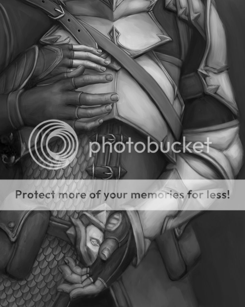
QUOTE(DragonReine @ Nov 7 2012, 09:22 PM) Well, it was supposed to be an experiment in finally putting what I learned from this tutorial [link] to good use. But it'll take a while, haha  Working on this now: » Click to show Spoiler - click again to hide... « those hands  very realistic wooo..I really like how you done a good job on those very realistic wooo..I really like how you done a good job on those how you paint the armor? mine always cannot show it is an armor..more like soft armor |
|
|
Nov 14 2012, 12:03 PM
Return to original view | Post
#24
|
|
Junior Member
242 posts Joined: Sep 2011 |
QUOTE(Agito666 @ Nov 14 2012, 03:12 AM) bamboo or not, it is same thing.... it depend on skill Very true...  Added on November 14, 2012, 12:05 pm QUOTE(DragonReine @ Nov 12 2012, 08:12 PM) Hands are a favourite thing of mine to paint. And ears. I love ears. I dunno why XD I will try, will upload them here when I have the chance On armour, it's a question of how you shade, especially for metallic armor. There needs to be a sharp transition from midtone to highlight, so the highlight has to be really bright and the midtone closer to the shadow in tone. Somethere like, in grayscale, will be Brightness 90% for the highlight, Brightness 40% for the midtone, and Brightness 20% for the shadow. Lines-wise, it's best to keep to sharp, geometric shapes and angles. The artificial quality of metal armour means that the shapes are even.  This post has been edited by FireFryXx: Nov 14 2012, 12:05 PM |
|
|
Nov 25 2012, 06:09 PM
Return to original view | Post
#25
|
|
Junior Member
242 posts Joined: Sep 2011 |
QUOTE(Quentin Coldwater @ Nov 23 2012, 01:22 PM) I need a drawing done by tonight, urgent. Anyone can help? Willing to compensate. What kind of drawing? |
|
|
Nov 25 2012, 09:55 PM
Return to original view | Post
#26
|
|
Junior Member
242 posts Joined: Sep 2011 |
QUOTE(Quentin Coldwater @ Nov 25 2012, 07:03 PM) Line art of an animal cool, PM me if you still need someone to draw for you |
|
|
|
|
|
Nov 27 2012, 02:24 PM
Return to original view | Post
#27
|
|
Junior Member
242 posts Joined: Sep 2011 |
QUOTE(elcieloultima @ Nov 27 2012, 02:23 PM) » Click to show Spoiler - click again to hide... « 2nd sub for project diva 2 fanbook and oh post count get! I like the girl's eyes... |
|
|
Nov 27 2012, 04:45 PM
Return to original view | Post
#28
|
|
Junior Member
242 posts Joined: Sep 2011 |
sometimes grunge wallpaper could help some character alive (well that's what I think)
how do you guys feel adding randoms pattern as finishing touches? » Click to show Spoiler - click again to hide... « |
|
|
Nov 27 2012, 05:08 PM
Return to original view | Post
#29
|
|
Junior Member
242 posts Joined: Sep 2011 |
QUOTE(Agito666 @ Nov 27 2012, 04:59 PM) for this case i feel you just simply slap the texture on it. I love to add it on my artworks but not consistently ofcoz (only when ever I don't know what background I should draw OTL ) i duno i not play texture a lot, cant help trying to emitted this kind of artwork I find it I failed to emitted it lol This post has been edited by FireFryXx: Nov 27 2012, 05:09 PM |
|
|
Nov 28 2012, 12:04 PM
Return to original view | Post
#30
|
|
Junior Member
242 posts Joined: Sep 2011 |
QUOTE(ThousandMango @ Nov 27 2012, 07:23 PM) in my understanding , textures can be helpful and can spoil ur work at the same time , i suggest try playing with diff layer mode see which suits the overall mood best , for this piece i think u can tone down the texture a lil , cheeeeeeeers Thanks friend!I will try to avoid using texture ^^' and try to tone down the texture many thanks! |
|
|
Jan 19 2013, 01:34 PM
Return to original view | Post
#31
|
|
Junior Member
242 posts Joined: Sep 2011 |
I love your deviantart page...full of pervertness!
 love it! love it!and I watch you! |
|
|
Jan 27 2013, 08:58 PM
Return to original view | Post
#32
|
|
Junior Member
242 posts Joined: Sep 2011 |
My 1st try to make an ugly Mecha....MUAHAHAHAHA!!
Attached thumbnail(s) 
|
|
|
Feb 4 2013, 11:02 AM
Return to original view | Post
#33
|
|
Junior Member
242 posts Joined: Sep 2011 |
QUOTE(Agito666 @ Jan 28 2013, 12:19 AM) looks more like an armor instead of mecha can give me some tips how to get a mecha look please? it is a base on a warrior armor... |
|
|
|
|
|
Feb 4 2013, 11:02 AM
Return to original view | Post
#34
|
|
Junior Member
242 posts Joined: Sep 2011 |
QUOTE(Sai91 @ Jan 27 2013, 11:06 PM) then add moar detail.. will do that!  |
|
|
Feb 26 2013, 07:31 PM
Return to original view | Post
#35
|
|
Junior Member
242 posts Joined: Sep 2011 |
» Click to show Spoiler - click again to hide... « love the perspective |
|
|
Mar 2 2013, 12:16 PM
Return to original view | Post
#36
|
|
Junior Member
242 posts Joined: Sep 2011 |
Update on my ugly mecha...
This post has been edited by FireFryXx: Mar 2 2013, 12:18 PM Attached thumbnail(s) 
|
|
|
Mar 7 2013, 08:47 PM
Return to original view | Post
#37
|
|
Junior Member
242 posts Joined: Sep 2011 |
QUOTE(PF T.J. @ Mar 7 2013, 10:16 AM) Just sharing a quick (nosebleeding very simple by using Galaxy note ) sketch while waiting for a delayed plane in Tawau  Drawn on a Samsung Galaxy Note~ [attachmentid=3334566] love it!-------------------------- My latest work for fan character XD I love Dragonball Z so much, so decide to make a simple comic using my own character with friends  This post has been edited by FireFryXx: Mar 7 2013, 08:51 PM |
|
|
Mar 7 2013, 09:40 PM
Return to original view | Post
#38
|
|
Junior Member
242 posts Joined: Sep 2011 |
QUOTE(Agito666 @ Mar 7 2013, 09:11 PM) can be more dynamic actually, refer with latest godlike manga... ONE PUNCH MAN hey thanks man! I had the feeling that the characters is almost look like with DBZ lol 1st chapter, Piccolo with big antenna  |
|
|
Apr 9 2013, 06:55 PM
Return to original view | Post
#39
|
|
Junior Member
242 posts Joined: Sep 2011 |
blue boy!!! Ignore those hands..slightly shorter than the other one lol
» Click to show Spoiler - click again to hide... « |
|
|
May 19 2013, 12:07 PM
Return to original view | Post
#40
|
|
Junior Member
242 posts Joined: Sep 2011 |
QUOTE(DragonReine @ May 19 2013, 02:29 AM) Stuff... TERBAIK!» Click to show Spoiler - click again to hide... « |
| Change to: |  0.0541sec 0.0541sec
 0.14 0.14
 7 queries 7 queries
 GZIP Disabled GZIP Disabled
Time is now: 26th November 2025 - 11:46 AM |
 Quote
Quote