

 Apr 13 2008, 12:19 AM
QUOTE(alwaysCheap @ Apr 13 2008, 12:14 AM)
relax, those words are for business purposes only, meaningless
If it's meaningless, it shouldn't be there at the first place. Here are some comments from me,
1# The left and top is too empty. It could be better if you frame it more towards rightside and lower a bit.
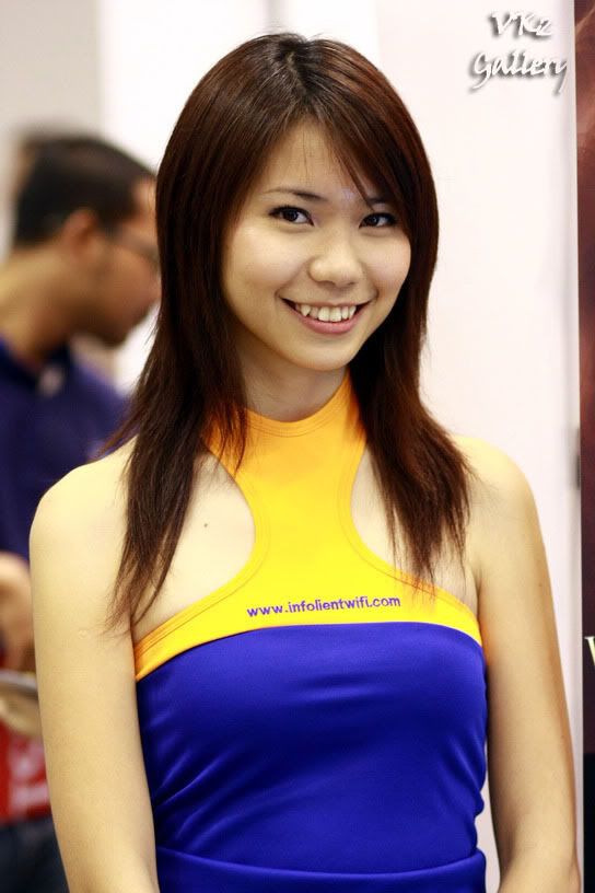
2# Flash is too harsh, should frame it slightly lower till her knee so that the top of the picture won't be that empty
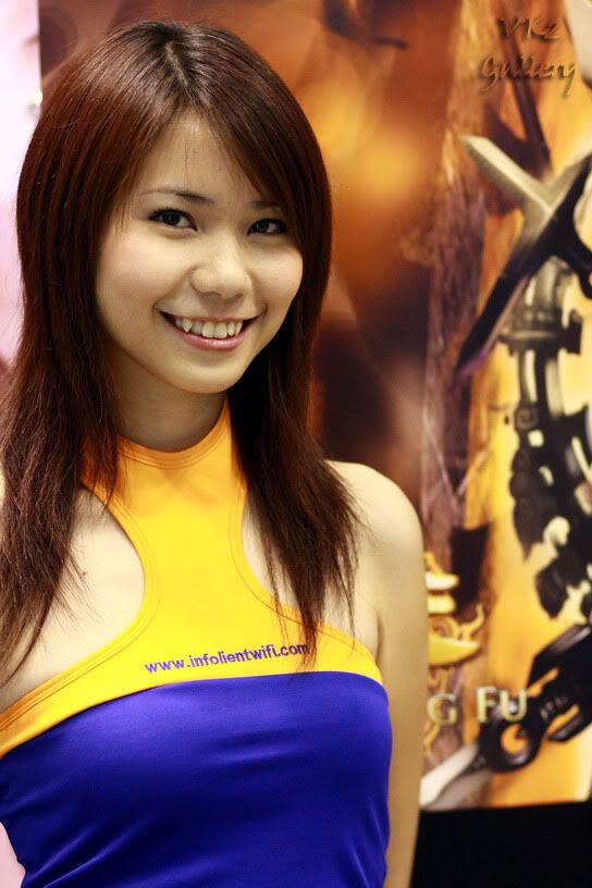
3# Composition isn't that interesting, the top is too empty. I would prefer it to be lower and slightly more to the left to frame her with the laptop as well.
4# You could have snapped at a better angle.
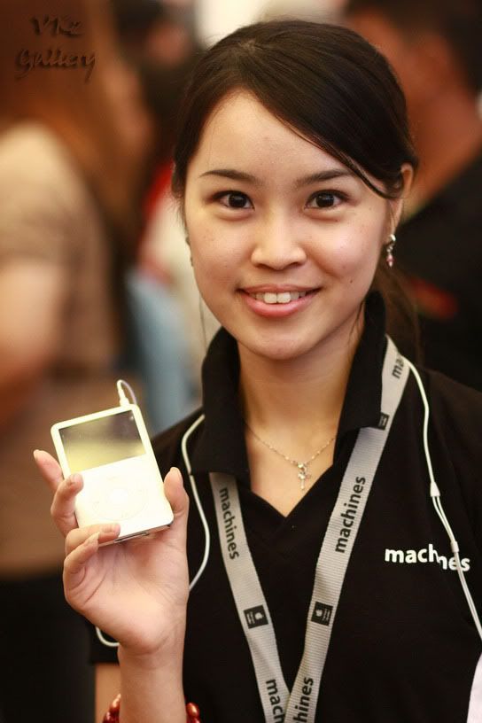
5# Hands chopped
p/s: Frankly, the frame is very distracting. Also, it'll look a lot nicer to me with the "Best Wedding & Event Photographer @ Subang Klang" thingy replaced with a humble watermark like what a Real Pro would do.

This post has been edited by vikingw2k: Apr 13 2008, 12:21 AM
 Quote
Quote


 Btw TS .. may i suggest you another forum ? It's called www.pcfairgirlphotosonly.com/forum ... the people there loves PC fair girls !! Even if your photo is like under, or it looks like direct flash, IT DOESN'T matter ... as long as there are boobs .. people there will say "WOW GOOD PHOTO .. SHARE MORE SHARE MORE" ... I suggest you go there mate... cheers
 0.0245sec
 1.03
1.03
 6 queries
 GZIP Disabled