Outline ·
[ Standard ] ·
Linear+
Design advice
|
TSlihtachan P
|
 Nov 19 2019, 12:01 AM, updated 7y ago Nov 19 2019, 12:01 AM, updated 7y ago
|
New Member


|
Hi Everybody!
I'm a designer. Working with vector maps right now. Some time ago I chose such colors for my maps
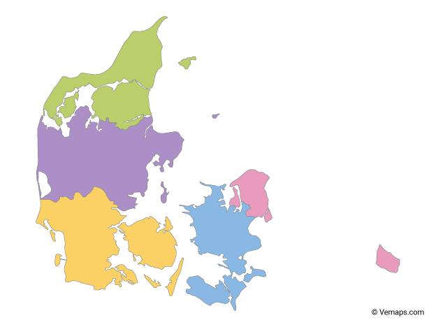
But I'm not sure right now because colors look faded to me. What do you think should I change them or keep like it is now?
If you want to look closer you can download vector map here.
Any advice are much appreciated! |
|
|
|
|
|
andreas18 P
|
Dec 2 2019, 06:10 PM
|
New Member
|
|
|
|
|
|
|
Fetilar
|
Dec 7 2019, 11:27 PM
|
Getting Started
|
I really like this color scheme. Yes, these colors aren't too bright, but they're not annoying and I think they can look great with other shades. I'm not a big expert on the subject, but maybe it's worth estimating what the background will be on this object, on a smooth dark or white background, these details look good, and if it's too bright, then it's really worth considering a replacement. But I still like it in general.
|
|
|
|
|
|
crolic P
|
Feb 4 2020, 07:48 PM
|
New Member
|
I think the colors are good overall. Maybe, you can replace their places. Change the arrangement of the colors. violet with yellow, and possibly green with blue
|
|
|
|
|
|
fu'house
|
Mar 11 2020, 10:44 PM
|
|
|
Like the colour distinction. Just the right pale colour, too deep then can't see text if you want to insert it in.
|
|
|
|
|
|
aisyahbb P
|
Mar 17 2020, 10:54 AM
|
New Member
|
I think keeping the colors light is a good choice but might want to rearrange the colors instead so look nicer
|
|
|
|
|
|
7rings
|
Apr 24 2020, 12:40 PM
|
Getting Started
|
Color wise it's pleasing to the eye.
Increasing the color saturation helps.
|
|
|
|
|
|
Princess_Alicia
|
May 1 2020, 11:29 PM
|
Getting Started
|
This is pleasing my eyes. To be honest, there are two major way to colour code the map, either to contrast (like what you having) or to harmonise (chose colour from the same range of spectrum).
Further down from both styles, you can explore temperature, strike or pastel, etc.
|
|
|
|
|
|
lixie P
|
May 7 2020, 04:22 PM
|
New Member
|
The tone looks pretty good, it's soft but not pale.
|
|
|
|
|
|
Kegor P
|
May 10 2020, 11:15 PM
|
New Member
|
Looks just amazing. I like the colors of your map. They're moderately colorful, but not bright. It makes your map interesting, but it doesn't hurt the eyes. You have a very cool style, I'd like to see more of your work. You can keep sharing your work with us in the forum.
|
|
|
|
|
|
QBeck37
|
Jul 5 2020, 05:32 AM
|
New Member
|
QUOTE(7rings @ Apr 24 2020, 12:40 PM) Color wise it's pleasing to the eye. Increasing the color saturation helps. I like the photo curation, looks very cool. |
|
|
|
|


 Quote
Quote


 0.0206sec
 0.39
0.39
 5 queries
 GZIP Disabled