

State down you all's comments and btw, will it be too abstract?
And do u guys able to see what is the grey and black thing?
Thanks.

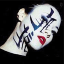
Judge this logo, The tennis logo i designed.
|
|
 Aug 21 2006, 03:28 PM, updated 20y ago Aug 21 2006, 03:28 PM, updated 20y ago
Show posts by this member only | Post
#1
|

Junior Member
419 posts Joined: Jan 2005 From: Singapore |
Pros, I want you guys to judge this logo I designed for my tennis club in school.
State down you all's comments and btw, will it be too abstract? And do u guys able to see what is the grey and black thing? Thanks. |
|
|
|
|
|
Aug 21 2006, 03:42 PM
Show posts by this member only | Post
#2
|

Senior Member
8,524 posts Joined: Jan 2003 From: The Jungle Of Pahang |
Is the black n grey supposed 2 b a person or a raquet?
What is that flaming things on the top?? I like the fonts though, looks classy..... |
|
|
Aug 21 2006, 04:20 PM
Show posts by this member only | Post
#3
|

Senior Member
713 posts Joined: Sep 2004 |
i see a human face and a racquet.. correct ar?
my opinion would be to remove the red abstract parts...the black racquet by itself is cool enuff.. it's the age of simplicity now. use solid color for the ball as well.. then it'll be coherent |
|
|
Aug 21 2006, 04:27 PM
Show posts by this member only | Post
#4
|

Senior Member
2,415 posts Joined: Nov 2004 From: Cheras |
I am also confuse about the black thing isit represent the people or the tennis raquet ?
 and the wording is not really obvious because of the font colour you choose doesn't seem to stand out . and the wording is not really obvious because of the font colour you choose doesn't seem to stand out .This post has been edited by ccy1989: Aug 21 2006, 04:27 PM |
|
|
Aug 21 2006, 04:30 PM
Show posts by this member only | Post
#5
|

Senior Member
1,885 posts Joined: Jan 2005 From: Sydney / Penang |
it's a little complicated in my opinion, especially the flames which is irrelavant to tennis
offtopic: you are a CLHS student too? I am ex-CLHS here  |
|
|
Aug 21 2006, 05:47 PM
Show posts by this member only | Post
#6
|

Senior Member
691 posts Joined: Jan 2003 From: Melaka |
i cant c anything ...
|
|
|
|
|
|
Aug 21 2006, 08:14 PM
Show posts by this member only | Post
#7
|

Junior Member
85 posts Joined: Jan 2003 From: Sitiawan/Puchong |
i think overal is ok ...
the only thing is the color of the wording the current color doesnt make the wording stand out. my opinion, maybe u can choose a dark color one |
|
|
Aug 21 2006, 08:24 PM
Show posts by this member only | Post
#8
|

Senior Member
1,389 posts Joined: Jan 2003 From: @home |
the black and grey = racquet ?
dont like the red flames thing... kinda distracting and spoils the logo outlook. the lines are too near to the words and the 'chung ling' fonts not good for its size. The words are almost invisible in this size. imagine its going to be a few size smaller... |
|
|
Aug 21 2006, 10:18 PM
Show posts by this member only | Post
#9
|

Senior Member
586 posts Joined: Jun 2005 From: under MPSJ |
Haha.. looks like everywhere is full of CLHS students. The logo is a bit complicated. Would like to fire thingy to be a speed thing. The tennis raquet also need some modification. From far it looks like a swimmer to me. More like CLHS swiming club. Btw where is CLHS tennis club playing now? Still at USM?
|
|
|
Aug 22 2006, 08:28 AM
|
|
Junior Member
419 posts Joined: Jan 2005 From: Singapore |
Yeah guys. The black and grey is the racquet. I was alil afraid when i designed it. I scared that it might be too abstract and ppl cant differenciate it. About the red thing, yea it's not my idea though. However I somehow think it might be representing the spirit of tennis players. In my mind, if i remove it, will it be too plain? And if i removed, where shall i place my words? loL, chung ling...I dunno...People tends to make 'CHUNG LING' looks smaller
loL. Yea, they're still training at USM. And bout to strike the words out, i think u guys are right. Darker colors, nice. I will take that opinion and make it become dark brown. Thanks guys =)*Btw, the red thing is a flame. This post has been edited by Resphoina: Aug 22 2006, 08:34 AM |
|
|
Aug 25 2006, 12:07 PM
|

Junior Member
8 posts Joined: Aug 2006 From: JB, Malaysia |
It looks to me like someone diving through fire. The flames should perhaps follow the shape of the racquet so it completes the look. I'm guessing it's about HOT HOT HOT playing and power and impact. So follow that through with your font...something HARD HITTING and clear.
Make the 'swoosh' shape be aflame too, really catch the whole flow of a ball being hit, look at photos of tennis players in action, see their expressions and feel the power in their stroke, put yourself in their mind ..imagine being hit by the tennis ball at topspeed..then you'll be in the right 'frame of mind' to adjust the design. Currently the flames are like a campfire, you need laser sharp, hyperactive flames that convey the HEAT and POWER you're trying to capture. Hope this helps Sofiah Emma This post has been edited by sofiahemma: Aug 25 2006, 12:08 PM |
|
|
Aug 25 2006, 01:43 PM
|

Senior Member
1,028 posts Joined: Jan 2003 From: KL |
It looks like a person running around burning in fire.
Come on, if you're afraid of people not able to understand your abstract then try to make it obvious. A logo should be straight forward instead of confusing. You may do abstractions, but try to make it so that people understand it as the way you want them to, you must convince them in order to do so. What I am trying to say is, too abstract = bad, people may not get what you are trying to convey, so be very careful on that. If you made it too confusing then expect people to go "WTF?" when they look at it. Just my 2 cents. This post has been edited by Kellicros: Aug 25 2006, 02:00 PM |
|
|
Aug 28 2006, 12:03 PM
|
|
Newbie
1 posts Joined: Aug 2006 |
i can see the raquet. if you remove the flames it would be perfect. coz somehow the flame seems irrelevent. that's what i think though
 |
|
|
|
|
|
Aug 29 2006, 03:43 PM
|
|
Junior Member
333 posts Joined: Oct 2004 |
Like most of the guys, I find the flames a little awkward. It doesn't really convey 'power'. I guess because it looks more like a torch. If you want to show speed or power, maybe some straight lines or 'rays' will be better. The font is nice but I find it a little too thin and overshadowed by the logo.
|
|
|
Aug 29 2006, 07:11 PM
|

VIP
4,567 posts Joined: Oct 2004 From: Bangi, Selangor |
At a glance, it doesn't look like something for a tennis club. I don't like the idea at all.
*p/s: Fix your English as well. It's very funny. |
|
|
Aug 29 2006, 09:36 PM
|
Senior Member
2,687 posts Joined: Jan 2003 From: Sue Bunk Jai Yaa! |
sigh.....
throw away the "tennis" font and any other typography then show it to 10 different people ask them whut does it looks like... if more then 7 people sayz it looked like a burning tennis racketz, then congratulation u did a good job on it... else, gotta do better then dat  |
|
|
Aug 29 2006, 10:04 PM
|
|
Senior Member
1,389 posts Joined: Jan 2003 From: @home |
better make some amendments to the fire swooshing position.
|
|
|
Sep 2 2006, 07:54 PM
|
Senior Member
1,162 posts Joined: Aug 2005 From: museum of kopitiam |
without the words...
i dont have any idea wat is the logo abt... anyway the font very nice.. |
|
|
Sep 2 2006, 10:57 PM
|

Junior Member
36 posts Joined: Aug 2006 From: vision city , kuala lumpur |
hello Resphoina,..
your logo's quite good but needs to fix more ,. here is my suggestion : - The black and grey is the racquet ? it seems like a people to swim .. u should trace a real racquet make it more real ( the shape) i think the racquet shape looks real if the ball removed and joining the broken part ( at the fire shape ) .. -The colors , . actually logotype must hav 3 color only ( standard ) ,.. for this logo based on your color i think u should use red n orange .. that's better -The typo, hmm nice , but try to use sans-serif types .. its better. -The line between the words , give a space between it. that's all ..  |
|
|
Sep 8 2006, 06:41 PM
|

Senior Member
1,526 posts Joined: Nov 2004 From: Ninja Turtle State |
the logo quite simple. but if you look deeply at the red line, it look like evil. that's just my opinion.
|
|
|
Sep 15 2006, 06:08 PM
|

Senior Member
1,695 posts Joined: Jan 2003 From: Ampang |
overall, ur logo is nice... but the fire is kinda not suitable with ur design.. try to change it to a more abstract design... juz my 2 cents...
|
|
|
Sep 18 2006, 10:44 AM
|

VIP
3,421 posts Joined: Jan 2003 From: 2 30 N, 112 30 E |
First off... the typography is awful. The 'fire' thing is weird. If you want my honest opinion, I'd give it a 1 out of 5.
Secondly, try using 'green', remove that 'fire' thingy, make sure there's a bit more detail on the tennis racquet... It's a tennis club, right? So, let's be realistic. It's not 'Anime' tennis cartoon... that's for sure. Tips. Try to design something in Black & White first. If you can achieve something in B&W, then you can slowly add in colors to it. Also, maybe you can try merging the tennis racquet, tennis ball and the tennis court together. Check them both out in terms of shapes, lines, etc. See if something 'links' between them. |
| Change to: |  0.0137sec 0.0137sec
 0.34 0.34
 5 queries 5 queries
 GZIP Disabled GZIP Disabled
Time is now: 2nd December 2025 - 11:32 AM |
 Quote
Quote