


Typography lover come in
Typography lover come in
|
|
 Nov 27 2013, 04:33 AM, updated 12y ago Nov 27 2013, 04:33 AM, updated 12y ago
Show posts by this member only | Post
#1
|
 
Junior Member
120 posts Joined: Mar 2013 |
Realise there's no typography thread here, any lover here?
|
|
|
|
|
|
Nov 27 2013, 06:26 AM
Show posts by this member only | Post
#2
|
|
Senior Member
599 posts Joined: Oct 2011 |
Well I like seeing pretty fonts, but not sure if I am a lover or not.
I did this when I am bored, well it has some fonts in it.  |
|
|
Nov 27 2013, 08:58 AM
Show posts by this member only | Post
#3
|

Junior Member
28 posts Joined: Feb 2013 |
QUOTE(seba @ Nov 27 2013, 06:26 AM) Well I like seeing pretty fonts, but not sure if I am a lover or not. It's good to hear that you like seeing fonts, my friend. I did this when I am bored, well it has some fonts in it.   But but...that piece is kind....of hard to read. |
|
|
Nov 27 2013, 09:36 AM
Show posts by this member only | Post
#4
|
|
Senior Member
599 posts Joined: Oct 2011 |
QUOTE(Howard Klen @ Nov 27 2013, 08:58 AM) It's good to hear that you like seeing fonts, my friend. Haha yeah I know right, but well... But but...that piece is kind....of hard to read. You should share your stuff as well dude.  |
|
|
Nov 27 2013, 02:00 PM
Show posts by this member only | Post
#5
|

Elite
10,672 posts Joined: Jul 2005 From: shah alam - skudai - shah alam |
i like typography. im not really good and graphic composition, so whenever somebody asks me to do some graphics (poster, cards etc), i will usually stick to typography.
then i met a friend who's totally into typography, and he said i'm too undisiciplined. he's like hardcore typography and can talk about the difference between kernings in arial and verdana and the big deal about it. entah aku tak paham sangat bila dia cakap the whole typography lingo hahaha. now i'm a bit more cautious. nanti kena kutuk dengan dia lagi ahhahaha. |
|
|
Nov 27 2013, 08:11 PM
Show posts by this member only | Post
#6
|
|
Junior Member
542 posts Joined: Jul 2007 |
I like Celtic like font style, but not crazy into it.
|
|
|
|
|
|
Nov 28 2013, 05:27 PM
Show posts by this member only | Post
#7
|

Junior Member
454 posts Joined: Dec 2005 From: JB |
I like Nokia Pure font, Segoe, and Signika ...usually I see the new typeface is the combination of old typeface that exist. Really interested to learn, but sometimes it a bit of hassle as need to pay attention to details. Sigh!
|
|
|
Nov 30 2013, 06:10 PM
Show posts by this member only | Post
#8
|
|
Senior Member
566 posts Joined: Sep 2013 |
QUOTE(seba @ Nov 27 2013, 06:26 AM) Well I like seeing pretty fonts, but not sure if I am a lover or not. Hi, if you don't mind I'm asking.I did this when I am bored, well it has some fonts in it. What font did you use to make this ? Looks awesome albeit hard to read. |
|
|
Nov 30 2013, 06:53 PM
Show posts by this member only | Post
#9
|
|
Senior Member
599 posts Joined: Oct 2011 |
QUOTE(Atomars @ Nov 30 2013, 06:10 PM) Hi, if you don't mind I'm asking. Yeah sure, some of it are "Colours of Autumn", "Quite Chocolatey", and "Ventography".What font did you use to make this ? Looks awesome albeit hard to read. I just took whats interesting from random websites on the handwriting section. |
|
|
Nov 30 2013, 07:01 PM
|
|
Senior Member
599 posts Joined: Oct 2011 |
QUOTE(azarimy @ Nov 27 2013, 02:00 PM) i like typography. im not really good and graphic composition, so whenever somebody asks me to do some graphics (poster, cards etc), i will usually stick to typography. Wow, I don't understand the fuss of it as well, maybe he's just being oversensitive, or maybe you had accidentally scratch on his ego a little bit? Haha then i met a friend who's totally into typography, and he said i'm too undisiciplined. he's like hardcore typography and can talk about the difference between kernings in arial and verdana and the big deal about it. entah aku tak paham sangat bila dia cakap the whole typography lingo hahaha. now i'm a bit more cautious. nanti kena kutuk dengan dia lagi ahhahaha.  Would be more interesting if u could share your works! |
|
|
Nov 30 2013, 08:00 PM
|
|
Senior Member
566 posts Joined: Sep 2013 |
QUOTE(seba @ Nov 30 2013, 06:53 PM) Yeah sure, some of it are "Colours of Autumn", "Quite Chocolatey", and "Ventography". Found them, thanks so much.I just took whats interesting from random websites on the handwriting section. |
|
|
Dec 1 2013, 02:27 AM
|

Senior Member
1,023 posts Joined: May 2010 |
got any work from u bro? i would like to see also
|
|
|
Dec 3 2013, 12:19 AM
|
|
Junior Member
70 posts Joined: May 2007 |
Hi guys, Im into typography too. Will share some of my work later.
|
|
|
|
|
|
Dec 3 2013, 02:13 AM
|
|
Junior Member
120 posts Joined: Mar 2013 |
QUOTE(gchee @ Dec 3 2013, 12:19 AM) Hi guys, Im into typography too. Will share some of my work later. Looking forward |
|
|
Dec 3 2013, 11:12 AM
|
|
Senior Member
566 posts Joined: Sep 2013 |
QUOTE(yellowranger @ Dec 3 2013, 02:13 AM) Looking forward Looking forward to some of TS's work too. |
|
|
Dec 5 2013, 12:16 PM
|

Senior Member
1,002 posts Joined: Jul 2009 From: Cney ya.. |
yellowranger
this was made 2years ago on my 1st semester,since my class was totally after 8pm at that sem  be noted that i dont hv any art design background it was just a tribute ive done toward my university and kept underneath my personal storage till now  so pls, im willing to heard any typo-hardcore advice/bash just made it clear on how do I fix/upgrade my typo skill and yeah, it was my 1st time doing typo-related stuff  just put aside my signature down there, that was a silly thing ive made on that time azarimy perhaps ur friend could share some of his/her insight/beginner advice im not taking this art field seriously, just as a way to present my feel n message tho got some bookmark typo which all of my friend kept proud of till now, ill find and share it later This post has been edited by fotosintesis: Dec 5 2013, 12:22 PM |
|
|
Dec 9 2013, 12:16 PM
|

Junior Member
237 posts Joined: Nov 2013 |
Hey someone got any opinion regarding this matter?
My graphic lecturer said it's something unethical to modified any font properties as example such as distorting it to make a "condensed version" of the font. For my self, I will do as I damn please with them font, as long as it's not becoming weird to look. Fist rule of design, there's no rules lol Whats your say? |
|
|
Dec 11 2013, 11:53 AM
|
|
Junior Member
70 posts Joined: May 2007 |
QUOTE(Buriburi San @ Dec 9 2013, 12:16 PM) Hey someone got any opinion regarding this matter? Your lecturer is correct. Type designers spent weeks, months, some even years fine tuning, perfecting and tweaking each individual font so that it looks best in a sentence or used as an individual character. Therefor please use it as it was designed. The only thing you can change is the scale/size. This is how I can tell whether a person is a desktop publisher versus a true graphic designer.My graphic lecturer said it's something unethical to modified any font properties as example such as distorting it to make a "condensed version" of the font. For my self, I will do as I damn please with them font, as long as it's not becoming weird to look. Fist rule of design, there's no rules lol Whats your say? |
|
|
Dec 11 2013, 11:55 AM
|
|
Junior Member
70 posts Joined: May 2007 |
Let me also add. To break the rule you must first know the rules.
|
|
|
Dec 11 2013, 12:07 PM
|
|
Junior Member
237 posts Joined: Nov 2013 |
QUOTE(gchee @ Dec 11 2013, 11:53 AM) Your lecturer is correct. Type designers spent weeks, months, some even years fine tuning, perfecting and tweaking each individual font so that it looks best in a sentence or used as an individual character. Therefor please use it as it was designed. The only thing you can change is the scale/size. This is how I can tell whether a person is a desktop publisher versus a true graphic designer. QUOTE(gchee @ Dec 11 2013, 11:55 AM) Let me also add. To break the rule you must first know the rules. Thanks for your valuable insight  Maybe as you said the rule of no tweaking the font can be applied as an iron rule in a long text design like a book or something, but if we want to use the font in a font based design, or heading in poster, I still believe the font is open for any tweak, pan, scale, distortion, perspective, 3D and all that. It will be so restricting to use the font as is without the possibility to tweak it to fit the design. |
|
|
Dec 12 2013, 10:47 PM
|
|
Junior Member
70 posts Joined: May 2007 |
QUOTE(Buriburi San @ Dec 11 2013, 12:07 PM) Thanks for your valuable insight Type in a book or body text is a no no to any form of distortion. You want it as legible as possible otherwise you won't be able to convey the message to the readers. Maybe as you said the rule of no tweaking the font can be applied as an iron rule in a long text design like a book or something, but if we want to use the font in a font based design, or heading in poster, I still believe the font is open for any tweak, pan, scale, distortion, perspective, 3D and all that. It will be so restricting to use the font as is without the possibility to tweak it to fit the design. There are many graphic designers and all of them has their own individual styles. But at the end of the day, and if you notice carefully there is always a reason and rational as to why they break a rule in the first place i.e distort a font etc... 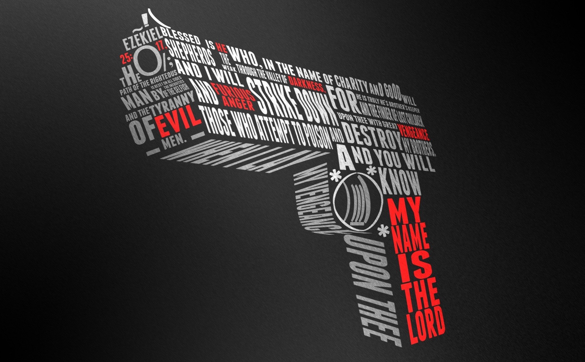 If you look at the poster above (not my work, just some random image to illustrate an example), it may come across to you that most of the fonts are distorted. But if you examine it closely you'll realize that it is actually perspective distortion. In this case it works because perspective is around us. The designer only breaks the rule because he knows the rules of perspective as an artist/designer in order for him to convey a message across visually. By doing this, he achieved greater impact and successfully engaged his audience as opposed to a paragraph of text with the same words. My 2 cents. |
|
|
Dec 13 2013, 11:01 AM
|
|
Junior Member
237 posts Joined: Nov 2013 |
QUOTE(gchee @ Dec 12 2013, 10:47 PM) Type in a book or body text is a no no to any form of distortion. You want it as legible as possible otherwise you won't be able to convey the message to the readers. Very nice of you to share the example and insight there, thanks! There are many graphic designers and all of them has their own individual styles. But at the end of the day, and if you notice carefully there is always a reason and rational as to why they break a rule in the first place i.e distort a font etc... If you look at the poster above (not my work, just some random image to illustrate an example), it may come across to you that most of the fonts are distorted. But if you examine it closely you'll realize that it is actually perspective distortion. In this case it works because perspective is around us. The designer only breaks the rule because he knows the rules of perspective as an artist/designer in order for him to convey a message across visually. By doing this, he achieved greater impact and successfully engaged his audience as opposed to a paragraph of text with the same words. My 2 cents.  |
|
|
Dec 13 2013, 05:22 PM
|

Senior Member
1,020 posts Joined: Jul 2012 |
what software do you use for creating font?
|
|
|
Dec 15 2013, 11:49 AM
|
|
Junior Member
70 posts Joined: May 2007 |
QUOTE(Lord Tiki Mick @ Dec 13 2013, 05:22 PM) what software do you use for creating font? I have created my own fonts before but without the help of a computer. Purely mechanical using pen and ink. Adobe illustrator would be a suitable software to create the form of individual characters and numbers. To make it into a usable font you can type with, that I have no idea. I'm guessing you probably need to send your newly created fonts to a font foundry for them to make it into a true type font. They might even buy it from you if they like it! |
|
|
Dec 16 2013, 01:21 PM
|
|
Senior Member
1,020 posts Joined: Jul 2012 |
QUOTE(gchee @ Dec 15 2013, 11:49 AM) I have created my own fonts before but without the help of a computer. Purely mechanical using pen and ink. Actually I've created my own font before, for non-latin support. I used FontCreator & FontForge. I just want to know what others are using. And if I could, I want to ask about diacritic marks.Adobe illustrator would be a suitable software to create the form of individual characters and numbers. To make it into a usable font you can type with, that I have no idea. I'm guessing you probably need to send your newly created fonts to a font foundry for them to make it into a true type font. They might even buy it from you if they like it! |
|
|
Dec 16 2013, 07:29 PM
|

Junior Member
36 posts Joined: Dec 2013 |
try google Fontstruct. a nice way to create your fonts. nice site, i've used it before
|
|
|
Dec 16 2013, 11:09 PM
|
|
Junior Member
70 posts Joined: May 2007 |
Thanks for sharing
|
|
|
Dec 25 2013, 03:41 PM
|

Senior Member
1,723 posts Joined: Oct 2010 |
i find fonts really inspiring eventhough i'm an architecture student. i always browse dafont website.
 |
|
|
Feb 18 2014, 03:00 PM
Show posts by this member only | IPv6 | Post
#29
|

Junior Member
340 posts Joined: May 2012 |
QUOTE(azarimy @ Nov 27 2013, 02:00 PM) i like typography. im not really good and graphic composition, so whenever somebody asks me to do some graphics (poster, cards etc), i will usually stick to typography. Oh I love to differentiate fonts by their names too whenever my friends are using them and they just went blur. then i met a friend who's totally into typography, and he said i'm too undisiciplined. he's like hardcore typography and can talk about the difference between kernings in arial and verdana and the big deal about it. entah aku tak paham sangat bila dia cakap the whole typography lingo hahaha. now i'm a bit more cautious. nanti kena kutuk dengan dia lagi ahhahaha. |
|
|
Mar 9 2016, 12:48 PM
|

Junior Member
37 posts Joined: May 2014 |
Love Jawi Typo? http://www.jawipatani.com/
Happy exploring! https://forum.lowyat.net/topic/3233724 |
|
|
Mar 10 2016, 12:30 PM
|

Junior Member
93 posts Joined: Oct 2015 |
For all typography lover, need help to suggest free font suitable for "shawls & more" .
 |
|
|
Mar 19 2016, 11:01 AM
|
|
Junior Member
37 posts Joined: May 2014 |
Salam Kawanku! Kenapa merumitkan Jawi Typo?
http://www.mudah.my/Jawi+dan+Arabic+Taipset-44736489.htm http://www.nonosoft.jifisa.net/download-no...hot-free-trial/ http://www.ejawi.net/tulisan-jawi-adobe-illustrator/ http://emashq.com/ Semoga BerManfaat dan Selamat Maju Jaya https://forum.lowyat.net/topic/3233724 |
|
|
Mar 30 2016, 05:09 PM
|
|
Junior Member
93 posts Joined: Oct 2015 |
Baru menceburi this type of art.
 |
|
|
Apr 4 2016, 08:52 AM
|

Senior Member
1,638 posts Joined: Jan 2003 From: Subang Jaya |
QUOTE(namikpasha @ Mar 30 2016, 05:09 PM) Baru menceburi this type of art. Not bad. Lines could be a little smoother. Good effort. (:Did you manage to figure out what font to use for your "shawls and more" |
|
|
Apr 4 2019, 06:06 PM
|
|
Junior Member
37 posts Joined: May 2014 |
Just linking https://forum.lowyat.net/topic/4753488
|
| Change to: |  0.0247sec 0.0247sec
 0.51 0.51
 5 queries 5 queries
 GZIP Disabled GZIP Disabled
Time is now: 26th November 2025 - 02:21 PM |
 Quote
Quote