

 Dec 12 2013, 10:47 PM
QUOTE(Buriburi San @ Dec 11 2013, 12:07 PM)
Thanks for your valuable insight 
Maybe as you said the rule of no tweaking the font can be applied as an iron rule in a long text design like a book or something,
but if we want to use the font in a font based design, or heading in poster, I still believe the font is open for any tweak,
pan, scale, distortion, perspective, 3D and all that.
It will be so restricting to use the font as is without the possibility to tweak it to fit the design.

Type in a book or body text is a no no to any form of distortion. You want it as legible as possible otherwise you won't be able to convey the message to the readers. Maybe as you said the rule of no tweaking the font can be applied as an iron rule in a long text design like a book or something,
but if we want to use the font in a font based design, or heading in poster, I still believe the font is open for any tweak,
pan, scale, distortion, perspective, 3D and all that.
It will be so restricting to use the font as is without the possibility to tweak it to fit the design.
There are many graphic designers and all of them has their own individual styles. But at the end of the day, and if you notice carefully there is always a reason and rational as to why they break a rule in the first place i.e distort a font etc...
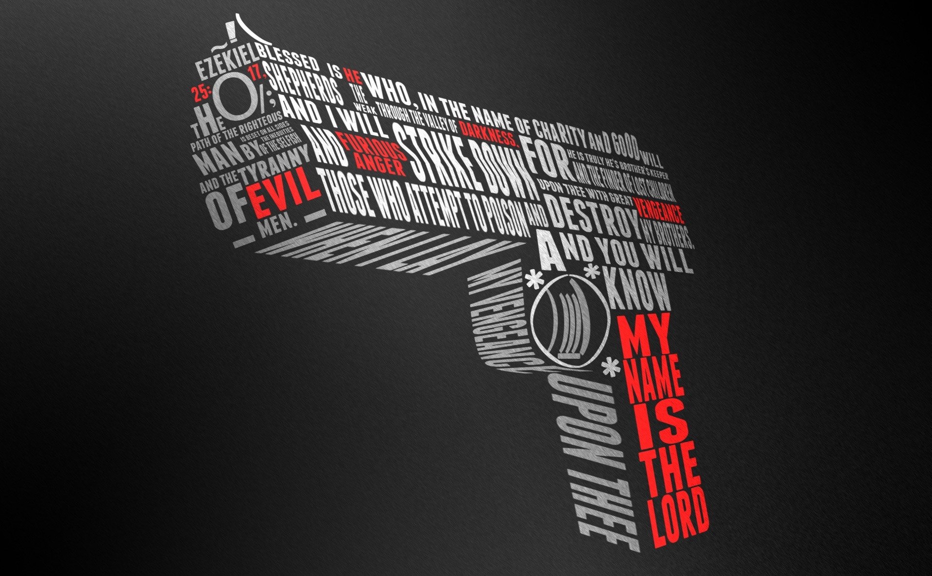
If you look at the poster above (not my work, just some random image to illustrate an example), it may come across to you that most of the fonts are distorted. But if you examine it closely you'll realize that it is actually perspective distortion. In this case it works because perspective is around us. The designer only breaks the rule because he knows the rules of perspective as an artist/designer in order for him to convey a message across visually.
By doing this, he achieved greater impact and successfully engaged his audience as opposed to a paragraph of text with the same words.
My 2 cents.
 Quote
Quote


 0.0186sec
 0.59
0.59
 5 queries
 GZIP Disabled