Welcome Guest ( Log In | Register )

Outline · [ Standard ] · Linear+

 Reconstructed version..., of that abandoned website...

views
     
TSStupid Khor
post May 16 2006, 10:25 AM, updated 20y ago

Getting Started
**
Junior Member
276 posts

Joined: May 2006
From: MMU, Cyberjaya


The reconstructed version of [this] website...
not done yet, 15% left... laugh.gif


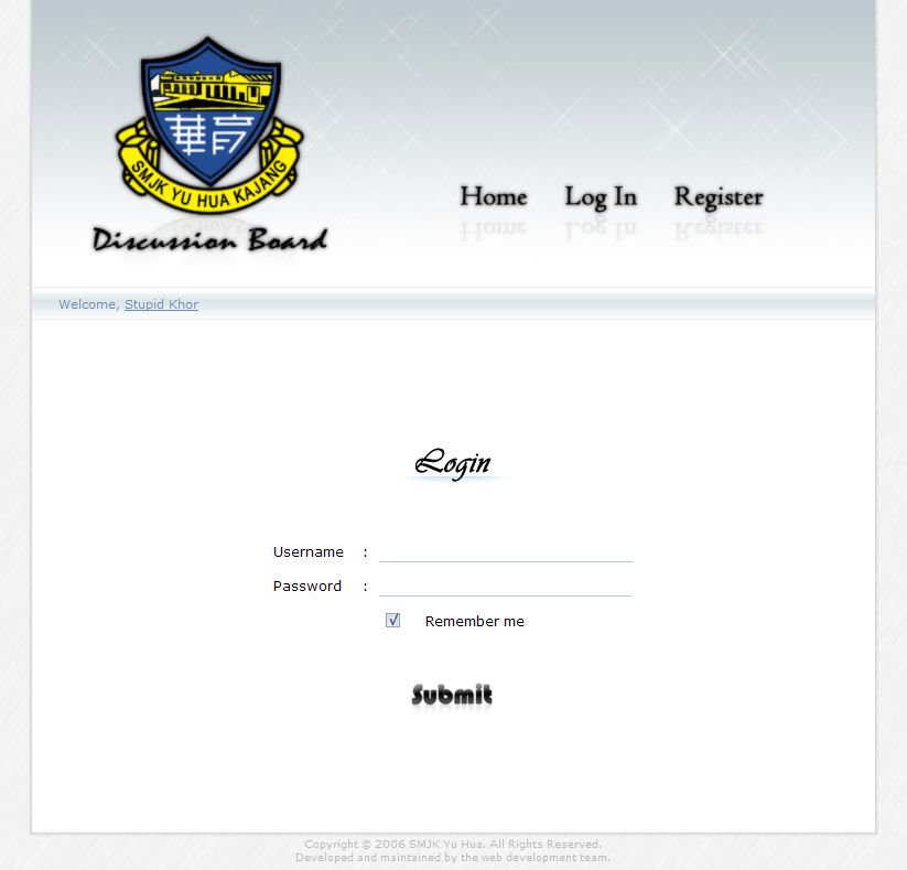
This is the login page :
user posted image

This is the username availability check window :
user posted image

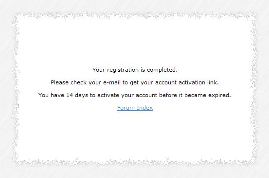
This is the page that displays all kind of alert/notice/message :
user posted image

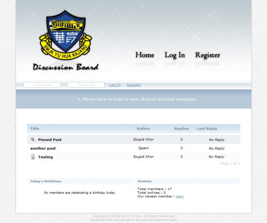
The discussion boad index :
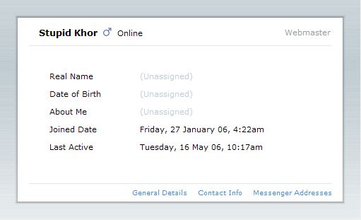
user posted image

Profile card :
user posted image


ps~
again, shoot me hard... tongue.gif

This post has been edited by Stupid Khor: May 16 2006, 10:28 AM
etsuko
post May 16 2006, 10:34 AM

Spaced out person
Group Icon
Elite
4,210 posts

Joined: Jan 2003
From: Malaysia


you might want to tone down the outer glow on the navigation text because it's looking like a mirage instead of clear read text.

which is the button to press to login..? issit the word Login or the word Submit..? no box around any of it so which is a button..?

i think this and the other one works. the reason it didn't go well with your teacher is because adults tend to get more confused with teen type websites. after all, target audience is rather different in terms of design.

cheers.
TSStupid Khor
post May 16 2006, 10:50 AM

Getting Started
**
Junior Member
276 posts

Joined: May 2006
From: MMU, Cyberjaya


hehe... the login button is 'Submit'... tongue.gif
I guess I have to redesign the button again...

it made me hard to decide how to design it
because the target audience is the students,
while the client is a teacher...
what's the choice?

the first person who hand on this will be the teacher,
hence I have to make it an acceptable design...
but I have to catch the target audience too,
so finally I decided to make it a simple, wide-accepted design...
r4ydc24
post May 16 2006, 11:16 AM

Level of Noobness
******
Senior Member
1,067 posts

Joined: Nov 2004
From: Puncak Jalil


when compared to the "old" design,this one is a dull one.. ahahhaha, sorry to say dat bro... I think itz ok to use those kinda graffiti or wat not. but dun over exaggerate em... u myt wanna try a graffiti design dat embed the school logo too, if datz ok wif the management... coz i dun think students gonna b attractive to this old boring color combination.. and the font effects, yeah, itz too "dreamy"... myt wanna ditch dat oso.

nice effort tho.. come to think of it,I myt wanna post my web design here later on too.. but gotta haf tym doing the technical(php) part 1st. when all is in place, then i'll haf tym to think bout the design... ahahaha... icon_rolleyes.gif


Change to:
| Lo-Fi Version
0.0424sec    0.25    6 queries    GZIP Disabled
Time is now: 26th November 2025 - 01:00 PM