

Thanks in advance
This post has been edited by Mr Ez: Mar 21 2006, 04:36 AM
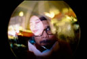
Rate my banner, yeah rate it!
|
|
 Mar 21 2006, 04:30 AM, updated 20y ago Mar 21 2006, 04:30 AM, updated 20y ago
Show posts by this member only | Post
#1
|
 
Senior Member
700 posts Joined: Dec 2005 From: KL |
It's on my sig, using Photoshop 7.0. And don't hesitate to leave a comment ya?
Thanks in advance This post has been edited by Mr Ez: Mar 21 2006, 04:36 AM |
|
|
|
|
|
Mar 21 2006, 07:35 AM
Show posts by this member only | Post
#2
|

Senior Member
1,112 posts Joined: Jan 2003 |
The green area on the left can notice the cut n paste color differentiation
|
|
|
Mar 21 2006, 07:41 AM
Show posts by this member only | Post
#3
|

Elite
648 posts Joined: Dec 2004 From: THE CLONING ZONE |
The green area on the left and the blue-gray area on the right makes your whole banner looks a bit messy. The banner will look better without them. Just maintain the characters as your background - and your words are too small
 |
|
|
Mar 21 2006, 08:11 AM
Show posts by this member only | Post
#4
|

All Stars
17,838 posts Joined: Jan 2005 |
I think i will only give you 40/100
 |
|
|
Mar 21 2006, 08:27 AM
Show posts by this member only | Post
#5
|

Senior Member
5,532 posts Joined: Jan 2003 From: Kuala Lumpur |
i am not sure what is the orange thingy in the middle of it, probably because i haven't play any DS games b4. however, just like what providence said, the background colours affects the whole banner...
 |
|
|
Mar 21 2006, 08:35 AM
Show posts by this member only | Post
#6
|

Senior Member
1,249 posts Joined: Feb 2006 |
Not bad
 |
|
|
|
|
|
Mar 21 2006, 08:54 AM
Show posts by this member only | Post
#7
|

Senior Member
853 posts Joined: May 2005 From: Kuala Lumpur |
not bad...
|
|
|
Mar 21 2006, 12:58 PM
Show posts by this member only | Post
#8
|

Senior Member
807 posts Joined: Aug 2005 |
keep going... try.. try and never stop try... good luck.
|
|
|
Mar 22 2006, 12:26 PM
Show posts by this member only | Post
#9
|

Senior Member
545 posts Joined: Jul 2005 From: 444 Industrial Drive. Shreveport, LA |
something wrong at the invers/negative effects.. maybe
|
|
|
Mar 22 2006, 01:36 PM
|

Senior Member
2,811 posts Joined: Jan 2003 From: Somewhere in middle earth |
Good effort, but I don't really feel that the font for "LYN" and "meetup" really strong enough to match with the design. It seem you tried to divide the banner to 3 part, why don't sync the style you use to divide the right part with the left (even the angle is not the same).
|
|
|
Mar 22 2006, 05:40 PM
|
Senior Member
534 posts Joined: Aug 2005 From: MYY/SWK/MY/Bumi Tuhan |
not
bad |
|
|
Mar 22 2006, 06:43 PM
|

Senior Member
1,104 posts Joined: Sep 2004 From: NUS,Singapore |
Don't feel nice..it gives me a strong bad contrast and blending
anyway At least u made it by yourselfTry to see other pros in LYN ,how they design their signature exp:muffins,gnome,nitrolancer,jayhan,fariz etc... Webmachine.com Pixel2life Learn as much tutorial as you can. I'm sure you can come up with something that can impress all of us soon or later. |
|
|
Mar 25 2006, 12:27 PM
|
Junior Member
206 posts Joined: Dec 2004 |
maybe u should put the mario up front and the tetris below it
|
|
|
|
|
|
Mar 25 2006, 03:16 PM
|

Senior Member
1,997 posts Joined: Jan 2003 From: Your Grandma With Kisses |
QUOTE(songhan89 @ Mar 22 2006, 06:43 PM) Don't feel nice..it gives me a strong bad contrast and blending i agree with you. For the long term, try to follow their style first and then came out with your own original style.anyway At least u made it by yourselfTry to see other pros in LYN ,how they design their signature exp:muffins,gnome,nitrolancer,jayhan,fariz etc...  for the banner, i choose not bad 1. compression is obvious 2. wrong font. 2.1 with that background that font is only suitable in the 60's. gonna have a retro theme? 2.2 this meet up is going to be fun right? i see randomness on the wording placement for LYN and meet up. That shows the fun part but still 60's style for quick suggestion .. here is my NBTDness notice that i applied the texture filter to hide the compression and the ugly edges. The size is only 7kb bigger  edit:  ^ there should be space between meet and up ^ there should be space between meet and up  .. sorry, in hurry .. sorry, in hurryThis post has been edited by shinnosuke: Mar 25 2006, 06:53 PM |
|
|
Mar 29 2006, 01:49 PM
|

Senior Member
1,124 posts Joined: Jan 2003 |
is fancy! dude u have to make it like "clear" "curious" "I wanto click inside".... then your banner will be superb!
|
|
|
Mar 29 2006, 05:48 PM
|
|
Senior Member
1,249 posts Joined: Feb 2006 |
not bad dude
 |
| Change to: |  0.0402sec 0.0402sec
 0.74 0.74
 6 queries 6 queries
 GZIP Disabled GZIP Disabled
Time is now: 25th November 2025 - 01:22 PM |
 Quote
Quote