

Attached thumbnail(s)


School Mag. Cover..., Need your advice comments!!
|
|
 Feb 20 2006, 05:19 PM, updated 20y ago Feb 20 2006, 05:19 PM, updated 20y ago
Show posts by this member only | Post
#1
|
 
Junior Member
171 posts Joined: Feb 2006 From: Malaysia |
What do you think of this... It's for my school magazine with the title 'cahaya'. I'm no pro as you can see so need your advice or comments to make it better (got a lot of pressure!! ) Anyway, forget the badge on the cover.. just testing!!
Attached thumbnail(s)
|
|
|
|
|
|
Feb 20 2006, 05:21 PM
Show posts by this member only | Post
#2
|
|
Junior Member
171 posts Joined: Feb 2006 From: Malaysia |
By the way, i'm using photoshop!!
|
|
|
Feb 20 2006, 05:44 PM
Show posts by this member only | Post
#3
|

Elite
4,210 posts Joined: Jan 2003 From: Malaysia |
I prefer the 2nd image but think the typeface could be better.
|
|
|
Feb 20 2006, 05:49 PM
Show posts by this member only | Post
#4
|

Senior Member
1,780 posts Joined: Nov 2004 |
Can i ask where u get the pics?
|
|
|
Feb 20 2006, 06:32 PM
Show posts by this member only | Post
#5
|

Junior Member
489 posts Joined: Dec 2004 From: malaysia |
are you designing a magazine for your school ?? i don't think both designs reflect the school identity.....
|
|
|
Feb 20 2006, 06:48 PM
Show posts by this member only | Post
#6
|
|
Junior Member
466 posts Joined: Nov 2005 |
i think the second one is nicer..
anyway, the design isn't much different from your school yearbooks last time. at least this one looks better than the one in 2005.  |
|
|
|
|
|
Feb 20 2006, 07:01 PM
Show posts by this member only | Post
#7
|

Senior Member
1,138 posts Joined: Aug 2005 From: Blackout |
nice .. but dun .. many use Out glow ler...
|
|
|
Feb 20 2006, 07:03 PM
Show posts by this member only | Post
#8
|
Senior Member
1,299 posts Joined: Jan 2003 From: Office |
i dun like the words... font... style.. mayb
|
|
|
Feb 20 2006, 07:08 PM
Show posts by this member only | Post
#9
|
|
Senior Member
1,138 posts Joined: Aug 2005 From: Blackout |
|
|
|
Feb 20 2006, 07:14 PM
|

Senior Member
1,959 posts Joined: Jan 2003 From: ~1337~ |
|
|
|
Feb 20 2006, 07:20 PM
|
|
Senior Member
860 posts Joined: Jan 2003 From: Kayangan |
cahaya. put bmw angel eye instead
 agreed on too much of out glow thingy. get rid of that. maybe can try drop shadow instead to make the text visible. This post has been edited by maelzx: Feb 20 2006, 07:22 PM |
|
|
Feb 20 2006, 07:59 PM
|
|
Senior Member
1,780 posts Joined: Nov 2004 |
QUOTE(Navigator� @ Feb 20 2006, 07:08 PM) ur design the one got ppl fight wif u wan hor...remember liao |
|
|
Feb 20 2006, 09:00 PM
|
|
Senior Member
1,959 posts Joined: Jan 2003 From: ~1337~ |
heheheheheh
whos that POKEMON u need to adjust all thing bro |
|
|
|
|
|
Feb 20 2006, 09:27 PM
|
|
Senior Member
1,138 posts Joined: Aug 2005 From: Blackout |
hahah people smart . just focus what they Really want to.
and . just. Take as a moral dude. BTW .. ur cover are really ok with ur school material. and what ur want to do is make a good layout. with colour balance |
|
|
Feb 20 2006, 09:55 PM
|
|
Senior Member
1,959 posts Joined: Jan 2003 From: ~1337~ |
wanna ask sumthang
wher u got da lilin background? heheheh pecah wooo pic u stretch like that umm where is sekolah seri sentosa? This post has been edited by Hackezkk: Feb 20 2006, 09:56 PM |
|
|
Feb 21 2006, 02:26 AM
|
|
Senior Member
1,138 posts Joined: Aug 2005 From: Blackout |
hahahahha Seri sentosa pon tak tau ka???
where ur from..??? Bangladess???? |
|
|
Feb 21 2006, 02:32 AM
|

Senior Member
719 posts Joined: Jan 2003 From: cyberjaya, ampang, malaysia |
u kids pls dont start arguing in other people thread.
usws - try to not using so many glow.. and try to contrast the text ( date, school name ) with the backgound so the words area clear enough to see. use 300 dpi o prevent blur later in your cover.. to see whether it is blur or not.. try pint at a4 with 300 dpi.  |
|
|
Feb 21 2006, 03:18 AM
|
|
Senior Member
1,138 posts Joined: Aug 2005 From: Blackout |
yahh 300dpi. is good one
I have ,, got it. |
|
|
Feb 21 2006, 03:44 AM
|

Junior Member
69 posts Joined: Jan 2005 From: Petaling Jaya |
Your fonts are too simple and your effects as well.
Can obviously see it can be done through a gradient overlay/ outer glow. It is way too simple. |
|
|
Feb 21 2006, 04:30 AM
|

Senior Member
2,687 posts Joined: Jan 2003 From: Sue Bunk Jai Yaa! |
it looks so unprofessional imho
|
|
|
Feb 21 2006, 11:00 AM
|
|
Senior Member
1,959 posts Joined: Jan 2003 From: ~1337~ |
Bewok doh mule jadi bewok
hummm try emboss da font lil bit http://img447.imageshack.us/img447/4076/magcoverfinal5fo.gif seee RADICAL works  kewll vector art  This post has been edited by Hackezkk: Feb 21 2006, 11:06 AM |
|
|
Feb 21 2006, 04:44 PM
|

Senior Member
1,120 posts Joined: Jan 2003 From: Dato' Keramat KL Status : Online |
QUOTE(usws @ Feb 20 2006, 05:19 PM) What do you think of this... It's for my school magazine with the title 'cahaya'. I'm no pro as you can see so need your advice or comments to make it better (got a lot of pressure!! ) Anyway, forget the badge on the cover.. just testing!! The photograph of da candle is not so nice for me.. try 2 put others pictures that can bring 'feel' when people look at ur design..  |
|
|
Feb 21 2006, 04:56 PM
|
|
Senior Member
1,120 posts Joined: Jan 2003 From: Dato' Keramat KL Status : Online |
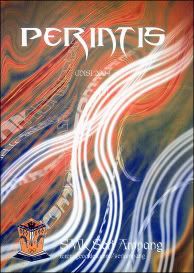
Eh.. wanna see my design?? this is my skewl mag for the last year..
and Im the person who in-charge for this.. {Perintis 2005 - Sekolah Menengah Kebangsaan Seri Ampang Kuala Lumpur} This is the design - Using Adobe Photoshop CS2 300DPI  The motif is all about BATIK.. A Tribute to Datin Seri Indon Mahmood.. This is the actual mag.. I jz scanned and put it here.  Ps : Miss the skewl soooo much  |
|
|
Feb 21 2006, 06:02 PM
|
|
Senior Member
1,959 posts Joined: Jan 2003 From: ~1337~ |
kewllll dude
heheheh but i dun like da smsa in red in glow haihhh |
|
|
Feb 22 2006, 10:34 AM
|
|
Senior Member
1,120 posts Joined: Jan 2003 From: Dato' Keramat KL Status : Online |
QUOTE(Hackezkk @ Feb 21 2006, 06:02 PM) kewllll dude Uikk why?.. I think okey what..heheheh but i dun like da smsa in red in glow haihhh jz to expose the website 2 the public.. hihi |
|
|
Feb 22 2006, 10:38 AM
|
|
Senior Member
1,120 posts Joined: Jan 2003 From: Dato' Keramat KL Status : Online |
Another design of my skewl mag.. The 2004 magazine..
 |
|
|
Feb 22 2006, 09:16 PM
|
|
Senior Member
1,959 posts Joined: Jan 2003 From: ~1337~ |
where?
i cant see arghhh i dun like tat red glow hohohooh |
|
|
Feb 23 2006, 02:55 AM
|

Senior Member
1,638 posts Joined: Jan 2003 From: Subang Jaya |
now zeps' stuff is good. the others didnt impress me at all.
especially that gaara one. that has copyright infringement all over it. |
| Change to: |  0.0182sec 0.0182sec
 0.63 0.63
 6 queries 6 queries
 GZIP Disabled GZIP Disabled
Time is now: 25th November 2025 - 06:17 PM |
 Quote
Quote