


check out their page here
My Recent Work, Tour Poster
|
|
 Dec 25 2005, 12:34 PM, updated 20y ago Dec 25 2005, 12:34 PM, updated 20y ago
Show posts by this member only | Post
#1
|
Junior Member
72 posts Joined: Jan 2003 From: Blut Aus Nord |
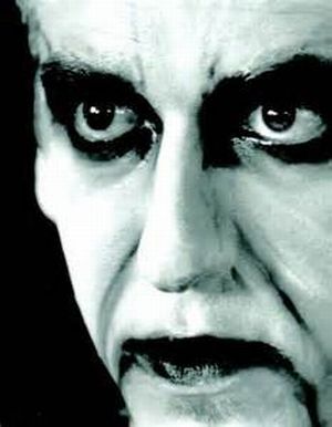
this is not finish yet..... poster about upcoming green carnation tour for the end records.... feel free to comment.....
check out their page here |
|
|
|
|
|
Dec 25 2005, 01:42 PM
Show posts by this member only | Post
#2
|

Junior Member
489 posts Joined: Dec 2004 From: malaysia |
cool.... very grungy..
|
|
|
Dec 25 2005, 02:12 PM
Show posts by this member only | Post
#3
|
|
Newbie
2 posts Joined: Dec 2005 |
i love it....really loveit!!!!!
|
|
|
Dec 25 2005, 02:59 PM
Show posts by this member only | Post
#4
|

Elite
4,210 posts Joined: Jan 2003 From: Malaysia |
Love the texture.. but the text needs some work to finish it..
 |
|
|
Dec 25 2005, 03:30 PM
Show posts by this member only | Post
#5
|

Elite
2,707 posts Joined: Feb 2005 From: KL |
^agreed, the typography seems not that matching the feels of the image
|
|
|
Dec 25 2005, 03:56 PM
Show posts by this member only | Post
#6
|
|
Junior Member
72 posts Joined: Jan 2003 From: Blut Aus Nord |
yeap i agree...actually i want to make a classic with swirl font but they want to use a default band logo so i don`t have any idea right now.....
|
|
|
|
|
|
Dec 25 2005, 04:49 PM
Show posts by this member only | Post
#7
|

Senior Member
1,780 posts Joined: Nov 2004 |
pretty..like a horror theme
|
|
|
Dec 26 2005, 05:55 PM
Show posts by this member only | Post
#8
|
|
Newbie
4 posts Joined: Dec 2005 |
cool! how u mix with the texture? great man...
|
|
|
Dec 28 2005, 09:29 AM
Show posts by this member only | Post
#9
|

Senior Member
970 posts Joined: Jan 2003 From: damansara & segamat |
i like it...maybe u can try a more grungy font...something like Grunge Aching Bold,Grunge Caltek Bold,Serrific Grunge, Basic Grunge..i think they'll look better with the current one you have for the wordings " Acoustic Verses "
but i really love it...wonderfully blended in...thumbs up!!!Bravos!! |
|
|
Dec 28 2005, 09:51 AM
|

Senior Member
9,257 posts Joined: Aug 2005 From: Not so sure myself Status: 1+3+3=7 |
Nice BG... Just the text doesn't really match the BG... Nice work.
|
|
|
Dec 28 2005, 10:01 AM
|

Senior Member
1,058 posts Joined: Sep 2005 From: Subang |
some humble comments:
1. the 'green carnation' title font could use the 'graffiti' type. like need for speed 2. since yr overall theme is the scribbly thingy, u could do that for the edges of the people esp of the guy on the right (his hair) 3. also the positioning of the bald guy in the middle of the back guy's groin (ugh) |
|
|
Dec 28 2005, 10:47 AM
|

Junior Member
257 posts Joined: Jan 2005 |
QUOTE(augurmaster @ Dec 25 2005, 12:34 PM) this is not finish yet..... poster about upcoming green carnation tour for the end records.... feel free to comment..... nice... check out their page here   btw..can't see really well the bald guy leg...does he had any ?? btw..can't see really well the bald guy leg...does he had any ??  overall...it still look nice overall...it still look niceThis post has been edited by atria83: Dec 28 2005, 10:48 AM |
|
|
Dec 28 2005, 11:24 AM
|

Senior Member
1,088 posts Joined: Aug 2005 From: Frostmourne For the Alliance!! |
your shading/ shadowing of the guys in the pic make it blend with the bg. Cos they just look so amature-ish sticking out like that.
|
|
|
|
|
|
Dec 28 2005, 04:21 PM
|

Senior Member
1,138 posts Joined: Aug 2005 From: Blackout |
waw... cool.. i like that.. how do you make the texture huh?
|
|
|
Dec 28 2005, 05:05 PM
|
|
Junior Member
72 posts Joined: Jan 2003 From: Blut Aus Nord |
thanks for all comments..... i`ll try to make into more detail looking..... especially the guys+bg blending plus that font/band logo......
|
|
|
Dec 28 2005, 06:57 PM
|

Junior Member
19 posts Joined: Dec 2005 From: KL |
like tv -^-^-^-
|
|
|
Jan 1 2006, 03:22 PM
|

Junior Member
46 posts Joined: Nov 2004 From: Cha Cha Island |
er....too green..... and all dry and dying trees........ I can't find any focus of attention.....
This post has been edited by Koala: Jan 1 2006, 03:26 PM |
|
|
Jan 7 2006, 03:20 PM
|

Junior Member
25 posts Joined: Nov 2005 |
font not suitable and touch up d pic alil more on d edges...it looks like a cutout from somewhere...try blending it wit the texture in d back and touch up the background...don juz align it in d center...try distort it alil...and one more problem...no focus...change it and u can c d difference...trust me...
This post has been edited by mystic_orgs: Jan 7 2006, 03:24 PM |
|
|
Jan 7 2006, 06:37 PM
|

Senior Member
3,065 posts Joined: Jan 2003 |
no bad keep it up
|
|
|
Jan 7 2006, 06:53 PM
|

Senior Member
9,706 posts Joined: Feb 2005 From: Why U wana know? Status: Meditating™ |
The man's face too white....
|
|
|
Jan 15 2006, 11:41 AM
|

Junior Member
260 posts Joined: Sep 2004 |
Needs a more gothic/heaver look, don't use italics or condensed fonts, looks filmsy, the words have to be firm.
|
|
|
Jan 16 2006, 09:22 PM
|

Senior Member
623 posts Joined: Mar 2005 From: somewhere over the rainbow.. |
Ya try use gothic font and see??
by the way nice background This post has been edited by andriel: Jan 16 2006, 09:25 PM |
|
|
Jan 16 2006, 09:27 PM
|
|
Validating
5,444 posts Joined: Jan 2003 |
QUOTE(Navigator� @ Dec 28 2005, 04:21 PM) waw... cool.. i like that.. how do you make the texture huh? Grunge brushes...You can make your own, or you can download them off the net. |
| Change to: |  0.0158sec 0.0158sec
 0.28 0.28
 5 queries 5 queries
 GZIP Disabled GZIP Disabled
Time is now: 26th November 2025 - 02:28 AM |
 Quote
Quote