QUOTE(shootkk @ Jan 30 2012, 11:30 AM)
I probably should not comment...
Pics are not interesting... background not interesting and may even be distracting.
Pics do not reflect the changes in season whatsoever... neither do the backgrounds reflect anything about seasonal changes... total fail here in you asked me.
Weak composition in all pics.
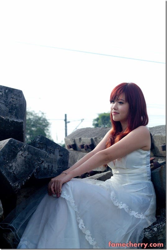
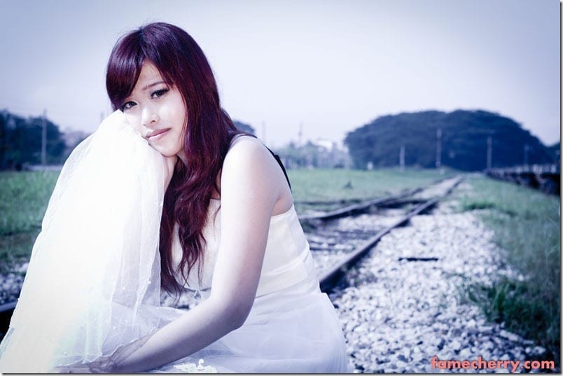
Pics #3 & #6 - Blown highlights in the gown. Can't see details there.. can't even tell if the model is wearing different gowns if you don't look properly...
Lastly... model supposed to be bride but there's nothing bride-like in her expressions. I could say that the model is bordering on nonchalance in her expression...
I'm sure these comments too will fall on deaf ears... like so many before them.
QUOTE(nicotine @ Jan 30 2012, 02:14 PM)
what is this ?? I'm really speechless.
wb out, color out, overblown highlight , cropping out. You did it on purpose ?
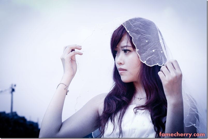
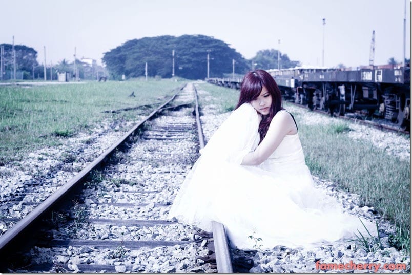
The only presentable shots in term of composition is #6 despite the lack to eye contact. The rest shouldn't be posted at all as it's some typical "facebook point and shoot" quality pic that failed miserably.
come on bro, be a man go attend some photography course !
QUOTE(deodorant @ Jan 31 2012, 08:59 AM)
#4-#6 the color balancing is atrocious. You can't say OK WINTER FEEL TIEM and just drag the temperature and saturation sliders to the left and call it a day.
Haiyo, i didnt say 4 season as in 4 season of weather did I ?
This is an art series. Its metaphoric and up for interpretation.
lol ok now when I read again "OK WINTER FEEL TIEM and just drag the temperature and saturation sliders to the left and call it a day" really sounds damn funny !!! hahahahahaaaah
But no, its not about winter feel la
Its about the emotion the photos give when I lower the color temp but the subject is actually shot with Full CTO gel so the photos are diff from if I shoot without the gelled flash.
If no gel flash the photos cannot be reproduce by simply dragging temp slider. Spending hours on PP maybe can i dunno.
QUOTE(-kytz- @ Jan 30 2012, 02:27 PM)

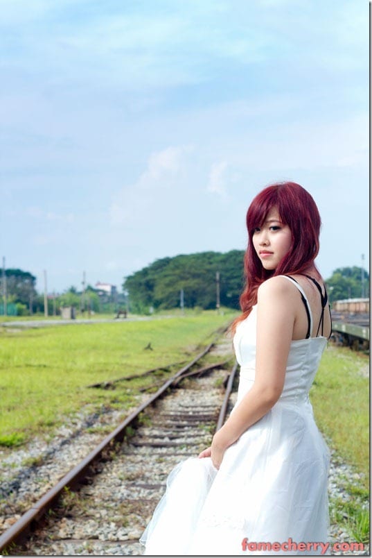
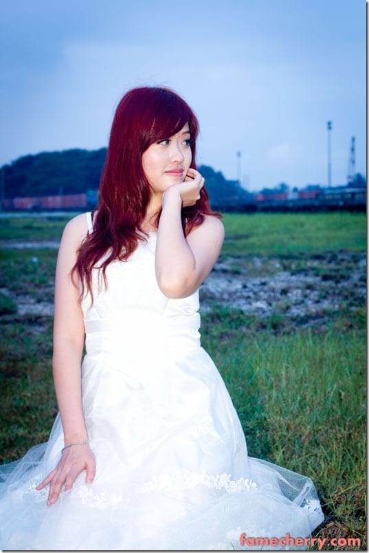
2,3,4,5,6 have inaccurate WB. Did you notice #2 where the subject is in orange whereas the BG is in blue? This is called WB inbalance and can be corrected using a colour gel..
Anyway......
http://fotop.net/dragon_baby/Agnes_LimThanks for sharing the photo, very nice =)
This post has been edited by Wholleymolley: Jan 31 2012, 11:14 AM 

 Jan 29 2012, 05:16 PM, updated 14y ago

 Quote
Quote


 0.0831sec
 2.62
2.62
 5 queries
 GZIP Disabled