Outline ·
[ Standard ] ·
Linear+
kobe8byrant's point-and-shoot gallery, Welcome to my gallery.
|
TSkobe8byrant
|
 Sep 3 2011, 03:01 PM, updated 15y ago Sep 3 2011, 03:01 PM, updated 15y ago
|

|
|
|
|
|
|
|
sniper on the roof
|
Sep 4 2011, 12:46 AM
|
20k VIP Club

|
I suggest adding numbers before each photo so it's easier for people to refer when commenting.
Generally speaking, you could start with the basic composition first... each photo needs a subject (pic 2,3,5,6,9) .. be it a person, a curious object, color, the setting sun etc to capture the attention of the viewer.... you can do this (for a start) by the rule of thirds.
Let's start with that first.
|
|
|
|
|
|
TSkobe8byrant
|
Sep 4 2011, 12:58 AM
|
|
|
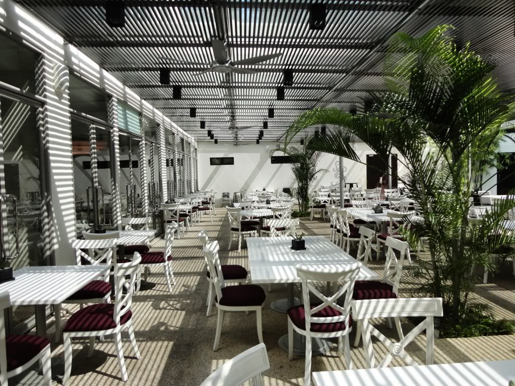
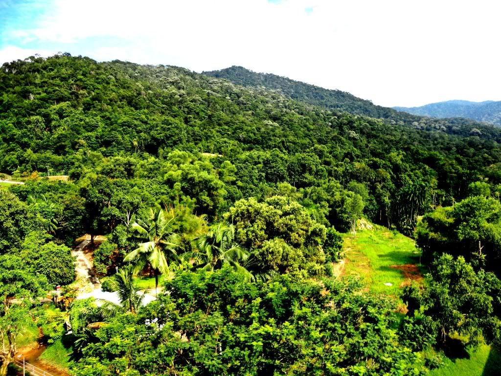
QUOTE(sniper on the roof @ Sep 4 2011, 12:46 AM) I suggest adding numbers before each photo so it's easier for people to refer when commenting. Generally speaking, you could start with the basic composition first... each photo needs a subject (pic 2,3,5,6,9) .. be it a person, a curious object, color, the setting sun etc to capture the attention of the viewer.... you can do this (for a start) by the rule of thirds. Let's start with that first. For photos 2 and 3 for example, can't the room/forest be the subject? I must admit I took those pictures because I thought it'd look nice.  |
|
|
|
|
|
sniper on the roof
|
Sep 4 2011, 09:20 AM
|
20k VIP Club
|
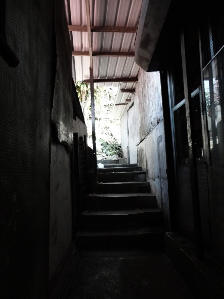
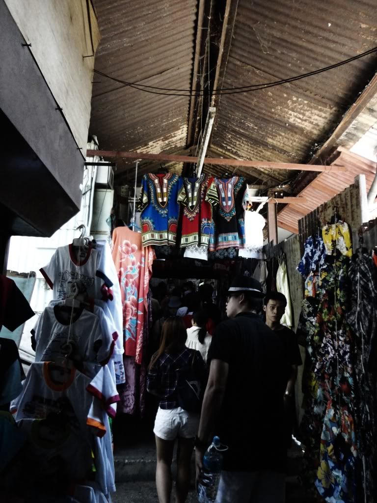
QUOTE(kobe8byrant @ Sep 4 2011, 12:58 AM) For photos 2 and 3 for example, can't the room/forest be the subject? I must admit I took those pictures because I thought it'd look nice. #2 works better ok cos the geometric shapes and their shadows are interesting #3, it looks to me like a picture full of trees with a dash of blown sky... not interesting at all. Maybe you feel differently because you experienced the place first hand but your viewers don't. Thats why some people use ultra wide to give it more feeling of vastness. Anyway, I reckon landscape is one of the most challenging disciplines. |
|
|
|
|
|
TSkobe8byrant
|
Sep 4 2011, 09:37 AM
|
|
|
Thank you very much, bro. Appreciate your tips.
|
|
|
|
|
|
TSkobe8byrant
|
Sep 4 2011, 10:33 PM
|
|
|
Gallery 2: Aquaria KLCC (July 2011) Theme: Point-and-shoot 1.0 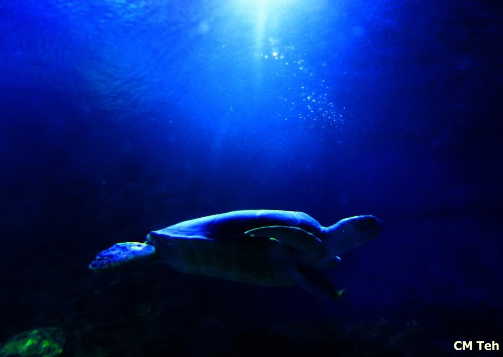 Note: Was thinking of cropping it to leave out the top part but I like seeing the light in the photo. As usual, any pointers? This post has been edited by kobe8byrant: Sep 4 2011, 10:55 PM |
|
|
|
|
|
Human Nature
|
Sep 4 2011, 11:24 PM
|
|
|
QUOTE(sniper on the roof @ Sep 4 2011, 09:20 AM) #2 works better ok cos the geometric shapes and their shadows are interesting agree with this. the photo attracts me  |
|
|
|
|
|
TSkobe8byrant
|
Sep 5 2011, 06:45 PM
|
|
|
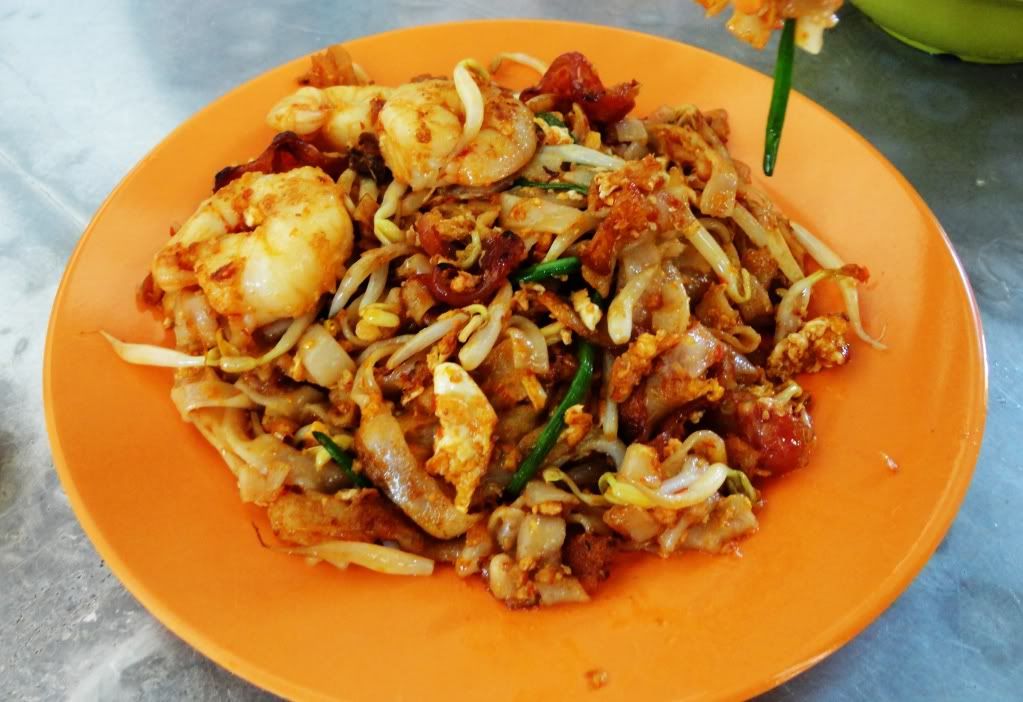
Gallery 3: Bon appetit! Theme: Food Photography. 1. 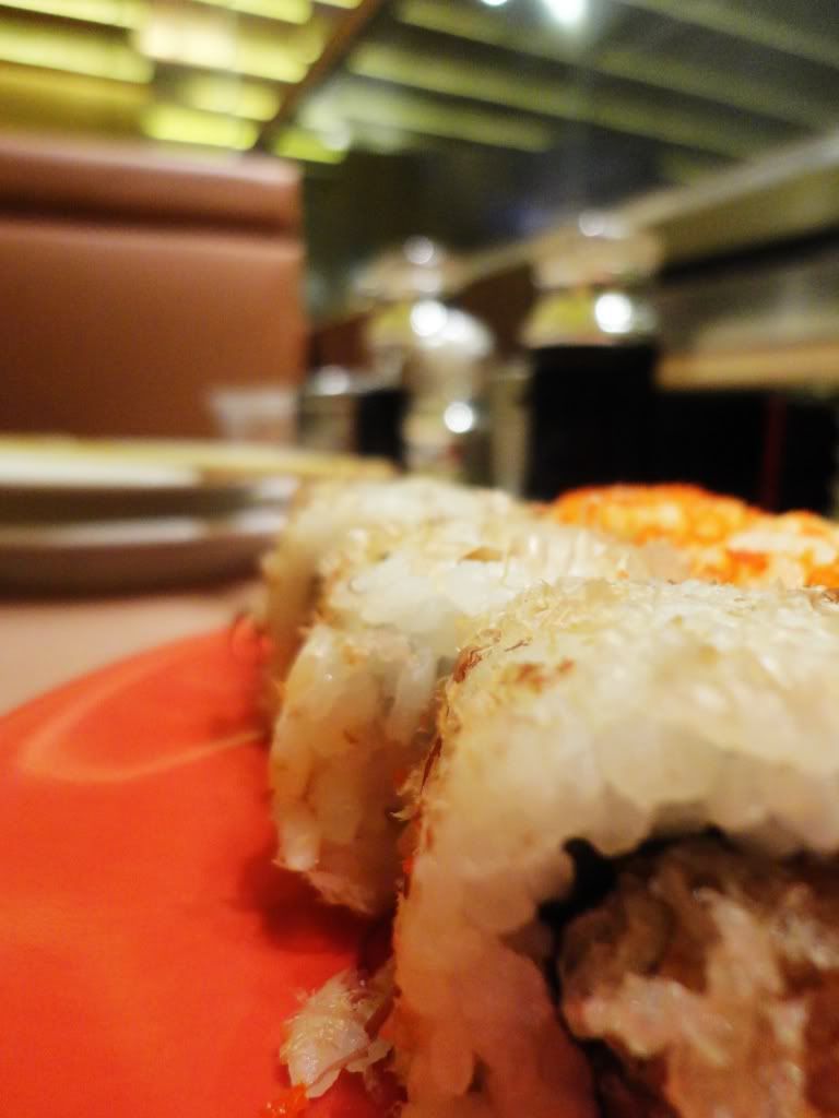 2. 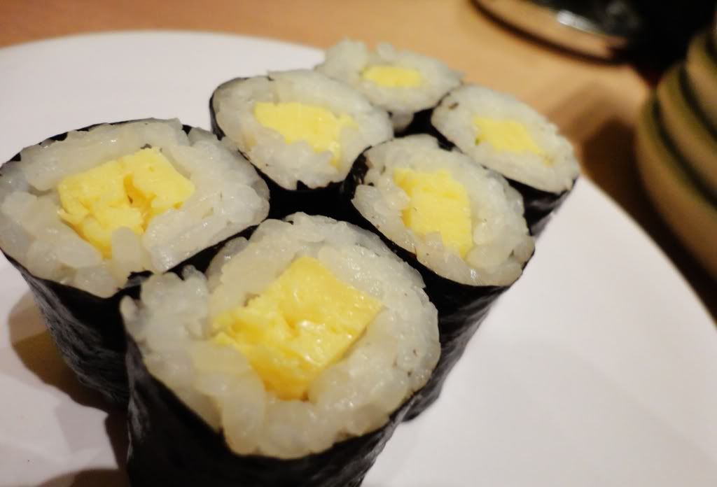 Comments/tips/advice? This post has been edited by kobe8byrant: Sep 5 2011, 06:46 PM |
|
|
|
|


 Quote
Quote

 0.0179sec
 0.24
0.24
 5 queries
 GZIP Disabled