::: ART ATTACK V3 :::, all about handmade ART :D
|
|
 Oct 29 2011, 11:21 AM Oct 29 2011, 11:21 AM
Return to original view | Post
#41
|
      
Senior Member
2,610 posts Joined: Aug 2011 |
What Hex said. Although for me, the small one works more than well enough. Kind of tiny if you're used to the Bamboo Fun's size, though
|
|
|
|
|
|
 Nov 1 2011, 01:43 AM Nov 1 2011, 01:43 AM
Return to original view | Post
#42
|
      
Senior Member
2,610 posts Joined: Aug 2011 |
Manga is something of an overused style on dA. Not a bad thing, per se, but it's hard to make your work look "unique" there :/
Today I took a risk and worked on something I never usually use. Bright colours~! So used to go from dark to light... starting with midtones is a bit of a challenge. 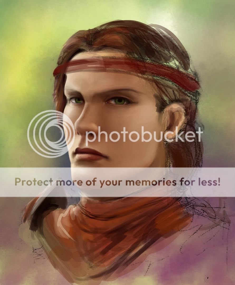 This post has been edited by DragonReine: Nov 1 2011, 01:44 AM |
|
|
 Nov 1 2011, 07:40 PM Nov 1 2011, 07:40 PM
Return to original view | Post
#43
|
      
Senior Member
2,610 posts Joined: Aug 2011 |
ADAM HUGH'S LARA CROFT ART IS AWESOME. AS IS HOW HE DRAWS WOMEN WHO ARE ATHLETIC AND STILL SEXY.
That is all @ Adam As for commissions... well, my clients apparently like drama LOL. I do have some exceptions where I draw smiling characters, but the smile is more evil/mischievous/cheeky than "happy" (spoiler because of large images): » Click to show Spoiler - click again to hide... « @ H4XF4XTOR What I'd actually suggest is that you use dark AND slightly more saturated colours for your shadows instead of just "darker" versions of the base colour. Right now it just looks very... "gray". |
|
|
 Nov 1 2011, 09:23 PM Nov 1 2011, 09:23 PM
Return to original view | Post
#44
|
      
Senior Member
2,610 posts Joined: Aug 2011 |
QUOTE(H4XF4XTOR @ Nov 1 2011, 07:52 PM) hurm... owh ic... guess you're right tough . Err... Not really "black"i use darker version of base colour so by using dark,do u mean black colour? I'll show you the skintone palette set I used for the painting that I'd posted the WIP for earlier, as an example.  The first four colours above are the ones I basically used for shading, going from highlight -> shadow. You'll notice that the highlight is a very pale, very DESATURATED yellow, sort of greyish. In contrast, the shadow tone is a dark, SATURATED red-orange (it looks brown here, but it isn't; the greenish tone of the background makes it look "cooler" than it really is) What's happening here is that I am using a progression of colours that goes from cool to warm. Mixing up cool and warm colours are a good way to give "life" to a painting. So if cool light, warm shadow. Warm light, cool shadow The three colours below are the "enrichment" or "enhancing" colours, which I brush lightly over selected areas of the face to give extra colour variety, using very low opacity, almost transparent brushes, with very soft edges. The yellow is most obvious on the forehead (which is usually yellow toned), the pink I used on the brighter parts of the cheeks and nose (the middle of the face is usually ruddy and warm), and the orange on the shadowed areas where skin is near skin (the edge of the nostrils, the underside of the chin) to give the effect of bounced light and the resulting subsurface scattering, which is quite important to make skin look like skin. EDIT: I actually AVOID black. It's too flat, too dark, and can make your painting look very muddy. It works best if the painting is very, VERY desaturated to begin with, but otherwise it's better to actually use the "dark and saturated" trick again for the darkest parts of the painting. Almost-black deep red, almost-black deep blue, that sort of thing. This post has been edited by DragonReine: Nov 1 2011, 09:25 PM |
|
|
 Nov 2 2011, 12:27 AM Nov 2 2011, 12:27 AM
Return to original view | Post
#45
|
      
Senior Member
2,610 posts Joined: Aug 2011 |
This is a very simple, but good colour theory tutorial:
http://katmomma.deviantart.com/art/The-Tom...Theory-77354239 And an good blending tutorial: http://acidlullaby.deviantart.com/art/Blen...torial-90939400 |
|
|
 Nov 3 2011, 12:19 AM Nov 3 2011, 12:19 AM
Return to original view | Post
#46
|
      
Senior Member
2,610 posts Joined: Aug 2011 |
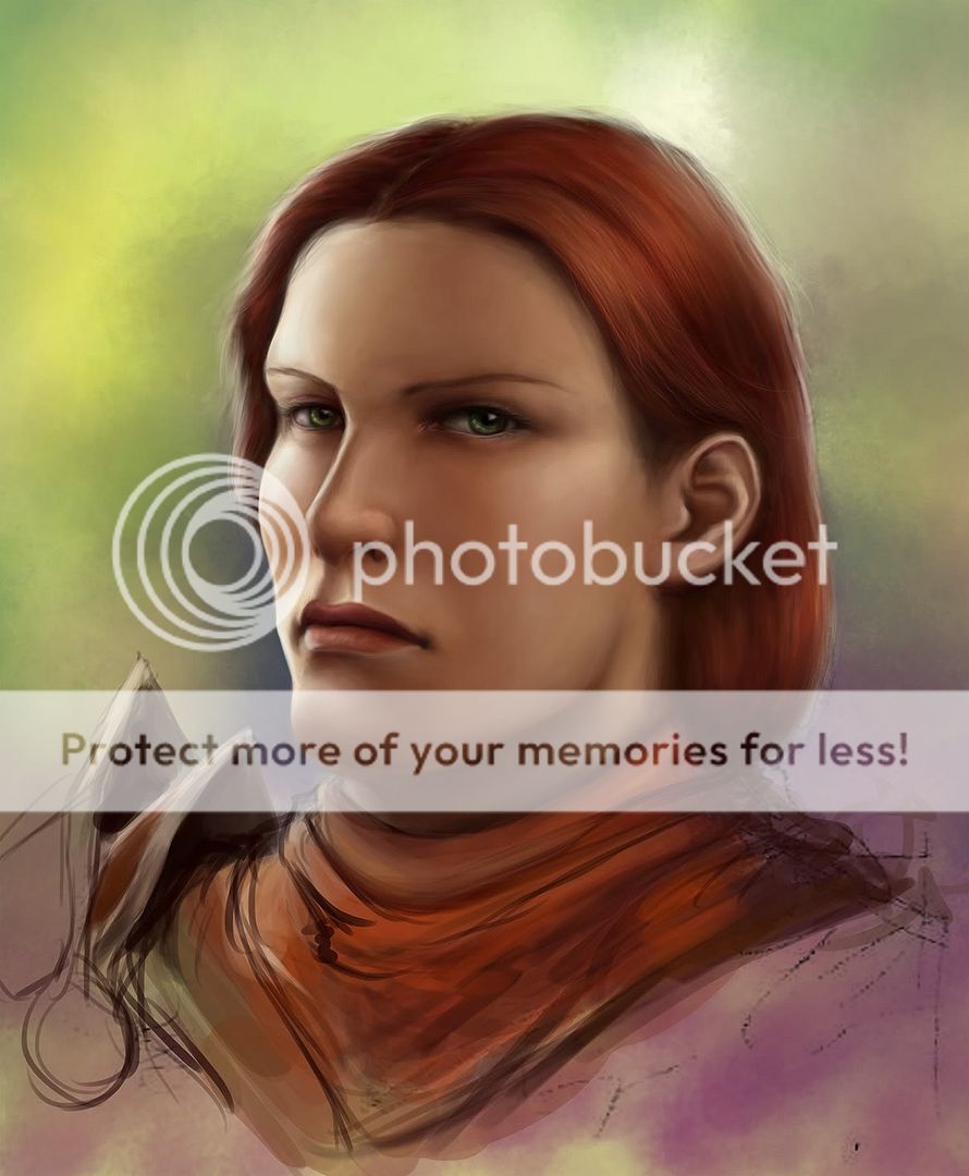
Progress on Aveline: » Click to show Spoiler - click again to hide... «
|
|
|
|
|
|
 Nov 6 2011, 07:11 PM Nov 6 2011, 07:11 PM
Return to original view | Post
#47
|
      
Senior Member
2,610 posts Joined: Aug 2011 |
Preview of my latest commission.
 |
|
|
 Nov 6 2011, 10:10 PM Nov 6 2011, 10:10 PM
Return to original view | Post
#48
|
      
Senior Member
2,610 posts Joined: Aug 2011 |
@ Bonchi
Just finished  --- @ Sai91 Aw, shucks, |
|
|
 Nov 7 2011, 12:07 AM Nov 7 2011, 12:07 AM
Return to original view | Post
#49
|
      
Senior Member
2,610 posts Joined: Aug 2011 |
@ Adam
If they shine, they'd look plastic in this case, considering the generally matte background, it'll look too "sharp" |
|
|
 Nov 7 2011, 12:43 AM Nov 7 2011, 12:43 AM
Return to original view | Post
#50
|
      
Senior Member
2,610 posts Joined: Aug 2011 |
@ Sai
Although in this case, the games I usually draw for has the option to customise the player character with facial tattoos, and most of my clients prefer getting characters with tattoos. |
|
|
 Nov 7 2011, 12:58 AM Nov 7 2011, 12:58 AM
Return to original view | Post
#51
|
      
Senior Member
2,610 posts Joined: Aug 2011 |
Likely, yes
|
|
|
 Nov 7 2011, 11:48 AM Nov 7 2011, 11:48 AM
Return to original view | Post
#52
|
      
Senior Member
2,610 posts Joined: Aug 2011 |
@ LingLing
Woops. Okay, clarification: I draw game FANART. The games I like to play, which I also like to draw fanart for, has the option to customise player characters with facial markings, in addition to things like the shape of facial features, and skin/hair/eye colouring. I do, however, design tattoos (usually of the tribal variety) on occasion for RL people. It's not something I do often, however |
|
|
 Nov 7 2011, 05:27 PM Nov 7 2011, 05:27 PM
Return to original view | Post
#53
|
      
Senior Member
2,610 posts Joined: Aug 2011 |
Nah, I'm not that good.
|
|
|
|
|
|
 Nov 24 2011, 12:10 AM Nov 24 2011, 12:10 AM
Return to original view | Post
#54
|
      
Senior Member
2,610 posts Joined: Aug 2011 |
Hair's too stringy. Looks like she added a mop on her head :/
Been a LONG time since I came here, LOL, damn you ill health. Anyway, something I'm still working on:  |
|
|
 Nov 24 2011, 12:27 AM Nov 24 2011, 12:27 AM
Return to original view | Post
#55
|
      
Senior Member
2,610 posts Joined: Aug 2011 |
@ Agito
Aiya. Okay, I'm officially blind to certain things. Sorry! D: |
|
|
 Jan 18 2012, 09:25 PM Jan 18 2012, 09:25 PM
Return to original view | Post
#56
|
      
Senior Member
2,610 posts Joined: Aug 2011 |
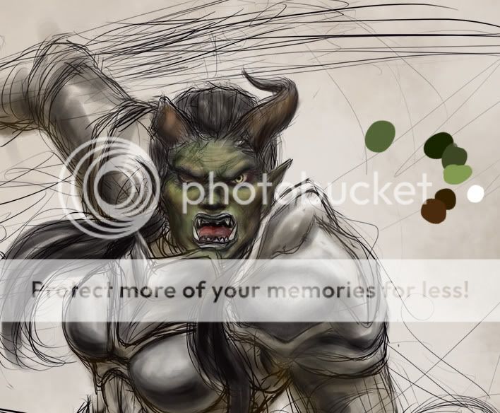
I really am glad I tried drawing something beyond the pretty women I usually work with. This is ridiculously fun.
 |
|
|
 Jan 19 2012, 06:14 AM Jan 19 2012, 06:14 AM
Return to original view | Post
#57
|
      
Senior Member
2,610 posts Joined: Aug 2011 |
Heh, helping my sister with her modeling career
|
|
|
 Jan 20 2012, 10:53 PM Jan 20 2012, 10:53 PM
Return to original view | Post
#58
|
      
Senior Member
2,610 posts Joined: Aug 2011 |
Tattoo sketch: NOT SAFE FOR WORK, so it's linked elsewhere
Added on January 20, 2012, 10:58 pm@ OH- Right now her hair looks very flat, and doesn't follow the shape of her skull. The eyes, too, look "pasted in", and you've made the common mistake of drawing eyelashes strand by strand. There are other issues with the drawing, but most of it is a result of drawing the face as a flat object rather than a three-dimensional form. I'll suggest that you take the time to learn the structure of the human face first before directly drawing from photo-refs. Once you know the three-dimensional shape of the human head, "eyeballing" details will be easy, even if the photo reference is less-than spectacular (under/over-exposed, too small, blurry etc) This post has been edited by DragonReine: Jan 20 2012, 10:58 PM |
|
|
 Jan 21 2012, 02:16 PM Jan 21 2012, 02:16 PM
Return to original view | Post
#59
|
      
Senior Member
2,610 posts Joined: Aug 2011 |
@ OH-
For the sake of convenience and practicality, most artists don't bother rendering eyelashes strand by strand. Unless you're a CG artist, or someone whose work is going to be blown up to billboard size, or something, LOL, and even then it's still mostly unnecessary. For example, here's the "final" image of one of my latest paintings:  ... and here's the 100% resolution crop of the eyes from the same painting.  You'll see that the actual painting actually has very simply rendered eyes, and the eyelashes are "hinted" at rather than actually detailed in. In this case, the hinting is actually achieved by drawing a thick, dark line over the edges of the upper lid (which is a trick makeup artists also use to give the illusion of thicker eyelashes, haha), and I only needed to draw in several CURVED AND TAPERING strands of eyelashes to give her the look of thick eyelashes. Now you might be thinking that "oh, this is digital, so it isn't relevant to me." but the "Keep it Simple" rule comes from traditional art teachings. Take these pencil portraits, for example:   Again, note that the "eyelashes" are mostly hinted at, again with thick lines. The woman has the extra strands, the man doesn't (because long eyelashes on a guy tends to look somewhat awkward, unless you're going for a certain 'look'). You may want to take a look at the site where the pencil portraits come from: http://www.portrait-artist.org/face/ It not only tells you the methods of drawing a face, but also the common mistakes beginners make (under their "don't do this" section). You may also want to take a look at these two pages: http://www.onlypencil.com/blog/tutorials/d...-the-human-eye/ http://www.artgraphica.net/free-art-lesson...es-tutorial.htm I suggest reading those two sites at the same time. The first goes into detail about the specific techniques used (line weight, pencil pressure, shading/toning, etc), while the second goes more in depth about the materials used (pencil types/softness). Hopefully, this will help |
|
|
 Jan 21 2012, 02:48 PM Jan 21 2012, 02:48 PM
Return to original view | Post
#60
|
      
Senior Member
2,610 posts Joined: Aug 2011 |
@ Adam
That works, yes. If you have the time and patience, it creates a nicely detailed result, as long as you don't overdo it. My method is more towards speed/workflow optimization |
|
Topic ClosedOptions
|
| Change to: |  0.0517sec 0.0517sec
 0.49 0.49
 7 queries 7 queries
 GZIP Disabled GZIP Disabled
Time is now: 29th November 2025 - 07:48 PM |
All Rights Reserved © 2002- 2025 Vijandren Ramadass (~unite against racism~)
Powered by Invision Power Board © 2025 IPS, Inc.


 Quote
Quote


